If you watched a Suns home game this season, you probably noticed that they had a new court design for the 2012-13 season. This court had a whole lot of black and orange, but a little bit of purple. That was weird because the Suns’ visual identity contained a lot of purple (Including the secondary logo that the Suns had basically been using as a primary logo as noted before on this website, and the uniforms as well). In fact, purple has been the primary color in the Suns’ look since they came into the league in the 1968-69 season.

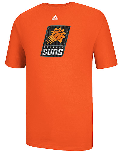
As it turns out, the court’s black-&-orange heavy design was a sign of things to come as the Suns have released changes to their logo set that show a clear move towards black-and-orange being the new focal point of their visual identity. Even this shirt, just released on the NBA Store’s website, seems to indicate that the future for Phoenix is black & orange.

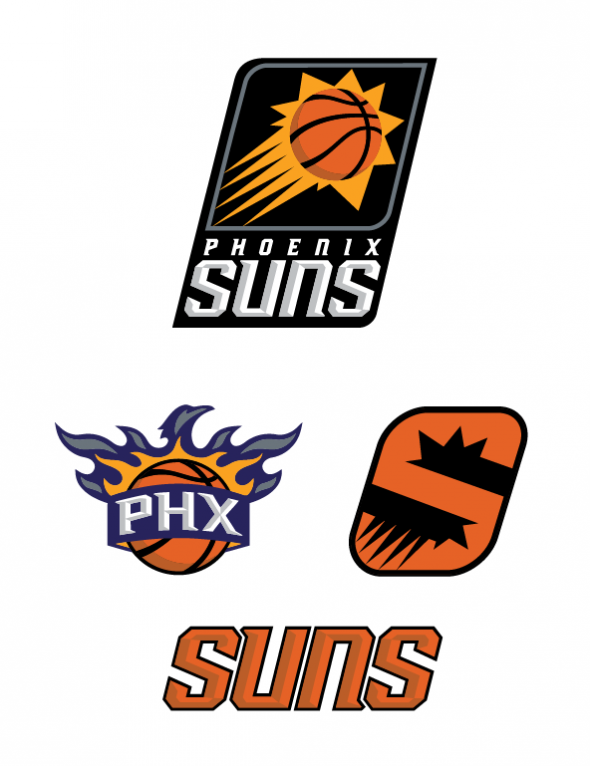
For the first time in franchise history, purple will not be in the team’s primary logo. The ambigram that served as the Suns’ center-court logo is now the new primary script. Interestingly enough, the secondary logo (that had a slight tweak before the 2012-13 season) has been retained. Honestly, I think that it sticks out like a sore thumb when you look at the rest of the set, and it’s mainly because it contains one thing that the other 3 pieces of this set don’t have: Purple.
However, for those who are hoping that purple could still play a big role for the Suns, there’s this other shirt that was released with one of the newer logos.
So it seems as if purple isn’t entirely dead. What do you make of the new changes? Are you glad to see the Suns evolve their look? Do you think that they’ll try to find a new way to keep the purple around? Maybe we’ll see it used in an alt in the future? Maybe we should wait until the uniforms come out, but for now, it’s looking as if they’re going to go heavy on the black & orange while purple goes to the sidelines after nearly five decades.


