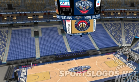
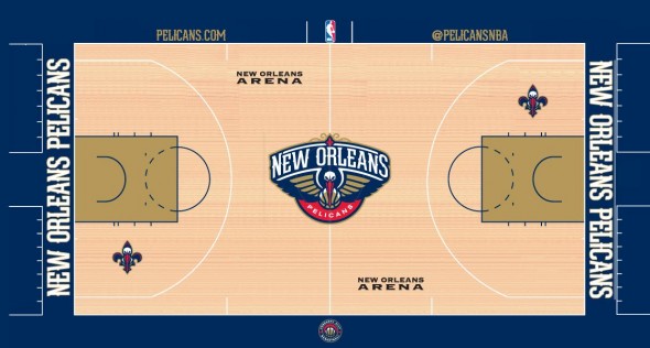
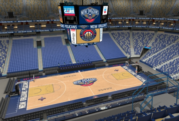
The Artists Formerly Known as the Hornets (better known as the New Orleans Pelicans) have released the design of the court at pelicans.com as part of a drive to start selling season tickets for the upcoming season. Using the Interactive 3D Map on their website, we can get a look at what this thing could look like in the actual arena.
As you can see, there’s nothing really too crazy about the court itself, with the only facet of interest being the all-gold key (with no lane markings, as has been standard for new courts since 2010), which is the only part of the floor that has gold as a dominant color. But overall, it’s your standard run-of-the-mill NBA court: Primary logo at center court, “Bird-de-lis” inside of each arc, website & twitter handles on each bench side, and script across the baseline. Again, nothing too out of the ordinary here.
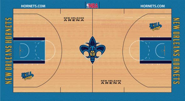
Plus structurally, it’s not that much of a departure from their final Hornets court (though it’s a huge departure when it comes to the colors and the absolutely fantastic “Fleur-de-bee” logo just popping out at you, but that’s another story for another day), with the only big difference being that there’s now a twitter handle on the away bench’s sideline.

