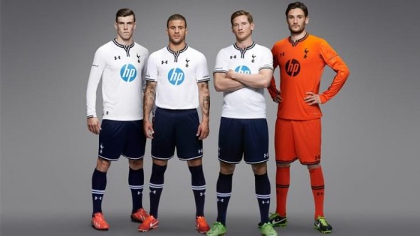
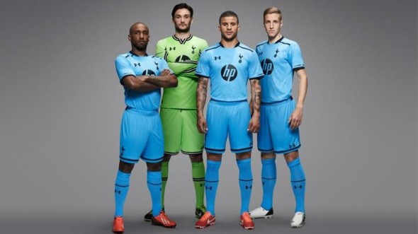
If you’re a fan of frequent uniform upheaval, I’d suggest that you become a soccer fan (if you aren’t already) because it happens a LOT in this sport. This is the case especially in high-profile European leagues, where the bigger clubs tend to unveil new kits every season, which is the case for a club like Tottenham Hotspur. Spurs unveiled their new kits for the 2013-14 season, and while there are plenty of changes, it’s still a very familiar look for Spurs.
The biggest change comes in the form of sponsorship, as Hewlett-Packard’s logo will return to the front of Tottenham’s shirts for the first time since 1999. Other changes include a switch to a darker navy blue than usual & navy shorts on the home kit (although they wore navy shorts with white shirts a few times last season, the primary look was an all-white strip), and an all-“Capri blue” clash kit.
As I said earlier, there might be plenty of changes from their previous primary look of all-white with silver accents, but this is still a very classic look for Spurs, and one that their supporters should be very happy with. The only issue I have is that the sponsor logo on the primary kit could’ve looked much better if it was in navy (like it was during its last sponsorship stint in the late 90s), but other than that, this is a very solid set of kits for Tottenham from Under Armour, and they should be one of the better looking teams in the Barclays Premier League next season.
Let us know what you think about Spurs’ new kits in the comments sections? Do you love em? Or do you think that it was a miss? Share your opinion with us!

