A second teaser graphic Tweeted out by the Buffalo Sabres all but confirms that the team will be wearing a predominantly yellow alternate jersey with their standard primary logo on the chest for the upcoming 2013-14 season.
The image tweeted is shown below:
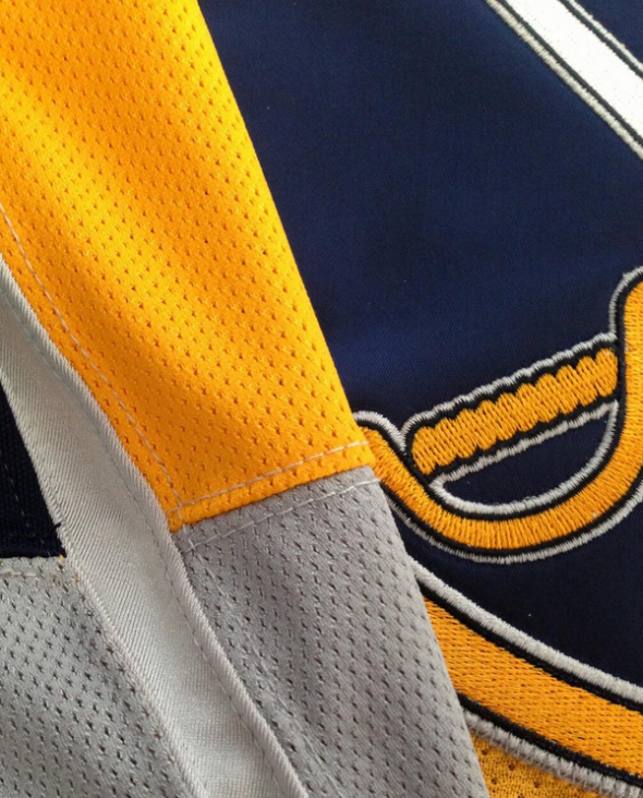
As you can see the body is yellow, the modernized primary logo (in use since 2010/11) on the chest.
What’s catching my eye is the striping pattern on what looks to be the sleeve shown on the left side of the graphic. What I’m seeing is under part of the sleeve with one half yellow, the other blue, separated by a single white stripe. This could indicate that the Sabres are going to pull off some sort of Toronto Raptor-esque jersey front in one colour, jersey back in another. Which, well, would be unique for the NHL should that be the case.
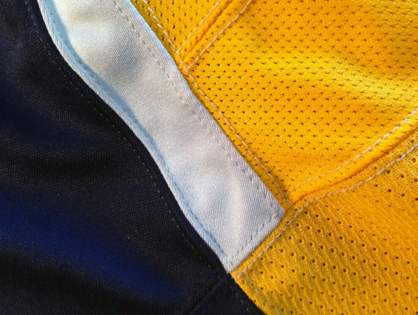
This graphic falls on the heels of what they sent out earlier this week which showed a shoulder yoke design of blue with white trim:
What do you guys think? Is this some sort of half-and-half design we’re looking at? If so, does it work? Share your thoughts in the comments…


