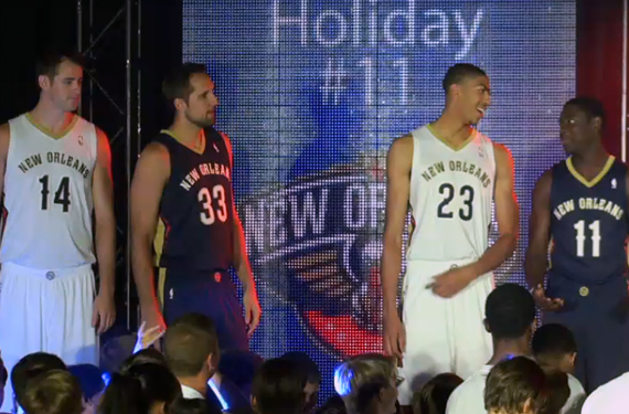
The brand transition of the New Orleans Hornets to the New Orleans Pelicans is complete as the franchise unveiled the uniforms for their inaugural season as the Pelicans during a fan event earlier this afternoon.
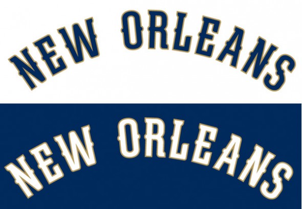
Both the home and road uniforms feature “NEW ORLEANS” arched across the front of the jersey in the same font seen on the team primary logo. Blue and gold are clearly the dominant colours when it comes to the uniforms, red is included but only as an accent on the side striping.

White uniforms at home, blue on the road, the “Bird-de-lis” logo is on the back of the jersey above the player name and number while a new logo previously unreleased – an “N” and an “O” merged together to form a basketball – is on the front of the waistband of the shorts.
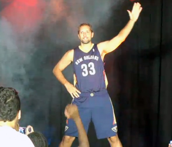
As is NBA policy, there will be no third jersey for the first season — the club did announce they will have an alternate uniform for 2014-15 and another “special uniform” (Mardi Gras perhaps?) for 2015-16.
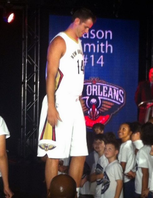
My thoughts on the new look? I’ll admit I’m disappointed after having seen such a fantastic logo set for this team. The font used for the jersey wordmarks seem way too small on these players and the gold outline isn’t helping it appear any larger. On straight-on front shots you don’t see any of the side stripes, all you see is a little gold on the neckline and a plain black and white logo on the shorts.
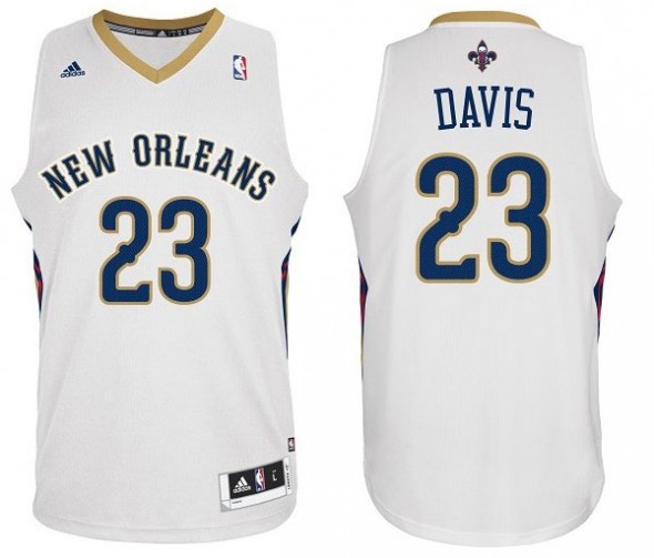
I also understand the desire to show love to New Orleans on both the home and road but they just changed their nickname, what was the point of changing the nickname if you aren’t going to even put it on the new uniforms? They could have used these same uniforms while retaining the Hornets name, just change the colours.
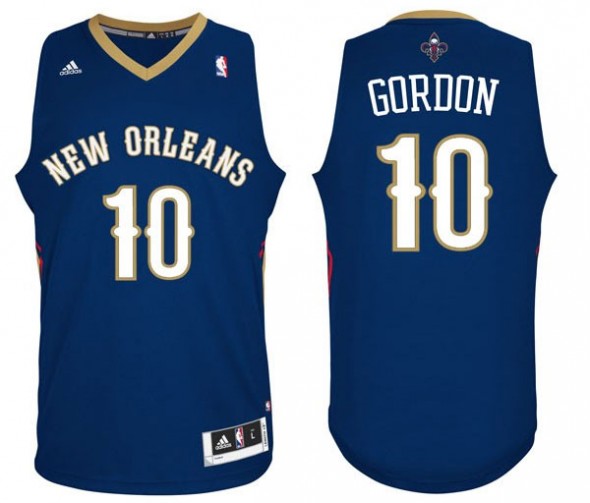
We’re still waiting on clearer photos of the new look and some additional details, as always we’ll post them as we get them.

