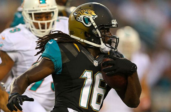
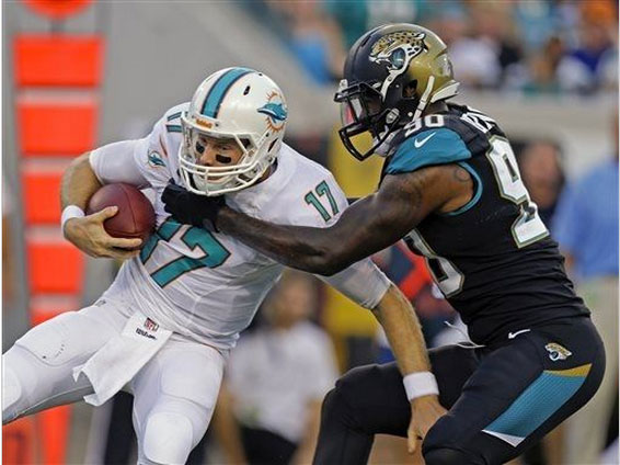
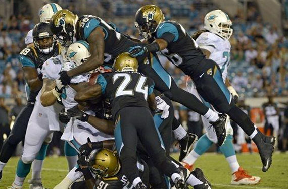
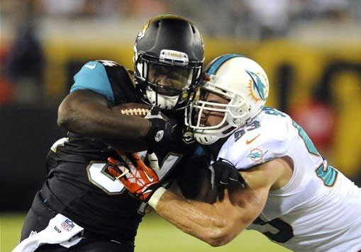
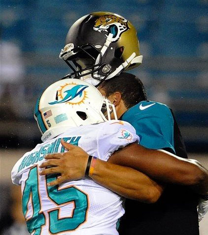
The Jacksonville Jaguars and their hmm… unique(?) new helmets made their in-game début last night for a pre-season game against the Miami Dolphins (who were also making a uniform debut with their new white set, but you know… boring!)
Jacksonville’s new uniform was relatively well received by the public with one universal noted exception, “if it weren’t for those silly helmets!” I concur.
The helmet, which is a gold to black gradient from back to front with the Jaguars new logo on the side, is meant to represent a jaguar lurking in the shadows and I guess how they slowly become more (or less?) visible based on the amount of light surrounding them. Yeah, it’s a bit of a stretch. I’m betting it went more like “Hey Jaguars, can we try this gradient thing on your helmets? You’ll be the first ’cause every other team says ‘no way, guys!'”. And Jacksonville being Jacksonville (cue up the angry Jaguars fans again), here we are.
Anyways, enough with the preamble. Here’s some shots from the game last night:
It’s yeah, I dunno, it’s different. Probably not as horrible as I had expected it to look but, not that any of their teams went with this type of helmet, I still think XFL or CFL USA every time I see it.
What are your thoughts? Share ’em in the comments!

