The Los Angeles Angels of Anaheim celebrated “Throwback Weekend” this past weekend against the Houston Astros wearing two different throwback uniforms.
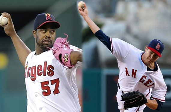
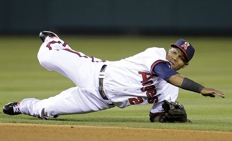
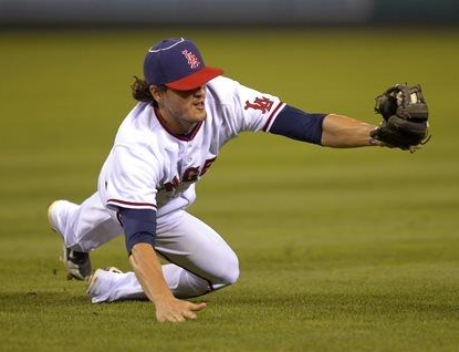
First up, on Friday night the Angels went back to (what can be best described as a combination of) their 1973-85 and 1989-92 designs with that classic navy blue and red “Big A” cap, the “Angels” script across the chest (in “Smartcaps” style).
Let’s compare the jerseys and caps to see how they did:
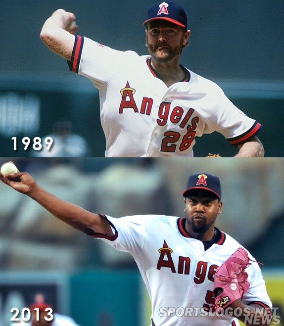
It’s looking pretty good, but where it becomes inaccurate is on the sleeve… or with the buttons. It depends on what era they were looking to emulate.
See, where the combination of two eras mentioned earlier comes into play is with the State of California patch on the sleeve (1973-85) on a button-up jersey with traditional belt pants (1989-92). Yes, you’re right, the Angels *did* wear a button up jersey with a California patch on the sleeve in 1971 and 1972 but notice the uniform script was all lowercase in those years.
Compare the 1972 look with the 1973-85 design as well as the early 90s uniform (with the updated sleeve patch) below:
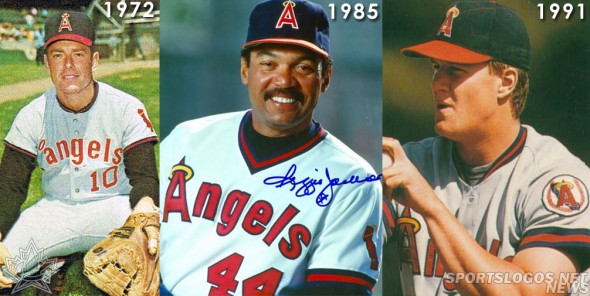
As you can see, the Angels like to tweak their look little by little over time, it’s a practice they still do today.
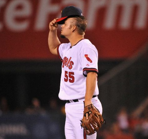
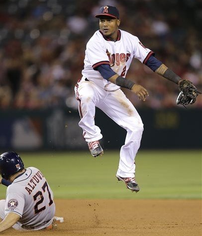
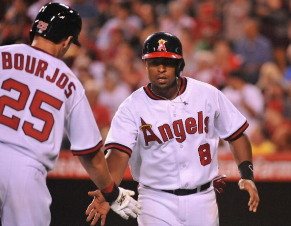
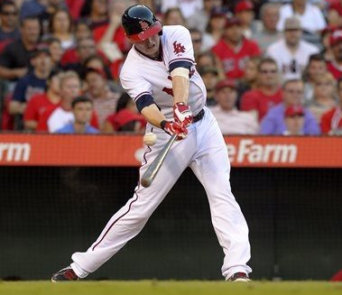
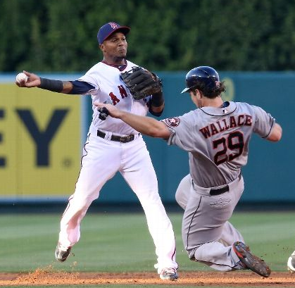
A few photos from Friday’s game, note the use of the proper logo on the batting helmets:
For Saturday’s game the Angels went back into the 1960s wearing the look from their days as the plain old “Los Angeles Angels” (none of this “of Anaheim” in the name back then kids). The original LA Angels look included one of the more interesting uniform designs of the 1960s, the halo on the top of the cap:
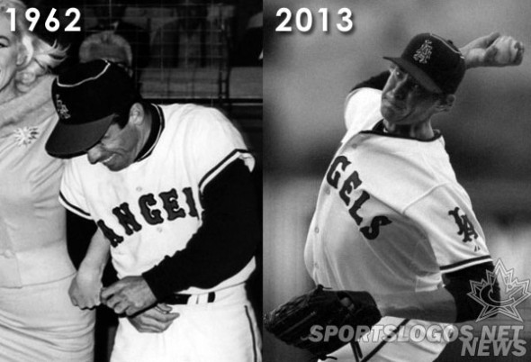
A fairly accurate reproduction… except for the Angels adding a patch they never actually wore to the sleeve of the reproduction. Again with the patch inaccuracies!
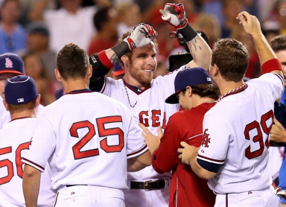
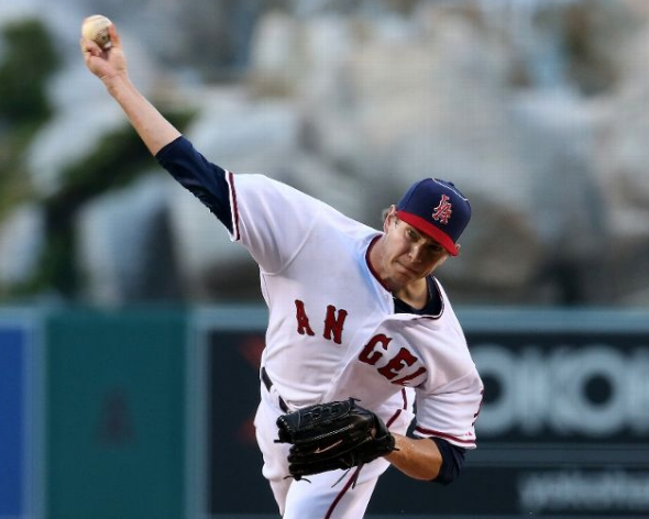
They also used the Boston Red Sox style of numbers for the throwbacks, but put down your torches and pitchforks because the Angels actually used to use that font for their numbers, weird right?:
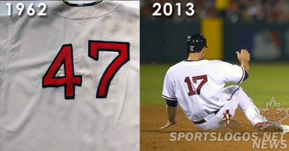
Some more photos from Saturday’s trip back to the early ’60s, again with proper logo on helmet (but no halo, shucks):
So, in short, while the team did pretty good with their jersey fonts, striping, and caps they really buggered up the patches. Not sure what happened there, maybe it makes it a more lucrative purchase for fans, who knows. Either way, I think we all can agree the idea of a throwback weekend is a great one, so kudos to the Angels for that.
Speaking of lucrative purchases… You can purchase all these throwback looks on the Angels official website…. The 1970s-80s cap here, the 1970s-80s jersey here, the 1960s cap (with halo!) here, and the ’60s jersey here.

