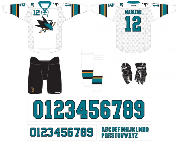
One step forward, one step back. That’s the best way I can describe the uniform changes announced today by the San Jose Sharks.
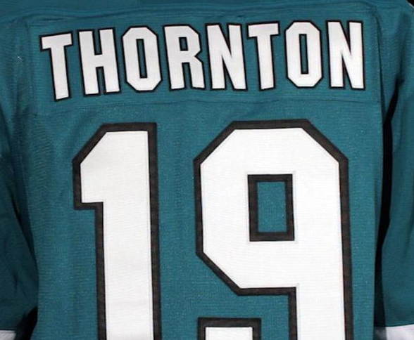
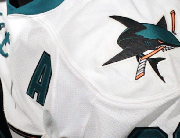
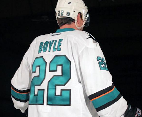
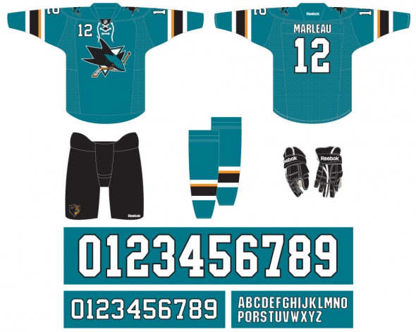
The biggest difference in the new uniforms is the removal of the black shoulder yoke from both the home and road jerseys while the shoulder patches remain the same from last season. This creates a much more clean look while also giving a nod back in the direction of the original Sharks uniforms from the 1990s. The “Pacific teal” now absolutely dominates the home jersey, which is really how it should be for the Sharks. Looks great.

Other changes include the removal of almost all orange from the uniforms — it’s now completely gone from the player name and numbers and has been reduced greatly on the sleeve stripes and the waist. Speaking of the waist…
While doing so really revs up the teal on the homes, the one change I’m really not a fan of is the removal of the waist stripes. This was something Reebok pushed when they re-designed the entire NHL back in 2006/07 and it started to look like most of those teams who went with the stripe-free look on the waist had reverted back… San Jose has done the opposite. It just doesn’t look right on a hockey uniform. The one plus is the contrasting pant colours breaks it up a bit (when worn on the player as a uniform) but a jersey with no waist stripes looks silly when you’re wearing it as a fan. That’s a $129 nightgown you got on there.

The Sharks are saying they removed the waist stripes to lighten the weight of the jersey. If this is the actual reason we can’t be too far off from screen printed logos, patches, stripes, and player name/numbers. Let’s just hope this never happens.
All stripes around the collar have been removed from the home uniform to complete that teal domination (a single teal stripe is around the collar of the white roads), and while we’re there — collar lacing is also new for the Sharks. Everybody’s doing it these days so they might as well too. I like it. I really like that the laces are teal on the roads, nice touch.
Front player numbers remain (boo), black alternate uniform also remains (meh).
The new uniforms can be pre-ordered (PDF) courtesy the Sharks “The Next Wave” portal on their official website. Some more photos and graphic representations courtesy that portal site below:
What are your thoughts? Was this a change worth making? Should they have kept the waist striping and shoulder yokes? Have your say in the comments section below:

