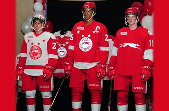
The Sault Ste. Marie Greyhounds of the Ontario Hockey League unveiled their new team uniforms at a fan and press event in the Soo this past weekend.
Despite the name of the team, grey has been removed from the colour scheme. It had been a part of every look the Greyhounds used since 1985/86.
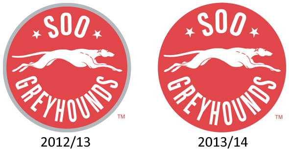
“The move today to unveil our new look is a move for us to simply get back to being ourselves. The Soo Greyhounds at their inception were red and white. This look gets us back to that. It is a pure, classy, and simple look.” – SSM Greyhounds GM Kyle Dubas
Mr. Dubas is spot on, the Greyhounds played their first 14 seasons wearing just red and white, and in that time the team had a teenage Wayne Gretzky on the roster who shattered the OHL record book in his brief time with Sault Ste. Marie.
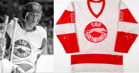
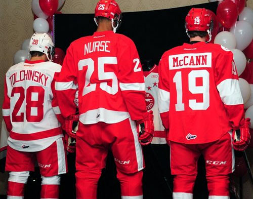
The new white jersey unveiled is basically a direct copy of the jersey the club wore during Gretzky’s years with the club, which in itself is a direct rip of the Detroit Red Wings white jersey. The only difference between the Gretzky jersey and the new one is the addition of the four red stars above the logo. These stars first appeared in 1981 and (except for their “let’s just completely change everything for fun!” seasons in the late ’90s) have been around ever since.
In addition to losing the grey, gone from last season is the shoulder yoke (well done). Overall, a much improved look:
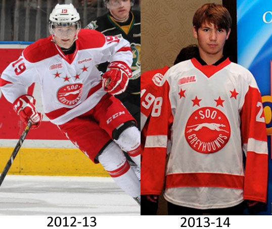
For their darks, the Greyhounds just kept it consistent and went with the Red Wings red uniform. The Greyhounds have never previously worn this style of jersey, during the Gretzky years they wore a similar version but with a white shoulder yoke. The stars have also been added to this jersey.
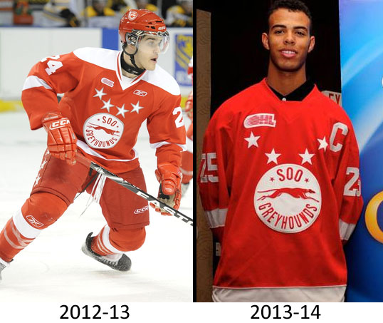
There was also a new alternate uniform unveiled, replacing the various black outfits the club had been using recently. The new third is a very basic, as clean as she gets, version of the new dark uniform. Only a white greyhound appears on the chest, the logo stripped of everything but. No stars, slightly wider arm stripes. The primary logo appears on each shoulder in white. It starts to get silly on the back with the contrasting player nameplate, but overall very well done.
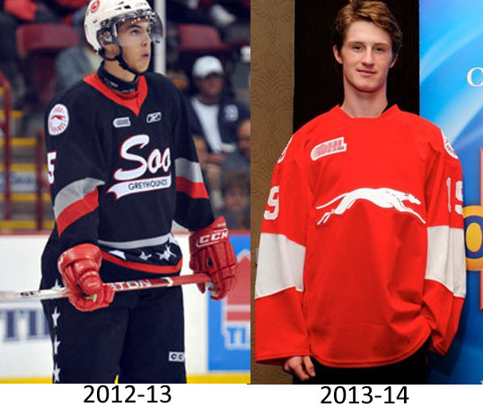
Comparing this alternate with last years it’s clear how much improved the new look is.
We’ll round this up with a shot of the back of all three uniforms only further reinforces the Detroit Red Wings style the club has adopted for 2013-14:
The new jerseys are available for pre-order now by filling out this PDF form, the team will wear their 2012-13 jerseys for the pre-season before switching to the new look on opening night.

