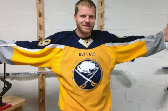
Frustrated (like the rest of us) by the absolutely agonizingly lengthy process they’ve gone about with their new jersey teaser, Steve Ott of the Buffalo Sabres has called out his own team and went ahead and just leaked the new look himself.
The Buffalo Sabres had been posting teaser graphics for their new yellow alternate uniform for nearly two months now, the first graphic posted to their Twitter account on July 12.
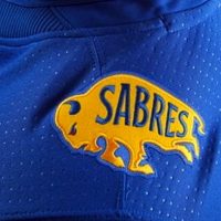
Today the Sabres posted nothing more than a photo of blue jersey fabric which apparently was the last straw for Ott who eventually posted photos of himself wearing the new uniform to his Twitter account. The Sabres acknowledged the “leak” on their own Twitter account about half-an-hour later in what is very likely nothing more than a fairly clever way for the team to unveil the uniforms… Or it could have been a way to distract us all from just how horrible the new uniform is.
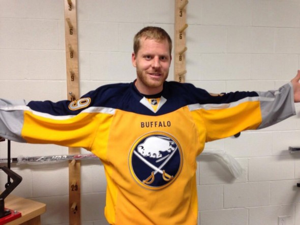
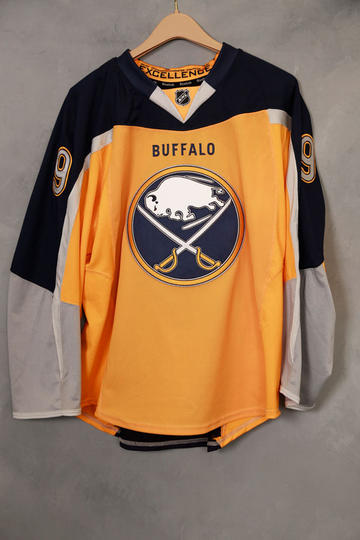
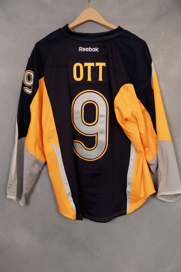
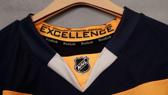
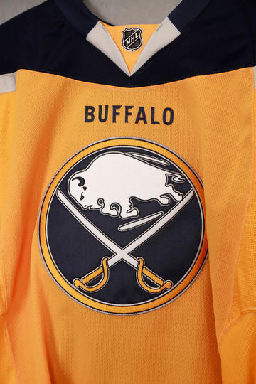
The new jersey has a yellow front and a blue back, recalling the days of that innovative but ultimately silly Toronto Raptors road uniform of the early part of the century. Carrying over from the back, the blue extends almost down the entire arm, around the shoulders, and even below the front collar. “BUFFALO” is in blue below the mullet yoke*.
On the yellow front is the primary logo, we can’t see waist striping in the front pic but a shot at the back suggests there is none. Silver dominates the last quarter of the sleeves.
Player numbers are in grey, outlined in blue and yellow, on both the sleeve and the back. The player name appears in a rather large yellow font.
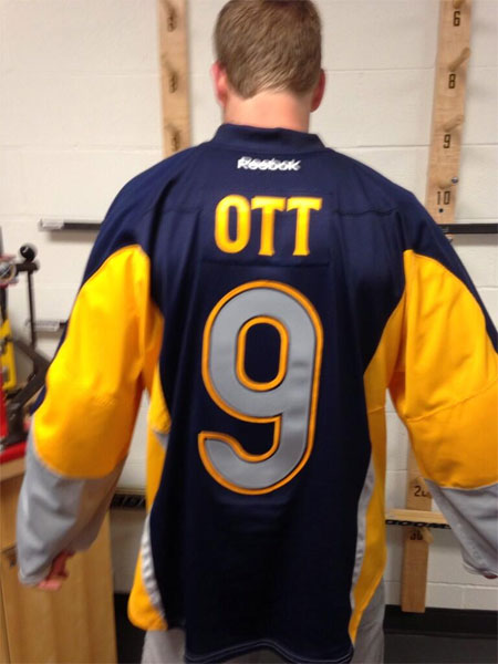
Both the name and number are unusually large — making us wonder if the font size will be adjusted based on the length of a player name or if a number is double digits because as this mockup from our own JR Francis shows…
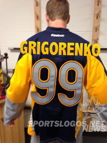
It doesn’t quite fit using the size shown here.
Not shown in this photo but previously released in a teaser graphic last month was the unique captains/alternate captains patches, an “A” or a “C” above two crossed sabres.
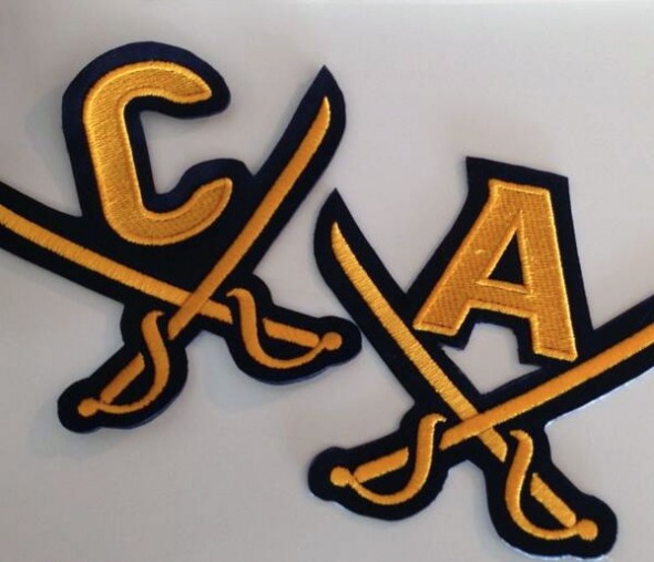
This alternate uniform is just the latest in a long line of Buffalo Sabres designs which show they just don’t “get it”, fans have been quite clear for years and years that they wanted nothing more than a return to their classic look of the 70s-80s-mid 90s.
When the team finally announced a rebrand to that classic look in 2006 what they got instead was the ‘Buffaslug’ (“What? You wanted blue and yellow!”); after feedback on that look was quite instant and quite clear they tried again, this time it was finally something close to the old look but still not what they craved. It incorporated the classic logo but it was sloppily outlined in silver (“it’s the 2000’s people! Everything needs silver”!), the jersey too, silver added seemingly randomly just for funs… and now this — a jersey design that would have fit in quite well in the Buffaslug era but in the complete opposite direction of what the fans have been wanting.

What are your thoughts? Am I too much a stickler for tradition? Am I failing to see some innovative, unique, brilliant design right before my eyes? Share your thoughts in the comments.
UPDATE (Sep 5/13 10:30am ET) — The Buffalo Sabres uploaded some additional, and better quality shots of the new uniform (all of which were crested with Ott’s name and number, so, yeah, that confirms what we all thought — the “leak” was just part of the show). Anyways, the new photos are below:

