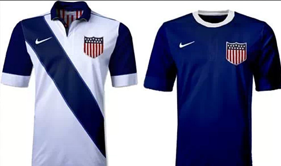
Joe Davis has a friend at Nike, or at least he says he does. That friend claims that the above is what the USMNT (United States Men’s National Team for those uninitiated, or who thought about mutant turtles with martial arts training) will be announcing as their jerseys for the upcoming, recently-qualified for, 2014 World Cup in Brazil.
What works in favor of this being accurate? The fact that teams announce new jerseys for the World Cup soon after their inclusion. The fact that the design looks to have some “Nike-ness” to it with the collar, and the excessively wide white arm bands on the white, and the contrasting all blue look. The inside of the white appears to have red and white flag stripes, and players-only design features seem to be en vogue these days, even if the R&B group En Vouge isn’t.
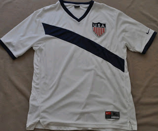
What works against this being true? Well, for one, who is Joe Davis? Two, these are VERY plain. We here at the Intergalactic Airship of Sports Logos and Uniforms are all fans of simple, clean uniform designs, but the white-haired guys who claim they run consumer testing don’t seem to be. At all. SO these are almost too plain to be believed.
The stripe isn’t outlined (NOTE: unless this low quality photo is hiding a super-thin pinstripe, or a lighter-blue outline, which some of the ghosting and JPG-artifacts seem to suggest to some eyes,) neither shirts have a texture or watermark, and the blue doesn’t even have a ghost of a sash. (Again, that we can identify for this one pic.)

But the big design interest of this whole potential”leak” is that crest. Announced and ALWAYS referred to as the “Centennial crest” by US Soccer, we all assumed it would retire with the 100-year anniversary jerseys. Many hoped it would return, or even become the US’s official crest. Seeing it here on what could be the World Cup jersey would certainly elevate it beyond a qualifying-round, anniversary edition.
We dare say, if these are legit, and this crest is used, it goes a GIGANTIC WAY towards thinking the crest may become officially permanent, if not the primary.
What do you think? Are these real? Do you love this crest? Or is the “shooting ball” logo one the US should keep?

