Earlier this summer, St. John’s signed a six-year sponsorship deal with Under Armour. The lucrative deal also came with a leak of what could have been the new road uniform for the Red Storm. Despite having a new supplier, the leak didn’t look that much different from what they wore in their final season as a Nike school, and it didn’t look like Under Armour had put their imprint on the new uniforms.
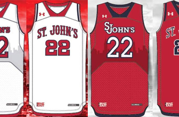
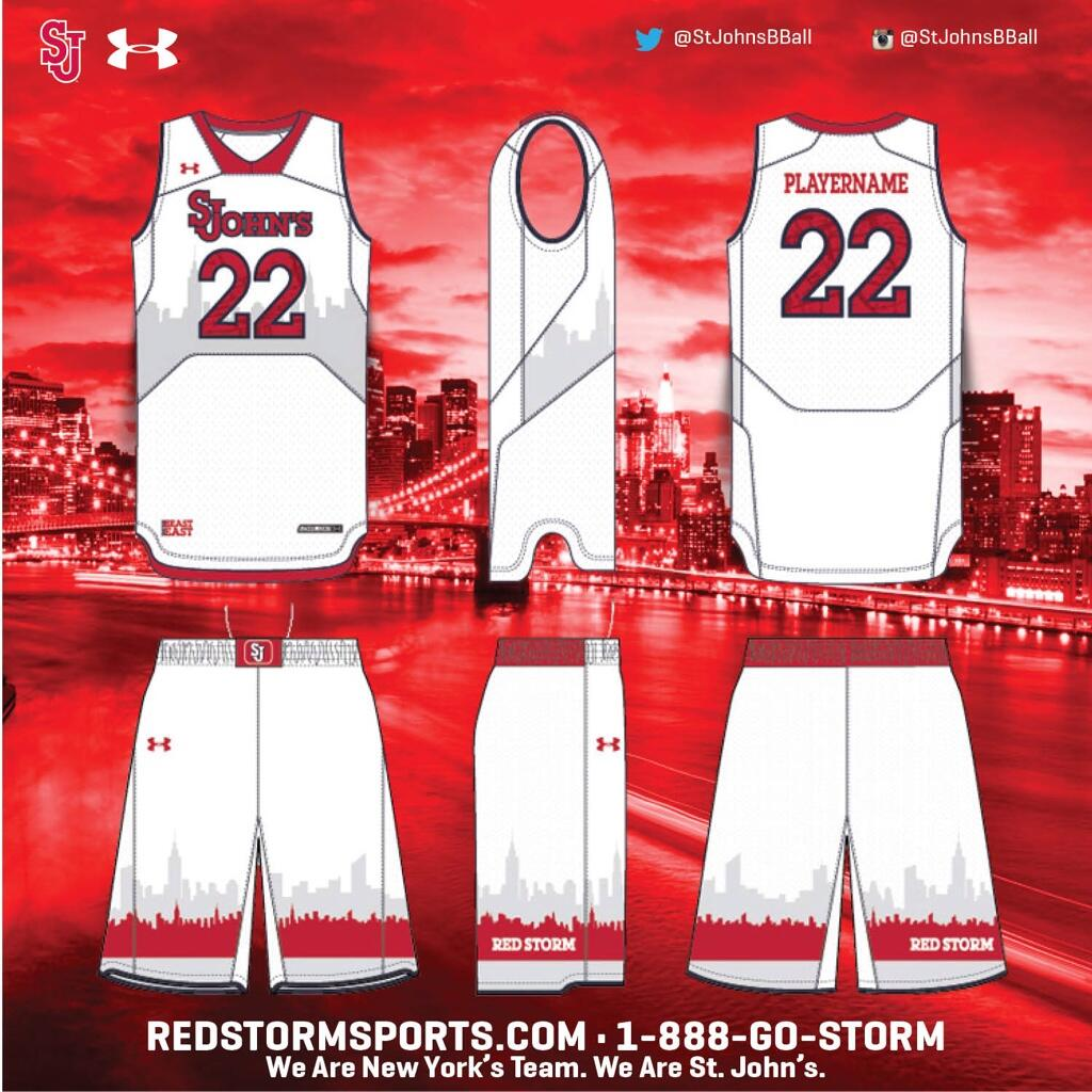
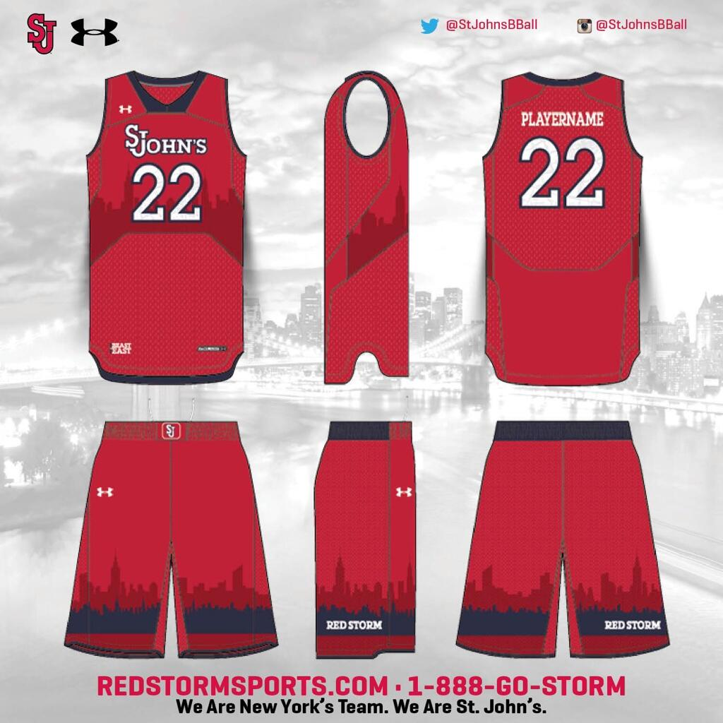
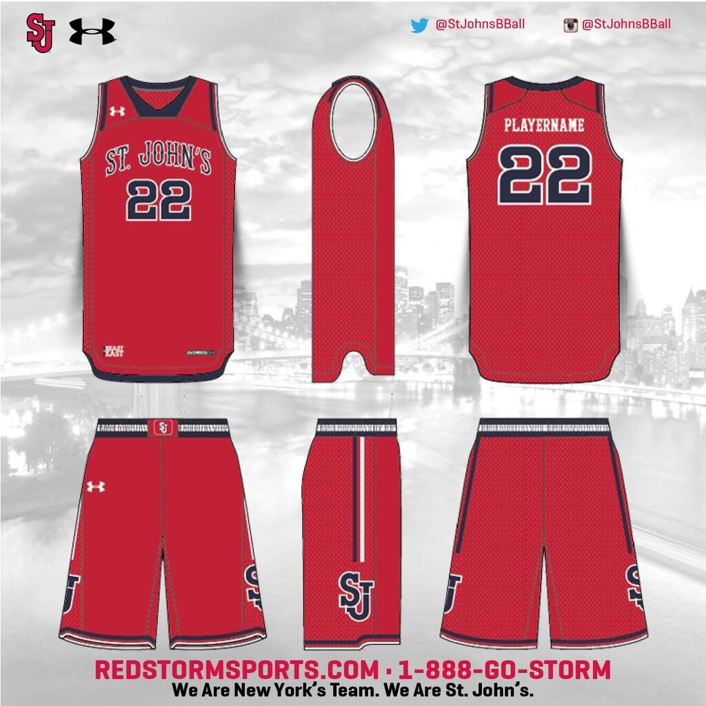
Fast forward to September, and things have changed radically as the Red Storm have released 4 uniforms (via Head Coach Steve Lavin’s twitter account): A home-&-road set for conference games and another set for non-conference games. The non-conference uniforms, pictured below, are an expectedly modern look from Under Armour, with the standard St. John’s wordmark across the crest, same number font, and an interesting sublimation of the New York City skyline across the chest and bottom part of the shorts.
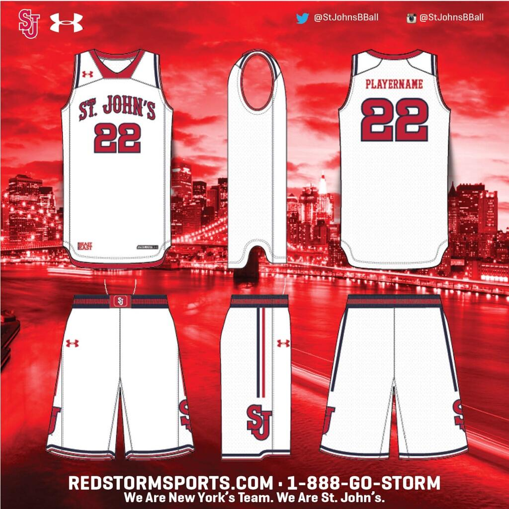
The uniforms for St. John’s Big East affairs will have a bit of a throwback feel to them, as the Red Storm have brought back an old wordmark and number font from the days of Mark Jackson. It’s a modern take on a retro look, and one that figures to be one of the better looks in the Big East this season.
Overall, the decision to go to 2 sets of uniforms was a very progressive idea, and one that, at least on paper, seems to have been executed pretty well. The final verdict should come when the uniforms are seen on the court, but right now it looks nothing like some of the disasters that we’ve seen in college sports lately. But, what’s your opinion? Do you agree that it’s a good look, or do you think that this should be included with the aforementioned disasters? Be sure to let us know in the comments section!

