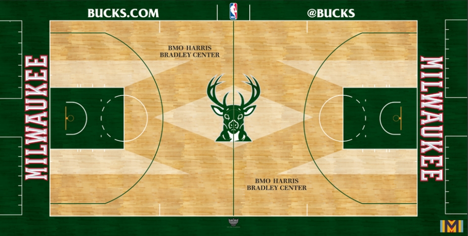
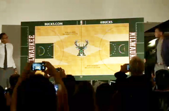
The Milwaukee Bucks recently unveiled a new court design, and while the painted areas are standard and run-of-the-mill for a basketball court, there are certain areas of the court that have received a different stain from the rest. The Buck logo at midcourt is right in the middle of a horizontally-shaped diamond, with 4 other polygons appearing almost as extensions of the key. It’s definitely a unique design in the league, but for Milwaukee basketball fans who have been around since the heydays of Sidney Moncrief &Paul Pressey, this is a familiar sight.


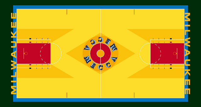
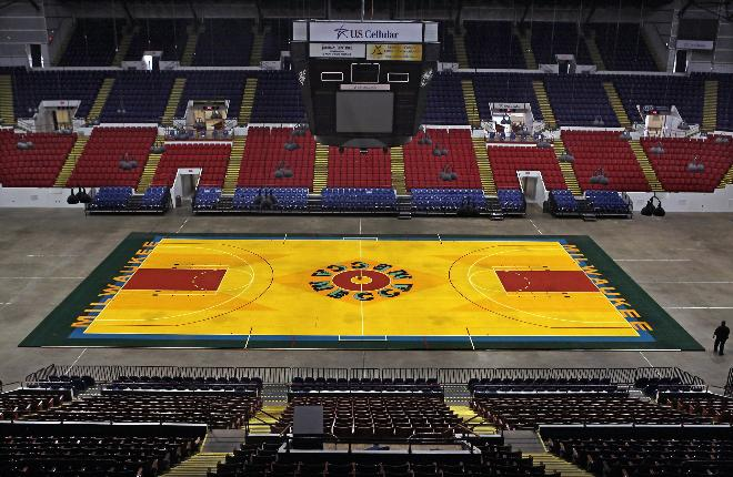
From the 1976-77 season until the Bucks left for what is now known as the BMO Harris Bradley Center in 1988, the Milwaukee Bucks played on the most unique court in all of basketball. With its garishly bright floor, lavishly stained wood designs, and baselines that were inexplicably splashed with blue (which was completely out of place with the Bucks’ colors of green & red), the old floor at the MECCA Arena was the epitome of 1970s style in that it was loud, obnoxious, and undeniably funky. It was also a contemporary piece for the state of pop art in the 70s, as it was designed by Robert Indiana (famous for those “LOVE” sculptures that have dotted various cities across the midwest and eastern seaboard). The court even made a return for 1 night only late last month, in an effort to foreshadow the return of Mr. Indiana’s signature court design.

Indeed, the spirit of the old MECCA court is back, but this time it has come in a much restrained form (Thankfully, there is no random outline of blue along the baselines). Although it is nothing like the wild and outlandish courts that dotted the NBA back in the late 90s, this court is sure to stand out in the rest of the league. For the seasoned, die-hard Bucks fans out there, it’ll be a welcome sight that is sure to bring back a bit of nostalgia for the days of old.
What’s your take on the new court? Love it? Hate it? As always, be sure to drop a comment or two below so we can hear your opinion on it!


