Just a few hours after the 2013 regular season comes to a close, we have our first leak for the 2014 Major League Baseball season.
When MLB ballclubs take to the field for Spring Training next February all 30 teams will have a new “batting practice” jersey, it happens every three seasons — so, that much we already knew. But thanks to a posting on ESPN’s Uniwatch we now have photos of all of the new uniforms.
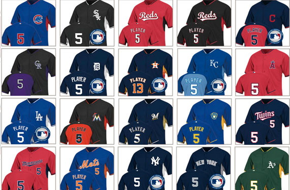
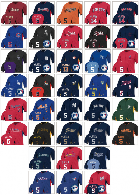
And here they are, all 30 teams BP uniforms for 2014… you can click the image to see a larger version:
So, before we get on with the “split coloured” jerseys mentioned in the headline, a look at the differences between the standard BP jersey design of 2011-13 and the new crop beginning in 2014:
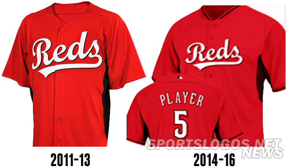
As expected they all follow the 2013 All-Star Game BP jersey template. Full button-up with a single stripe around the collar and alternate coloured patches in the underarm area. The alternate colour under the arm will only stay in the general vicinity of the armpit; most teams had the colour continue down the side to the waist in the 2011-13 version.
While we figured some teams would break out of the mould and try something new, what we didn’t expect was just how crazy things would get.
For lack of a better term… “Split-Coloured Jerseys”. Seven of them: Atlanta, Cleveland, Colorado, Kansas City, Miami, Tampa Bay, and Washington. The front is one colour, back of the jersey is another. Eh.
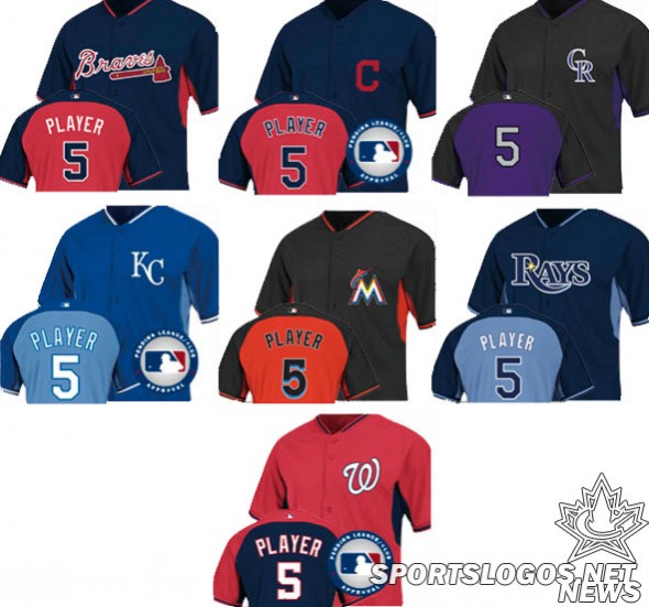
Front-back “split-coloured jerseys” have come (and gone, thankfully) in the NBA, the Toronto Raptors and the NBA All-Star Teams have used them in the past. The NHL is seeing their first take the ice this season when the Buffalo Sabres wear a jersey yellow on the front and blue on the back. This is a first for Major League Baseball.
Other points worth mentioning…
Firstly, ten of these designs have a graphic overlaid on them cautioning that they’re still pending league/club approval. So, take that into consideration when looking at these leaked designs.
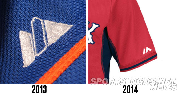
We see a new Majestic logo on the sleeve of one jersey, presumably we’ll see this throughout the league next year. A comparison of the old and new:
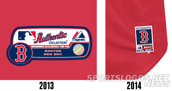
There’s also a new style “jock tag” on the bottom front of each jersey, another comparison for you:
Chief Wahoo is missing from the Cleveland Indians BP jersey altogether, the Wahoo logo appeared on the sleeve of the 2011-13 design. However, the Indians are one of the 10 teams with the pending approval stamp. So, there’s that.
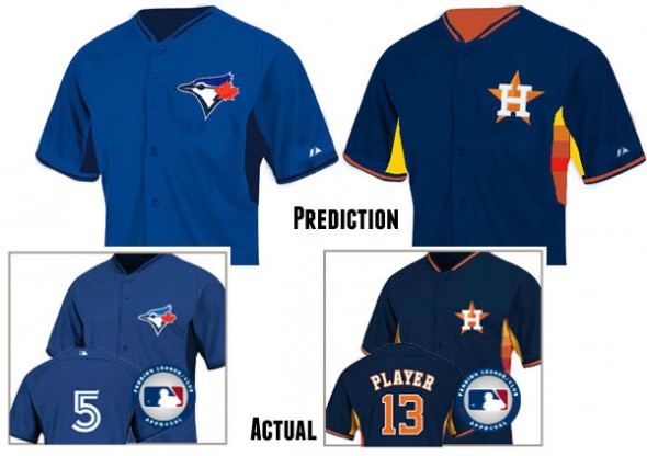
Houston is bringing back the best BP jersey design element in the league, the rainbow sides. Like the rest of the league, it’s limited to just the underarm area.
The Milwaukee Brewers have a retro version of their BP uniform, likely to be worn on throwback nights (the first Friday home game of each month)
Six teams will have a home and road version of the jersey – Boston, Cincinnati, Minnesota, NY Yankees, and San Diego. This means Philadelphia is finally retiring their blue away BP jersey.
Ten teams will be going without a player name on the back of the jersey: Baltimore, Chicago Cubs & White Sox, Colorado, LA Angels, Minnesota, NY Yankees, Oakland, Texas, and Toronto
Minnesota is using a red BP jersey for road games with their standard road jersey “Minnesota” script across the front in blue.
Pittsburgh is going black script on black — with yellow outlines. The Pirates are one of three teams who I’ve been hearing might change their logo in 2014, hopefully this black on black isn’t a sign of things to come. The other teams I’ve heard rumours about are the Chicago Cubs and the Seattle Mariners, who both appear to be doing nothing at all if these leaks are any indication.
I couldn’t end this article with pointing out that our (frankly, not too bold) prediction on what the Blue Jays and Astros would end up using from our article in July was spot on… well done, pat on the back:
Typically the new jersey designs are not unveiled until December/January, we’ll be sure to see if any changes were made between now and then with those “pending approval” teams.

