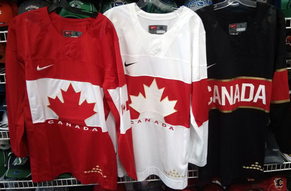
Tomorrow afternoon, the Canadian Olympic Committee will be unveiling the new hockey jerseys their Olympic mens, women’s, and Paralympic sledge teams will be wearing this coming February.
We’ve all seen the leaked photo already which shows the front of three jerseys, but now in a SportsLogos.Net exclusive, we have obtained a plethora of photos of the new set giving us information of some elements we had yet to see with the earlier leaked photos, however…
Unfortunately, part of the agreement to receive these photos were that I could not, in any way, share them with the public prior to the unveiling. I apologize for this, I really would like to share them but I must abide by the deal I struck.
They didn’t say anything about describing them in as much detail as possible though. Let me break this down bit-by-bit using the already leaked photograph as a reference point for you:
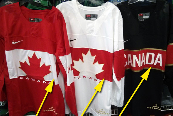
What we already knew:
Like the Montreal Canadiens, there’s a horizontal chest stripe on all three jerseys
What we didn’t know:
Unlike the Canadiens, the chest stripe stops at the sides. It does NOT continue to the back of the jersey. This is good news, nothing makes a jersey look more cluttered than having players numbers placed over several different jersey colours. Should allow for a nice clean look on the back.
—
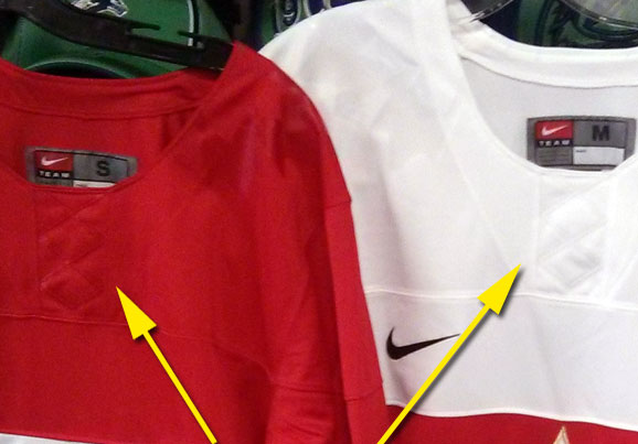
What we already knew:
There’s a faux lace-like design coming down from the collar, screen printed in the same colour as the jersey
What we didn’t know:
There’s actually stitching in them there “laces”, a single row that goes down the center of the fake-lace pattern. This single stitch makes the fake-lace design look, well, not good, but it’s still better than if it were just the screen print and nothing more.
I will say that on a close-up look the material used for the fake lace pattern has a very “cheap” appearance. This one element is just overall disappointing and would have been much better as actual laces.
—
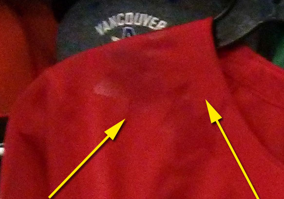
What we already knew:
Something else is screen printed on the shoulders of each jersey, probably maple leaves
What we didn’t know:
They are indeed maple leaves, two of them, a large and a small. The larger of the two is screen printed but has the bottom of it removed to create the smaller leaf from nothing but the jersey base material. It reminds me a lot of the early 1990s Team Canada logo, but without the motion lines and centred.
Like the “laces”, this material also isn’t too attractive on a closer look. I honestly keep getting the urge to reach through the screen and peel it off like those LCD screen protectors that come on new electronics.
—
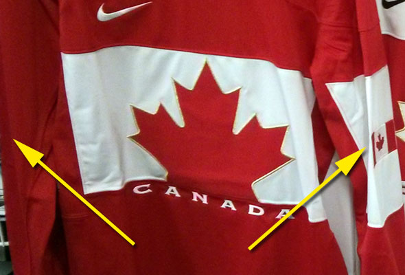
What we already knew:
There are sleeves on these jerseys.
What we didn’t know:
What’s on those sleeves.
The red and white jerseys both have a contrasting horizontal stripe on left sleeve and no stripe on the right. Within that horizontal stripe on the left sleeve is a Canadian flag (that much we knew), on the right sleeve at the same level as the flag is a Canada Olympic logo patch sewn onto the jersey (news to us!).
The black alternate jersey has a slightly different sleeve design, instead of a Canadian flag within the contrasting red and gold stripe there is a large gold maple leaf patch in the exact same style that is on the front of the red and white jerseys.
—
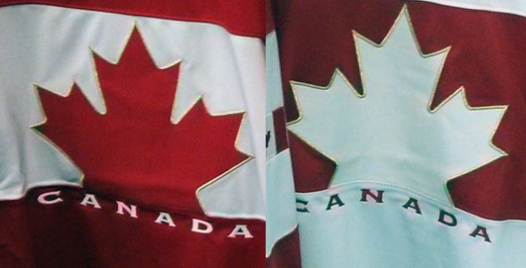
What we already knew:
Due to regulations put in by the IOC, the familiar Team Canada hockey logo is not on these jerseys.
What we didn’t know:
The familiar Team Canada hockey logo *IS* on these jerseys. It’s sewn onto the back of the jersey near the waist next to an equally tiny IIHF logo patch. Rejoice!
—
The rest of the information I have based purely on how the design elements are applied to the jersey…
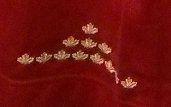
The 12 golden maple leaves, the “CANADA” script on the black alternate jersey, the smaller “CANADA” scripts below the maple leaf on the red and white jerseys, the Nike swoosh, the Canadian flag, IIHF, Team Canada logos are all sewn onto the jersey. The gold trim on the leaf on the red and whites are also sewn into the jersey, the red and white stripes are sewn in as separate jersey panels.
Along the red horizontal stripe on the black alternate jersey is a gold trim, unlike everything else mentioned in the paragraph above this gold trim is not sewn into the jersey. It is applied in a similar fashion as the leaves on the shoulders or the faux-lace up collar.
I hope this information whets your appetite until the big unveil tomorrow — if you’re still looking for surprises, well, we haven’t seen the name and numbering style yet, or the helmet/pants/sock combo that goes with it.
If you have any questions about the jersey which we didn’t cover here, feel free to ask, chances are I can give you information on it, just can’t share the photos yet.

