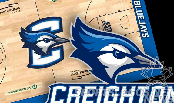
 To prepare for their big move from the Missouri Valley Conference to the Big East, Creighton has announced a new Bluejays logo, wordmark, and basketball court design. Toronto baseball fans may end up jealous when they see this beautifully rendered design.
Mongoose Graphics designer Craig Whitlock was responsible for the design, working with a reported 100 person committee. We doubt all 100 gave their input at every stage, or else this logo was started in 1814. We imagine this was more of a “everyone had to like it” type of thing. And seeing the results, we don’t think there was very much “group-think design” going on here. Its a beauty.
The basketball court was redesigned and was unveiled at an even last night. Player practiced and fans cheered, in their new logo-adorned T-shirts.

So, how do you like the new logo? Are you Toronto Blue Jays baseball fans jealous? Or do you feel this logo was “over-inspired” by your own? Do you hate the new look? Connecticut fans, is their C too close to yours?

