Earlier this week, we covered Germany’s unveiling of their progressive-looking kits for World Cup 2014. Today, adidas officially unveiled 7 kits on their twitter account, and we’ve got details for all of those kits.
Argentina
Basically your run-of-the-mill Argentina kit, here. Nothing too flashy or deviant from the norm when it comes to La Albiceleste, as the Argentines will continue to run out in their iconic look of white with sky blue stripes. The crest has been slightly updated, although there isn’t too much of a difference between the new one and the old one. The big difference here is that Argentina will apparently have white shorts as a first choice.
Like Germany, this is a departure from their normal look of black (or navy blue) shorts, but unlike the Germans, the Argentines have worn white shorts a bit more often in their storied history (mostly against Brazil). Either way, it’s a very classy look for the Argentines, and their fans should be happy with the look come next Summer.
Colombia
Colombia have returned to the World Cup Finals for the first time since the ’90s (which were the glory days of eccentric stars such as Rene Higuita & Carlos Valderrama), and they will be doing so with a slightly altered look.
Normally Colombia runs out in yellow shirts, navy shorts, and red socks (alluding to the order of colors on their flag) and have done so for most of their history unless forced to change. The new look comes in the form of white shorts and white socks, with navy & red reduced to trim colors throughout the rest of the kit. It’s definitely a new look for Los Cafeteros, but one that their fans will come to adore should they make the grandest return to the World Cup by winning it.
Germany
We went into further detail here, but for those who missed the major points:
-> 3 shades of red on chest represent 3 World Cups that (West) Germany has won
-> No black shorts, huge departure from tradition
Japan
At first glance, it seems like a typical Japan kit: Mostly blue (which the men’s national team considers a lucky color ever since a famous win at the 1936 Olympics) with red accents (the shade of red being very bright, almost pink). There’s also a sublimated design of sun streaks centered from the crest on the chest, alluding to the Rising Sun flag design that has been present in Japan’s long history.
This design could cause a little bit of controversy should Japan run into South Korea in the knockout rounds (since the Rising Sun is considered offensive in Korea), adding a bit more fuel to an already heated rivalry. Other than that, there are no big surprises for Japan here, and it continues a bit of a monochrome trend for adidas.
Mexico
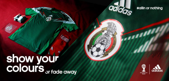
El Tri have actually been wearing this kit since the tail end of World Cup Qualifying (possibly because at one point there was a very good chance that they would have been eliminated from the World Cup in embarrassing fashion at the qualifying stage), so this unveiling is a bit more formal than it is breaking news. Since that’s the case, we actually have action shots to show you, here.
They also show the Mexicans in great spirits because there is no way that they are going to fail to make it to Brazil after the thrashing they gave to New Zealand. As far as the kit is concerned, it’s a very interesting take on a traditional look for the Mexicans: The kit still consists of green shirts, white shorts, and red socks, but it’s accented with vibrant, jagged stripes on the shirts and socks and the crest is now positioned in the middle of the shirt.
It’s modern, but it works for El Tri as they head into what should be a very interesting trip to Brazil.
Russia
Unlike the Mexican team who have actually worn the kit on the pitch or the other teams who have at least modelled their kits, the Russians have done neither of this, so this is actually the first official unveiling of what the Russian National Team will be wearing next Summer. It’s a return to the dark-red, nearly maroon look with gold accents that the Russians wore for World Cup 2010. Once again, the entire kit is the same color, but this is a normal look for the Russians so there isn’t much of a deviation here. The big difference here is that the Russian flag bookends the obligatory adidas shoulder stripes, adding a nice patriotic touch to a very classy kit.
Spain
The reigning World Champions may have given us a hint as to what their primary look for 2014 would be when they took to the pitch in an all-red look for their match against France at the 2013 Confederations Cup. If you liked that look, then you’ll probably be a fan of this look as La Furia Roja are going to look muy Roja for the World Cup.
Like fellow soccer bluebloods Argentina & Germany, they’ve discarded their darker shade of shorts for a monochrome look. However, the gold accents & striping seem to be very fitting for a team that has won nearly every major competition that they have entered since Euro 2008.
Overall, adidas have managed to leave most of their wacky & nonsensical looks in the previous decade and have managed to find a happy medium between modern & classy. That’s just our opinion, though. What’s yours? As usual, let us know how you feel about all these kits in the comment section!


