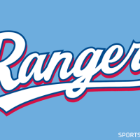
While baseball fans watched as the Texas Rangers introduced their most recent off-season addition today, eagled-eyed readers of SportsLogos.Net were busy contacting us as they noticed the newest Ranger was wearing a new jersey design for the team.
Black is out, the “bevelling” is out.
Additional white outlines and clean wordmarks are in.
All four of the Texas Rangers uniforms — the home whites, road greys, and the two alternates (blue, and red) received a cleaning up today. The black drop shadow which had been present on the home and road wordmarks since 2001 are both gone in favour of a simple additional trim. Both these wordmarks will now be trimmed in white and red.
The alternate uniform wordmarks, both of which did not have black in them in 2013, had their grey in-letter bevelling removed as well as an additional layer of trim. The result is a much more clean “TEXAS” wordmark which really pops a lot more off of the jerseys than before.
On the backs of the jerseys the player name and number have received the same updates as the front. No black, additional trim:
A side-by-side photographic comparison of all of the 2013 jerseys and the new 2014 below:
A very simple but terrific update by the Texas Rangers.


