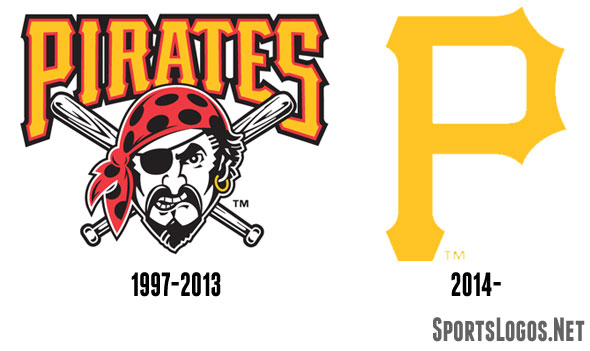
According to several very reliable sources of ours, the Pittsburgh Pirates will be announcing shortly that they will be dropping their primary logo – which they had used since 1997 – in favour of the yellow ‘P’ logo which has been on the front of their caps for as long as any of us has reading this has been watching baseball.
The Pirates hinted that a primary logo change would be coming for 2014 quite early in the 2013 season, saying at the time that they wanted to place a heavier emphasis on their cap logo. No heavier emphasis possible than just the cap logo and nothing more. Note that the apparent new primary logo is just the plain yellow “P” logo, no black outline, no circle, just the P on its own.

While the primary logo that they’re replacing, the pirate head wearing a bandana under the “PIRATES” script is going away, the pirate head/bandana without the script will stick around as an alternate logo and stay on their uniform sleeves.
The Pirates have worn a yellow (or black on yellow) “P” logo on their caps every single season since 1948, that’s over 65 years, but as far as we can tell (and, to be honest, baseball primary logo research in this era is tricky), the team hasn’t used a “P” as their primary logo since the 1930s. In 2010 the Pirates added a secondary logo featuring the yellow “P” logo on a black and white roundel, they had also eliminated nearly all traces of red in their branding following the 2008 season.

Once this change is officially announced, the Pittsburgh Pirates will be the fourth Major League Baseball team in the last ten years to swap out their primary logo for (a version of) their cap logo joining the Arizona Diamondbacks in 2012, Detroit Tigers in 2006, and the Los Angeles Angels of Anaheim in 2005.


