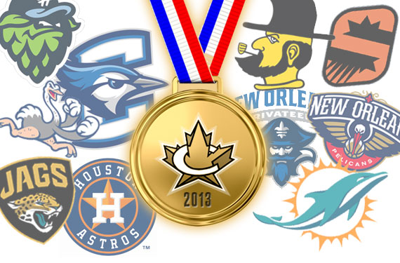
Another year over, a new one about to begin; 2013 was the most successful year to date in the history of SportsLogos.Net, our 16th year bringing you the latest in news and rumours from the world of sports logos and uniforms.
Over the past twelve months we’ve seen hundreds of new sports logos make their debut, people often say “there’s no such thing as a good logo anymore”, to that I say… “poppycock”. There’s plenty of good logos still being produced, we may be in the golden age of sports logo design… now uniforms, well, that’s another story, but the new logos are solid. And here we’re going to show you the best (as well as some of the worst) from the past year.
The ratings you see below were tabulated by readers of SportsLogos.Net via the “Rate This Logo” feature available on every single logo page within our comprehensive database. To be eligible for inclusion in our 2013 Logos of the Year list a logo had to have made it’s in-game début during the 2013 calendar year — this means a logo unveiled in the Fall of 2012, but not used in a game until 2013 is eligible (Houston Astros or Buffalo Bisons for example). A logo unveiled within the last two months but not meant for use until 2014 (like the Charlotte Hornets or El Paso Chihuahuas) will be eligible in 2014. Logos required a minimum of 35 votes to be included in the list. In the instances where several logos from a single re-brand were ranked high only the top performing logo from the set was ranked with the others noted in the paragraph below it.
So enough of the pre-amble, here they are folks! These are the logos you, the users of SportsLogos.Net, rated as the best and worst new logos from 2013.
We’ll start with the very best:
2013 BEST NEW SPORTS LOGOS OF THE YEAR
First Place
 GOLD: Creighton Bluejays (NCAA) Primary Logo User Score: 8.83/10
Congratulations to the Creighton Bluejays and the designers at Mongoose Graphics for taking home the SportsLogos.Net Award for the Best New Sports Logo of the Year in 2013!
This is the second year in a row in which the users have picked a blue jay brand as the best of the year as the Toronto Blue Jays and their new identity took home top prize in 2012. This is a perfect example of a logo that’s designed so well that you actually want to own merchandise despite not being a fan of the team, I know I certainly do… I want that logo on something I own right now.
The entire new logo set of the Creighton Bluejays ranked very high with our readers with one alternate scoring an 8.7/10 and another at 7.6/10. Just an all-around, high-quality set, kudos to all of those involved in the rebranding process.
***
Second Place
SILVER: New Orleans Pelicans (NBA) Alternate Logo User Score: 8.28/10
When the New Orleans Hornets announced they’d be rebranding as the New Orleans Pelicans for 2013/14, the new name was met with ridicule by many (certainly not us, we were always big fans of the Pelicans name); the scorn for the new name was quickly forgotten when the Hornets unveiled their absolutely fantastic new Pelicans logos back in January.
Like the Bluejays, other Pelicans logos were also rated quite high; their primary logo scored a 7.8/10 while another alternate (the “Bird-de-lis”) came in at 7.6/10. Congratulations to the New Orleans Pelicans and the design team at RARE for finishing second in the SportsLogos.Net Best New Logo Awards for 2013.
***
Third Place
BRONZE: Minnesota Vikings (NFL) Primary Logo User Score: 7.99/10
Missed by many, the Minnesota Vikings made changes to and cleaned up their logo heading into the 2013 season, the lines on the face and in the hair were simplified and presented in a style more closely to modern logo designs. The most obvious change was made to the details in the horns on the viking’s helmet. A detailed analysis showing all the changes from the 2012 logo to the 2013 logo can be found in our post about the new logo when it was originally unveiled back in February.
***
HONOURABLE MENTIONS
4th Place – 2013 Stanley Cup Playoffs (NHL) Primary Logo: 7.93/10
5th Place – Calgary Flames (NHL) Alternate Logo: 7.91/10
6th Place – Dallas Stars (NHL) Alternate Logo: 7.90/10
Three NHL logos take home the 4th through 6th spots on our best new logos of the year list. The slightly re-done Stanley Cup Playoffs logo was created by the incredibly talented guys at Torch Creative who also created the NHL Stadium Series logos. The 2013 playoffs logo removed blue from the colour scheme which had been used in the logos of 2008-2012 leaving only black and silver: the colours of the NHL shield and the colours of the Stanley Cup.
Calgary’s brilliant new alternate jersey shoulder patch, unveiled just last month, shows a typical Alberta landscape (wheat, mountains, sunrise) combined with the team initials “CF”. While I’m not much of a fan of the actual alternate uniform, I love what they’ve done with this logo, it’s the perfect hockey jersey shoulder patch.
The complete re-brand of the Dallas Stars didn’t get a lot of praise amongst hockey fans but there was plenty of love for that State of Texas logo which the Stars are unfortunately only wearing on the pants of their new uniforms. Maybe after they see the love for it we can get them to put it on a new alternate jersey one day.
7th Place – New York Yankees (AL) Event Logo: 7.86/10
8th Place – St. John’s IceCaps (AHL) Alternate Logo: 7.81/10
9th Place – Hillsboro Hops (NWL) Primary Logo: 7.65/10
10th Place – New Orleans Privateers (NCAA) Primary Logo: 7.60/10
Coming in at number 7 was a farewell patch worn by the New York Yankees during their final homestand of the 2013 season to say goodbye to longtime closer, likely the best of all-time, Mariano Rivera. The Yankees wore this patch, showing Rivera wearing his familiar #42 (the last player to ever wear the number) in Yankee pinstripes as he exits the bullpen to enter a game cementing that image into our heads forevermore.
The logo featured on the chest of the St. John’s IceCaps new third uniforms was ranked 8th, the logo features local landmark Cabot Tower as well as a glacier incorporating a map of the province of Newfoundland and Labrador. The logo was created by IceCaps fan and local artist Troy Birmingham who sent in his design to the team as a shot in the dark. Don’t give up on those dreams guys, it worked out for Troy.
In 9th spot it’s the primary logo of the Hillsboro Hops, a unique and all-around enjoyable identity conjured up by the guys at Studio Simon. The logo features a hop cone, paying tribute to their home state of Oregon being one of the world leaders in producing the hope, a key ingredient in beer. We called it the “next great Minor League logo” at the time of it’s unveiling in October of 2012, our opinion remains the same.
Rounding out the top ten is Joe Bosack & Co.’s new primary mark for the University of New Orleans Privateers. The new mark “strongly ties into the city and the popular fleur-de-lis, while also removing the colour red”. It’s certainly an upgrade over their previous logo which made no connection to the bevy of local imagery a home city of New Orleans has to offer to a graphic designer.
Alright, we’re gonna go in the complete opposite direction now… from the best of the best here’s what you guys picked as the worst of the worst in 2013.
2013 WORST NEW SPORTS LOGOS OF THE YEAR
Worst Logo
GOLD: Appalachian State Mountaineers (NCAA) Alternate Logo User Score: 3.36/10
I kinda feel bad for Appalachian State. They did what you’d hope any other school or team would do. They asked their fans what they wanted their new logo to be, their fans made it quite clear they wanted what you see above.
While the students of the Boone, NC based university may be satisfied with the use of the “Victory Yousef” logo, design fans were not. Not even close. Which begs an important question, do you just do what your fans want to make them happy or do you try and put out a good design to look good and hope the fans embrace what they didn’t ask for? Regardless of their intentions the readers of site have spoken out and, by far, have chosen the Mountaineers new alternate logo as the worst new logo for 2013.
***
Second Worst
SILVER: American Athletics Conference (NCAA) Primary Logo User Score: 3.76/10
Remember the Big East Conference? Well, this is what the Big East Conference turned into.
Known informally as “The American”, the American Athletics Conference was born out of the former Big East in July of this year introducing the logo you see above along with it. “We believe this bold mark and our series of ancillary marks will support our conference name and the values that our name represents, in addition, our partners at ESPN and CBS agree that its strength, simplicity and elegance will resonate well on TV.” said league commissioner Mike Aresco at the time. So there ya go, ESPN and CBS thinks it’ll look good on TV, therefore it is. Everyone else seems to disagree though.
***
Third Worst
BRONZE-TO-BLACK MEDAL: Jacksonville Jaguars (NFL) Helmet Logo User Score: 4.06/10
I mean, often there’s a reason something hasn’t been tried in the 90+ year history of the game. Right?
The Jacksonville Jaguars and Nike were thinking outside of the box, you can’t fault them for that, but the black-to-gold kinda-gradient-but-too-abrupt-of-a-transition-to-really-be-considered-a-gradient design they ended up with did not work. They should have caught the horribleness of this before it ever hit the stage of a new uniform unveiling. They wanted to replicate the idea of a golden jaguar lurking in the dark shadows before striking it’s prey, that’s not a bad concept, but it didn’t work. Like a bad relationship, when you there’s something you want to work so desperately but it’s just not working out you gotta know when to pack it in and come up with something new.
The rest of your new logo and uniform set is fine Jacksonville, but this just didn’t work. Try again.
***
DISHONOURABLE MENTIONS
4th-to-Last – Super Bowl XLVII (NFL) Primary Logo: 4.07/10
5th-to-Last – Scranton/Wilkes-Barre RailRiders (IL) Alternate/Cap Logo: 4.10/10
6th-to-Last – Reading Fightin’ Phils (EL) Primary Logo: 4.30/10
Moving up from second worst in 2012, it’s the Super Bowl’s latest in a series of standardized logos coming in 4th worst in 2013. While the design itself isn’t bad, clearly logo fans are not on board the “use the same basic design every year” train the NFL is running through town with. One positive note? While in 2012 the XLVI logo scored a 3.35, in 2013 the XLVII version jumped up to a 4.07. Progress!
Sticking with logos which really don’t deserve to be ranked so low – the S/WB RailRiders and Reading Fightin’ Phils. The two Minor League Baseball identity overhauls were both risky moves by ownerships with fan bases which craved something traditional. Scranton/Wilkes-Barre fans wanted a return to their “Red Barons” days while the folks of Reading, Pa. had been cheering on their Reading Phillies since the LBJ administration.
Methinks what we have here in spots 4 through 6 is more of a case of a low user score based on those upset about not getting the identity they wanted rather than the actual quality of the identity they received.
7th-to-Last – Bloomington Thunder (SPHL) Primary Logo: 4.31/10
8th-to-Last – Phoenix Suns (NBA) Alternate Logo: 4.57/10
9th-to-Last – St. Charles Chill (CeHL) Primary Logo: 4.69/10
10th-to-Last – Hudson Valley Renegades (NYPL) Primary Logo: 4.71/10
Finishing seventh-to-last is the Bloomington Thunder of the Southern Professional Hockey League, a team who had to give up a fairly solid logo and uniform set while known as the Bloomington Blaze due to an apparent trademark dispute (I can’t confirm this) upon switching from the Central Hockey League to the SPHL. This may have resulted in a hurried rebranding and the mess you see above. You’ve got all the time in the world now Bloomington, let’s re-do this thing properly.
I was surprised to see the Phoenix Suns’ new orange-and-black alternate logo ranked so low but it goes to show you just how much Suns fans wanted purple in the new set. The Suns had used purple since their very first season and chose to remove it from all branding save for the new road uniform… which is entirely purple. No surprise then that while this alternate logo was rated a pretty low 4.5 out of 10, their new all-purple roads scored an impressive 7.0 out of 10 and their new alternate logo, which also includes purple, finished 11th overall with a superb 7.44. Purple reigns.
The final two spots in the worst new logo category both belong to minor league teams. The Central Hockey League’s expansion St. Charles Chill came in 9th with their ice-cube styled wordmark while the Tampa Bay Rays’ Single-A affiliate in Hudson Valley disappointed readers, coming in 10th last with their new look. Proving you can’t always go up when you already have a poor logo, the Renegades previous logo had scored a fairly low 5.3/10, but the new look took them even further back with a 4.7. Let’s try again.
While they didn’t quite crack the top 10, I had to dedicate a paragraph to one of my least favourite new logos of the year… coming in at #11:
It’s the newest member of the National Basketball League of Canada, the Brampton A’s, a team named after the fact the owner owns an athletic club (sounds like a nickname origin story from the 1890s, doesn’t it?). Owner James Tipping not only named the basketball team after his other business enterprise, he also just used the logo directly from his ACTS Athlete Institute… adding a maple leaf because, you know, how else would we know a team in the Canadian League was Canadian? The A’s attempt at turning a basketball team into a commercial netted them 11th in our worst logos of the year ratings with a score of 4.90 out of 10. Should’ve been one of the top 3, in my opinion.
So… you may be asking yourself, where’s the Miami Dolphins? The Houston Astros? Good question, the obvious answer is they’re neither in the top nor the bottom 10. Curious as to where your favourite new identity of 2013 placed? Well, here’s the top 90, rated top to bottom, scores out of ten to the right:
***
***
***
Congratulations to all the teams, leagues, their marketing departments, and the designers involved in creating the top new sports logos of 2013. We look forward to what’s in store for us in 2014, our 17th year covering the world of sports logos and uniforms.
Happy New Year, everyone!


