In the run-up to this summer’s 2014 World Cup in Brazil, most teams will be announcing new kits, some with logo tweaks, and many more with interesting alternates. Here, we get our first look at a new jersey and new logo treatment for the US National Soccer Team.
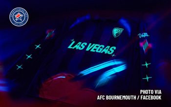
Thanks to http://todosobrecamisetas.blogspot.ca a source which we have historically found to be incredibly reliable, we see the white jerseys for the American side will be polo-style with a collar and placket. Based on the Nike logo and Badge placement, one imagines the number will be placed center-chest.
A closer look shows a small, tonal, horizontal stripe.
The collar and sleeve are ringed in a thin red single stripe. Quite a clean, simple, plain look for the Americans’ white jersey. This author hopes they are paired with navy shorts to avoid the all-too-common and terrible white-on-white look.
But the real “star” of this sneak peek is that crest.
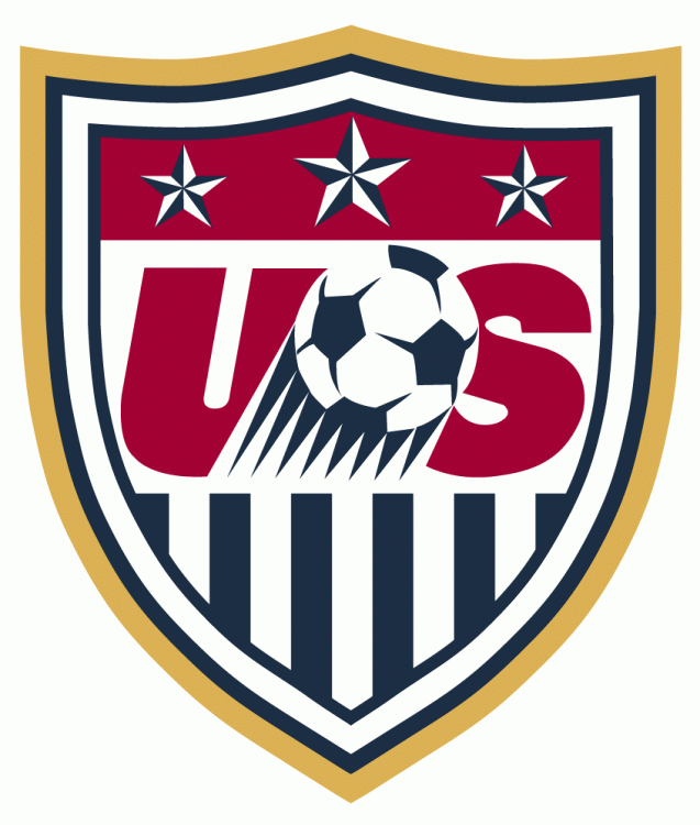
Oh boy, that crest. Apparently, the US Soccer Association joined most every American soccer fan and decided it was time to update their crest. Hooray! But their idea of an update was to cheapen the color of the blue, and to eliminate the tasteful ring of gold.
While the design screams “90’s clip-art” with the swooshy ball, the stripes and field of stars are color-inverted form our actual flag for some inexplicable reason, and the fans are in almost unanimous voice in clamoring for the Centenntial crest to be made the primary logo, they seem to have ignored all of that and “fixed” the one thing they actually had right; the color of the blue.
In the official specifications for the US Flag, the blue is called to be a darkish blue, often related to the Pantone Matching System color of 281. The resulting color is somewhere on the navy side of the spectrum, though a touch lighter to assure the color is not confused with black. In other words, exactly what the old logo used to have.

The new color is almost dead Royal. Perhaps a slight bit darker than royal, still the color is much lighter than it has been recently on US jerseys, and much lighter than the specification of the US flag dictate as the official color.

The millions of groans you hear are coming from US Soccer fans who have been looking for a crest redesign for years. Many designers have tried their hand at creating something better, even the US Soccer Development Academy has a better, arguably the best, logo for their teams.

The white jersey is crisp, and follows within the tradition of simple white jerseys for the US team. It does not include the sash, which had become a US hallmark of late, which will disappoint many.
What do you think of this jersey? Is this what you expect the US to look like? How do you feel about the crest change? Is royal the right blue? Do the Americans need a whole new crest?


