San Jose has a rich history as a soccer city, with the Earthquakes of the North American Soccer League starting in 1974 and the Clash of Major League Soccer in 1996, with the club adopting its original name of the Earthquakes in 2000.
That club would go on to win two MLS Championships, in 2001 and 2003, and a Supporters Shield in 2005. The owners of that club then moved the team to Houston and became known as the Houston Dynamo. For three long years San Jose had no MLS team, until Lew Wolff revived the franchise in 2008 along with Bay Area’s fans’ love and passion for soccer. The new club won its second Supporters Shield in 2012, and in 2014 celebrates its 40th Anniversary.
Along with that celebration came the unveiling last month, of a completely new identity for the team. The project, spearheaded by the Portland-based design agency Fiction, entailed more than creating a new logo. Successfully positioning the team as champions within a sports universe that includes both a young (U.S.) and long-standing (global) heritage would require a full examination of who the Earthquakes really are. We would need to translate that reality into the designs, words and concepts that embody the team’s history, its passions and its dreams for the future. And so it began..
The Process
One of the first steps we took to understanding the task at hand was to conduct a comprehensive survey of national and international soccer logos and sports team logos in general. We knew going in that the new identity system, once completed, would need to live in amongst, and stand out above, the existing landscape of competing identities. Whenever we engage in a project where we’re tasked to deliver a unique and authentic identity, we make sure to know first what will be required to be successful and truly unique and authentic to the client while at the same time what will be essential to work as part of an existing ecosystem. It’s somewhat akin to building a house in an established neighbourhood; the older the neighbourhood, the less you want to disrupt its overall aesthetic by building a modern monstrosity. Such a house might certainly stand out, but would anger the neighbours and be a target of ridicule
Once we had a clear picture of the national and international landscape we knew what we wanted in general terms: we knew we wanted a classic soccer logo, flat and undimensionalized, that acknowledged San Jose’s rich history and that somehow expressed the idea and energy of an earthquake. That was enough to give us a rough target to shoot for as we began the next phase, our deep-dive anthropological study of the club and its history.
We studied the club’s rich past, from what we could find of its days as part of the NASL to the Western Soccer Alliance (WSA), to its first Major League Soccer incarnation as the Clash, until finally the club adopted its original name of the Earthquakes in 2000. We poured over virtually every newspaper article the club had saved over its existence, including video and DVDs of its championship runs, but what was most instrumental in aiding our research of the earlier days was a scrapbook kept and maintained by a single fan that had nearly the entire NASL Earthquakes history captured within its faded pages.
This unknown fan had kept everything in chronological order inside an artist’s sketchbook, and it would never have been seen by us or the club had not the descendants of the fan bothered to gift the notebook to the current club as a token of curiosity and interest.
We had a solid understanding of where we wanted to go, and now we had a solid understanding of where the club came from. The next step was connecting the two and building a new, connected identity that would honour both.
The Quakes Code
Who are the San Jose Earthquakes? The quick and easy answer is, they’re San Jose’s MLS franchise, but like any living, breathing entity that is tied to a living, breathing community, the complete answer is much more complex. The club represents Bay Area soccer at its highest, most competitive level, but it’s also deeply ingrained within an extremely diverse community. The Bay Area is San Jose, San Francisco and Oakland; taken together, they are the most culturally and ethnically diverse community in the country, among the most highly educated and employed, and thanks to Silicon Valley have the highest per capita income in the country and is often considered the most innovative and forward thinking.
With such a deep understanding of the club and a broad understanding of the Bay Area to account for, we felt what was needed was a Quakes Code that codified and acknowledged the complexities of the community and the club’s relationship to it.
The final version of this code is made up of three main pillars: Unity, Devotion and Heritage. Unity expresses the close connection between the club and the community; Devotion expresses their shared love of the game and the club’s devotion to its fans; and Heritage honours the club’s rich history, which began in 1974, and expresses today’s pride in being part of this continuum. Armed with the pillars of what makes the San Jose Earthquakes tick, we proceeded to build a document that would tell the complete story of the Quakes up to and including the new identity.
The club’s motto – Forward As One – expresses the unity of the players, fans and community moving together toward a shared vision for the future.
The Quakes Brand Constitution
The more we researched, the more we uncovered a rich history vital to the identity of today’s San Jose Earthquakes. We soon realized that, just like our country’s own constitution helps ground this nation and guide us into the future, the Quakes as an organization would greatly benefit from its own brand constitution.
So the Quakes Brand Constitution began as a repository of information we found pertinent to the Earthquakes history and identity over the years. It would eventually house a timeline of the club’s history from 1974 to the present.
It would also include the Quakes Code, the new Quakes motto, and several voices from the club’s past, including first owner Milan Mandaric, first GM Peter Bridgwater, long-time Quakes superfan Krazy George, players like George Best, John Doyle, Eric Wynalda, Landon Donovan, Jeff Agoos, manager Frank Yallop, and current superstar Chris Wondolowski and club president Dave Kaval.
The Constitution also shows the club’s logo evolution through the years, with a section reserved for the new logo, identity system, uniforms, and club motto, along with a glossary of meaningful Quakes terms. As a comprehensive compendium of everything anyone would want or need to know of the club’s identity and place in the community, the Constitution would prove to be a very useful tool as we moved closer to the date of the big reveal on January 30th of 2014, in San Jose
The Design Process
To tackle the challenge of designing the new logo, we unleashed the full creative horsepower of our studio of over a dozen designers to concept a broad range of compositional possibilities.
One of the earliest challenges was how to visually communicate the idea of an earthquake. Unlike other team mascots that tend to be animals or even simple nouns like objects or forces of nature, an earthquake is the moving of tectonic plates against one another beneath the earth’s surface. We took that abstract idea and created a pattern, which we call the “impact pattern.”
This pattern was created to visually encapsulate the idea of energy and movement. It would prove invaluable as part of the team’s overall identity and could be used almost anywhere to evoke images of the team. It became incorporated into the final logo as part of the field in which the ball rests.
Through an iterative process of sharing our early explorations with the client and incorporating feedback on desired directions, we concepted literally thousands of logos and compositional possibilities to critique as a group throughout the design process. Over several months of explorations and refinement of our strongest directions, we finally landed on three executions the client and we agreed were the strongest potentials. These were submitted to Major League Soccer and adidas, their title and uniform sponsor, for approval. By then it became a matter of choosing which version would be our final.
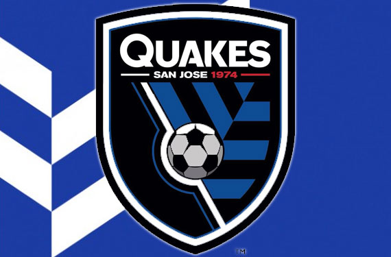
But in the end, we got to have our cake and eat it, too, by incorporating some of the strongest elements between the three finalists into a fourth, and ultimately winning, design. And we’re glad we took this last additional and unanticipated step, because the resultant logo is, we believe, far superior to any one of the three finalists. It accomplishes everything we sought out to achieve from the beginning; it captures the club’s rich heritage, embraces its devotion to the game and to its fans, and expresses a unity of club and community as it looks forward to the next 40 years.
Soccer Ball:
For 40 years, the Earthquakes primary badge has featured a soccer ball and our new identity also embraces this symbol of our devotion to the game. We are a soccer club and we are proud to express that through our logo. We are Devotion.
Axis:
The white and blue lines holding the ball connect us to our original logo from 1974 with the ball representing a globe. The ball is spinning in its axis and pushing us forward into a limitless future.
Shield:
The shield shape honours soccer tradition and heritage from around the world. We wanted a logo that showed our club’s strong connection to the world’s game. The three sides of the shield represent the three largest communities of the Bay Area: San Jose, San Francisco and Oakland.
San Jose 1974:
The San Jose Earthquakes were founded in 1974 and we fully embrace the club’s complete history, not just the MLS years. The Quakes of the North American Soccer League wore red jerseys and we pay homage to that era with our use of red for the 1974. We are San Jose’s first professional sports team. We are Heritage.
Quakes:
The use of the name Quakes in the primary logo demonstrates the strength of our soccer community. If you are part of the Earthquakes community, you often refer to the team as the Quakes. We are Unity.
Pattern:
The blue and black impact pattern is a representation of the shifting of the Earth’s tectonic plates and the energy created within our club on and off the pitch. The impact pattern also represents our community’s forward thinking and belief in creating positive change through innovation.
Visual Center
In addition to designing the new logo, we developed a comprehensive Visual Center that houses every element of the identity as a usable toolkit, from the unifying shield and wordmark to the impact pattern and every conceivable variation of element lockups, with ball, player, pattern and wordmarks. Everything that would ever require a version of the logo was anticipated, designed and included into the VC, so that the club would be ready to fulfill any conceivable requirement that called for their identity.
We also concepted and delivered multiple campaigns for community engagement and advertising, from grassroots guerilla campaigns at soccer camps across central California to full-blown TV advertising and out-of-home executions. And we designed and executed a whole host of club marketing requirements and deliverables, from VIP and partner packages to season ticket promos to postcards, all the way down to club letterhead and business cards. We even flexed our motion graphics muscles and created an animated sell-in video for the club to pitch the stadium’s title sponsorship. Currently, we are developing design elements and assets for the new stadium set to open in 2015.
The Launch
Fiction joined the San Jose Earthquakes players and management to unveil the new identity to the general public in a grand unveiling ceremony celebrating 40 years of Earthquakes soccer
On the evening of January 30th, thousands of Quake fans gathered in Silicon Valley’s San Pedro Square to hear club president Dave Kaval introduce the moment of truth with a 5-minute video we created highlighting forty years of Quakes heritage, the club’s devotion to the game and to its fans, and to the club and community united in its love of soccer — all to a raucous beat written by the Bay Area band Old Firm Casuals, especially for the Quakes. At that moment, Quakes players Sam Cronin, Alan Gordon, Steven Lenhart and Victor Bernardez appeared on stage wearing the club’s new uniforms, including the new “throwback” kit highlighting the original red of the NASL Earthquakes and the subject of much Internet forum speculation.
The crowd went wild.
The event culminated a very long journey of discovery, exploration, surprises and epiphanies that resulted in some of the best work Fiction has ever done. We look forward to continuing our relationship with the Quakes as we draw nearer to the opening of their new stadium.


