

The first day of Major League Soccer’s Jersey Week was a busy one, with 4 clubs unveiling 5 new kits that will probably be around for 2 seasons at the most. Despite the fact that most of the shirts were leaked beforehand, that didn’t keep each club from turning things into a major event, plus we still had to see the shorts and socks as well. So without further ado, let’s get into the jerseys!
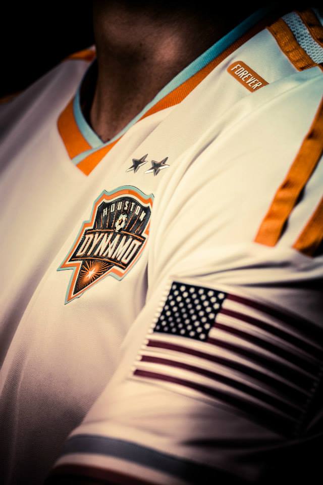
Houston Dynamo

After unveiling a white secondary jersey with orange sleeves during last year’s Jersey Week, the Dynamo unveiled a new white jersey sans orange sleeves, with the sleeves being trimmed with a thick light blue stripe and a thin orange stripe at the cuff. Other than that, most of the elements from the previous shirt have been transferred to the new shirt, so the only big change here is the lack of orange sleeves.The crest itself implements adidas’ new “lenticular team crest” identity, which basically means that it has a bit of a 3D feel.
Los Angeles Galaxy
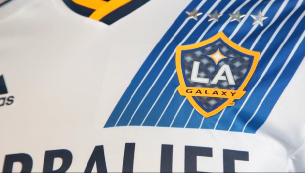
The 4-time MLS Cup Champions released a new home shirt that feels more like an update of the previous shirt than a completely new direction for the Galaxy. The team’s traditional sash has been divided into 11 lines which form a fading/shooting gradient-sash sort of look. The shade of blue gets darker as the sash descends down the shirt. The traditional adidas 3 stripes that run along the shoulder end about halfway down the sleeve with two thick blue and gold lines. Blue & gold stripes adorn the collar and the end of the sleeves. This shirt also utilizes the 3D crest technology.

Seattle Sounders
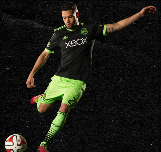
The Sounders have gained a bit of a reputation for their extremely loud and electric third shirts, but it appears that they’ve gone in a bit of a different direction with their latest third shirt, which sees the loudness and electricity relegated to a secondary role in favor of a darker, toned-down look. The Sounders released a relatively simple kit that is mostly black, with light green trim on the shoulders and at the end of the sleeves. The crest is just as toned-down, as it’s monochrome outlined in green. The shorts, however, are just as loud as ever as the light green trim that was on the shirts and crest is on full display on the shorts and socks which are trimmed with the black that dominates the shirt.

Portland Timbers

Portland revealed two jerseys yesterday: Their secondary (or Rose City) kit, and a throwback-esque third kit. The Rose City kit is very progressive and it introduces black to their Rose City color scheme for the first time, after their previous two Rose City kits were mostly red-and-white. The torso of the shirt is adorned with sublimated thorns, which completely wrap around the black-to-red gradient on the shirt. The secondary Rose City crest makes an appearance on the jock tag, and is also colored in red-and-black.

The third kit also follows a theme from a previous kit, as this is the dark-colored successor to the white fauxback that the Timbers have been wearing for the past two seasons. Instead of a kelly green and yellow color scheme that they had on the previous fauxback kit, the Timbers went with their more traditional NASL-era colors of forest green and gold. With minimal gold trim (aside from the obligatory 3 stripes on the shoulder and down the shorts), a pronounced collar, and even a throwback ad logo across the chest (as was the case with the last fauxback kit), this kit should definitely invoke memories for the longtime Timbers fans who have stuck with the club since the 70s.

***
So there you have it: 5 kits from 4 teams, and there are plenty more on the way. Which one is your favorite so far?
Related stories:
 MLS Renews Calls to End Plastic Waste With Return of Parley Kits
  2023 Football Kit Preview: Major League Soccer
  Adidas, Major League Soccer Extend Contract Until 2030
  Busy Wednesday Sees 13 MLS Clubs Launch New Jerseys for 2023 Season
  2022 Football Kit Preview: Major League Soccer
  MLS 2021: What’s New in Kits and Logos
  Multiple 2015 MLS Kits Leak Over This Past Weekend