After the festivities last night, MLS’s Jersey Week finally came to a close. The entire league got at least one new shirt, and we covered the first night of Jersey Week for you. Now, we’ve got the rest of the jerseys and details for you to take in as Jersey Week comes to an end and the actual season begins this weekend. So, without dragging this on any further, here are the jerseys:
Chicago Fire
It’s a bit of a departure for the Fire, as the team that’s mostly known for running out in all-red kits have added a lot of blue to their look with these new shirts. There’s also a very progressive-looking gradient going on at the sponsor area around the chest. You can bet that opinions are mixed on this one.
Chivas USA
Chivas USA will be entering this season under league control, and this will also be the club’s last season under the Chivas USA moniker, as the team will definitely be rebranded under new management. As far as the kit is concerned, it’s pretty standard (which is amazing considering who the manufacturer is). The shirt has simple vertical stripes with the club’s alternate logo serving as a jock tag.
Colorado Rapids
After debuting a secondary kit that was adorned with the colours of the state’s flag, the Colorado Rapids have decided to extend the state flag theme to the primary shirt as well. Not only is the state flag itself on the jock tag, but the flag’s design is sublimated onto the chest of the jersey. They could not make it any more obvious that they are truly representing the state of Colorado and not just the Denver area.
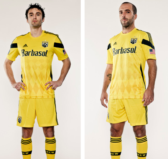
Columbus Crew
The rebuilding Crew haven’t strayed too far from tradition here, as the kit is still all yellow with black trim from top to bottom. As with most of the new kits for 2014, the story is in the sublimation, as diamonds have been sublimated into the shirt’s design. Columbus will be getting an entirely new look, yet-to-be-unveiled for 2015.
FC Dallas
You’re going to have to look real hard to find the hoops on the shirt of the club nicknamed as “Hoops,” as FC Dallas’ “Red for 90” primary home kits are all red from the shirts to the socks, with an even darker shade of red serving as the hoops, instead of their traditional white hoops. There is also a small tribute to Lamar Hunt on the back of the jersey as well.
Montreal Impact
Once again, sublimation is the star of this show, as L’Impact’s new primary kits are mostly blue with sublimated fleur-de-lis forming a pattern on the shirt meant to invoke a look similar to that of Quebec’s flag.
New England Revolution
The Revs will take the field in 2014 wearing a simple yet modern primary kit that is mostly navy with red trim, plus thin white hoops on the socks. Also making an appearance on the back of the jersey is the flag that New England flew during the Revolutionary War. Pretty clever, to be honest.
New York Red Bulls
NYRB’s new alternate kit isn’t too much different from what they’ve worn for a change kit in the past: Navy shirt with gold trim, gold shorts, and Red Bull’s at every logical place. What makes this shirt stand apart from the others is the fact that the name “New York” itself makes two appearances outside of the crest: On the jock tag and on the back of the shirt as well, below the numbers. I have no idea as to what could have possibly raised the sudden interest in civic pride.
Philadelphia Union
Philadelphia Union’s new kit may not look too much different at first, but a couple of elements from the previous shirt have indeed been changed. Powder blue has been completely eliminated from the shirt (outside of the crest), and in its wake, thin old gold vertical stripes have emerged.
Real Salt Lake
RSL’s new kits aren’t too different from what they normally wear, except for the funky stripe across the upper part of the chest that goes below the chest. A crown of sorts forms in the middle of this jagged stripe, and you can get more detail of the stripe (and the 3D crest) in the photo below:
Sporting Kansas City
The defending MLS Cup Champions have come out with a new shirt that adds hoops to their growing gallery of various shirt designs. Also of note is that there’s a checkerboard pattern within the crest, and they’ve also gone a different route in their placement of Championship Stars, as they’ve chosen to stack their stars vertically instead of horizontally. The star alignment will be on all three of their shirts, but the checkerboard crest will be exclusive to this shirt.
Toronto FC
MLS’s hard luck franchise came upon some good fortune this offseason, and they’ll attempt to make the playoffs for the first time ever while wearing these “Onyx” kits as a secondary look. The shirt has sublimated dark grey maple leaves which form vertical stripes on the shirt.
Vancouver Whitecaps
From the official Whitecaps press release:
“Building off of the club’s original MLS secondary kit, we see the return of the familiar deep sea blue, an ode to the water that surrounds and makes up the landscape of Vancouver. Down the left side on the front of the jersey are embossed Whitecaps FC logos forming a curve, representing the flowing structure of a wave.
Silver is featured more prominently on the new kit, in honour of the silverware won by Whitecaps FC and the winning tradition of the club since the inaugural season in 1974.
On the back of the jersey is the club’s 40th anniversary mark, a nod to the ‘Caps history. Inside the neckline are the words ‘Our all. Our honour.’ – the club’s mantra.”
****
So there you have it: thirteen new jerseys over the past three days. As we asked you in the post earlier this week, which one is your favorite? Do you prefer one from the earlier post, or did one of the jerseys in this post catch your eye? As always, we’d love to hear your opinion so make sure to let us know what you think. There’s a lot of jerseys up there, so there’s definitely plenty up for discussion here.


