There are three constants in life: Death, taxes, and college football teams getting new, modernized uniforms. That was the case for four programs in the NCAA’s Football Bowl Subdivision, as Illinois, Miami (FL), Syracuse, and the defending Naitonal Champions Florida State Seminoles all rolled out new uniforms, and in the case of Florida state, updated logos as well. We’ll start with Florida state since that’s the highest profile change of the 4 schools here.
Florida State
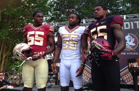
Following the leak of the new primary logo not too long ago and leaked photos of the new logo being painted on the field and on various signage of the stadium, Florida State went ahead and unveiled the new uniforms and the rest of the updated logo set. Aside from the updated primary and spear logo, the biggest addition here is the use of what’s called the Seminole Pattern. The pattern adorns the collars and sleeves of each jersey, and the pattern also seems to form small “FS” monograms and spears as well. There’s also the addition of a black alternate. Florida State’s football team wearing black is not exactly new, but the helmet certainly is: A garnet-and-black gradient with a gold facemask and a gold spear. FSU’s goal with these new uniforms was apparently to “Ignite Tradition,” which means that they wanted to jump into the future with the rest of college football but also wanted to keep the tradition of the storied program alive as well. Jury’s still out on whether the fans will take to it.
Miami (FL)
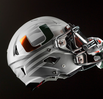
Meanwhile in the extreme southern part of the state, the Miami Hurricanes ditched their uncharacteristically restrained uniforms that they’ve worn in the past few years for a more modern-leaning design. The Hurricanes now have 3 helmets, four jerseys, and four pairs of pants to choose from, and knowing how college football uniform trends have done nowadays, you can probably expect them to mix and match them in all sorts of funky combos. And yes, there are actually three helmets: there’s the traditional white helmet that Miami have worn since 1977, then there’s another white helmet that has a sublimated Ibis logo beneath the U logo. In addition, there’s an orange helmet that has the same design as the second white helmet, except with an orange shell.
 The Ibis logo makes another sublimated appearance on the sleeves as well.
Syracuse
 Syracuse became the 3rd ACC team to get new uniforms, and they went down the modern route as well. From the press release concerning the unveiling:
Custom numbers appear tall and narrow, mimicking the height of New York City’s skyline. The numbers also feature a unique 44-degree linear “V” pattern. This pattern is mirrored on the uniform pant lines and shoulder panels for unified positioning of the Orange as New York’s college team.
In addition, there have “players” in uniform roaming the streets of New York City to promote the new look.
Illinois
The last uniform unveiling here isn’t official yet, but all indications are pointing towards this being the real deal for the Fighting Illini. An imgur gallery uploaded yesterday showed a full-scale revamp of the school’s athletic uniforms, with the football team being the centerpiece. Also included is a new logo that appears on the collar of the jersey, in addition to a couple of new helmets to go with the new uniforms.
Overall, one word seems to sum up the design of these uniforms: Modern. Illinois is easily the most “conservative” design here, but even then, each uniform is definitely moving forward when it comes to design in an effort to keep up with the ever-changing tastes of the players and possible new recruits as well. What do you think about this new crop of uniforms? Which one (if any) caught your eye?


