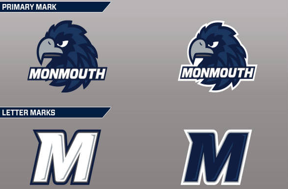
The Monmouth University Hawks are making two big moves: To the Metro Atlantic Athletic Conference for all sports but football, which they will be playing in the Football Championship Subdivision’s Big South Conference (the school is located in New Jersey, but I digress). The school’s athletic program decided to mark the occasion with a brand new set of logos. The entire set of logos is below:
 From the press release on the new logos:
Developing the new look was a team effort that began in the fall of 2013. A University-wide committee of coaches, administrators and community members contributed to the process of creating the new visual identity for Monmouth University Athletics. After an extensive process which saw multiple drafts and designs, the work was completed by New Jersey graphic design company Corsa Creative.
For comparison, here’s the school’s previous visual identity, which you can see the rest of here on the logo database:

Now that you’ve seen the new logos compared with the old stuff, what do you think? Upgrade or downgrade for Monmouth?


