

Orlando City Soccer Club is currently competing in USL Pro, the 3rd tier of the United States’ soccer pyramid. However, Orlando City will be “promoted” to the top tier league, Major League Soccer, in time for next season. Since that date is rapidly approaching, the club has unveiled the new crest that the team will wear on their shirts and on all other equipment and merchandise in 2015 and beyond.
As expected, the new crest retains purple as the primary color. The big differences between the new logo and the current, soon-to-be fully replaced logo is that the three-headed lion beast from the old logo has been replaced by a new, more streamlined and cleaner looking lion’s head. In addition, the Orlando City script itself has also been streamlined and given a modern touch with sans-serifs and slanted endings to those sans-serifs, as you can see on the “R,” “L”, “A”, “N”, and “T” on the wordmark. Also, red has been eliminated from the crest, and purple clearly dominates the badge now.
Here’s a side-by-side comparison of the two crests:

From the article concerning the logo on MLSSoccer.com:
The new crest features an updated version of the club’s lion mascot, stylized in a nod to Florida’s “Sunshine State” moniker and ringed by 21 sunbursts representing Orlando’s status as the 21st MLS club. The lion wears a subtle crown symbolizing last year’s USL PRO championship.
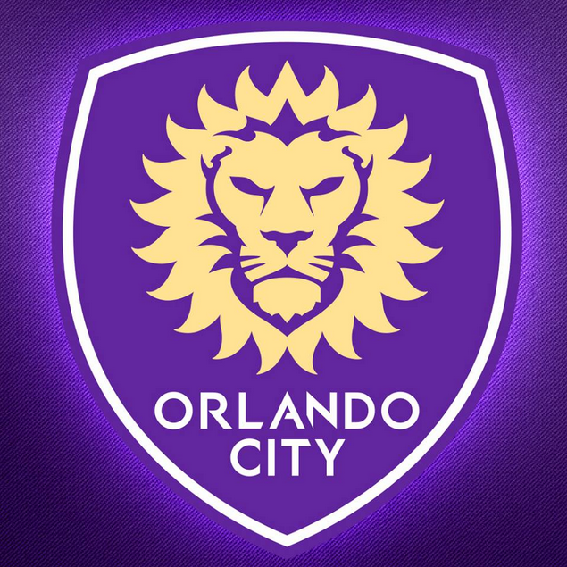 Coinciding with the unveiling, the club has also announced a “Paint It Purple” campaign intended to promote the new image of the club across the city of Orlando, and are also selling merchandise with the new logo emblazoned on it. Clearly, the club is proud of the new logo, and it appears that the fans have definitely taken to the new crest as well.
What about you? Are you feeling the new crest, or do you think that the changes weren’t good enough?
Related stories:
 2023 Football Kit Preview: Major League Soccer
  Toronto FC, Orlando City Round Out MLS Kit Unveilings Ahead of 2023 Season
  Along With Black, MLS Refs to Wear Yellow, Blue and Pink Uniforms in ’23, ’24
  Friday Flurry of Activity Across MLS Sees 11 Teams Unveil Kits Ahead of 2022 Season
  MLS: Terrible Ad Destroys Otherwise Swell LAFC Kit
  Handful of MLS clubs have leaked jersey designs
  What Could The Atlanta MLS Team Look Like?