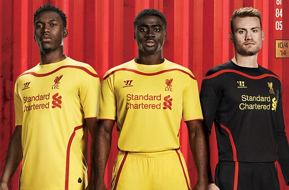
After previously unveiling their home/primary kit for next season, Liverpool FC have revealed what they’ll be wearing for most of their away games, and it’s a call back to a look that Liverpool have utilized as an away identity in the past: Yellow.
For the first time since the 2006-07 campaign, Liverpool will wear yellow from top to bottom for their away strip, and unlike their previous garish clash kits, it’s actually pretty simple. Although Liverpool have combined yellow with different colors from time to time, they’ve normally done it with yellow accents, and this one is no different: Thick red piping adorns the area below the collar and runs across the lower shoulders and all the way down the side of the shirt and down the shorts as well, with a similarly thick red stripe running across the top of the socks.
Just as on the home shirt (and all of the shirts that Warrior have manufactured for Liverpool since they acquired the contract to become Liverpool’s sponsor), the Liver bird serves as the crest.  Just as there is on the home kit, there is a logo on the back of the shirt that serves as a tribute to the victims of the Hillsborough Disaster, complete with a 96 to represent the number of victims. Although the Hillsborough tribute crest has been removed from the shirt, it’s still pretty nice to see that the club has found a way to put some sort of tribute on the shirt, even if it’s on the back of the shirt.
 As a comparison, here’s the away kit side by side with the home kit:
There should be a third kit unveiled pretty soon (which may or may not have leaked), but so far, this set of uniforms for Liverpool looks pretty good. I’m not to going to ask whether this is an upgrade or a downgrade because anybody who saw the Reds take the field wearing this atrocity from last season can easily tell that this is a clear and obvious upgrade. Just let us know how you guys feel about it below!


