

The Portland Sea Dogs, who are celebrating their 20th anniversary in 2014, are among the most consistently popular teams in all of minor league baseball. They have been a fixture in New England since the 1993 expansion of Major League Baseball required the minor leagues to expand as well, first as the double-A affiliate of the Florida Marlins, and more recently with the Boston Red Sox. The design of their logo is the result of a simple equation that looks like this:

In case this visualization is not entirely self explanatory, I spoke with Chris Cameron, the team’s assistant general manager and director of media relations, who explained. “The logo’s actually created by Guy Gilchrist. He’s the guy who does the Nancy comic strip,” he said. “He told us he took the eyes from the old Chicago Bulls, and got the bat-in-the-mouth idea from the San Jose Sharks.”
Guy Gilchrist not only draws the world-famous Nancy comic strip, but he worked on the Muppets, Looney Tunes, Tom & Jerry, Fraggle Rock, and The Pink Panther. Not only that, he’s a huge baseball fan—specifically of the Red Sox. In a recent phone conversation, he regaled me with stories of growing up on baseball, then raising his own children in minor league parks all around New England.
The Portland Sea Dogs were the first minor league baseball logo he designed, to be followed by the Norwich Navigators, New Britain Rock Cats, and Binghamton Mets. And about that equation above?
“At the time that I did the Sea Dogs, the biggest-selling logos were the San Jose Sharks and the [Chicago] Bulls,” he said. “And so, I mean, duh. I took Slugger and instead of him having a hockey stick in his mouth, I put a bat in his mouth. And I had him looking straight at us, just like a bull.”
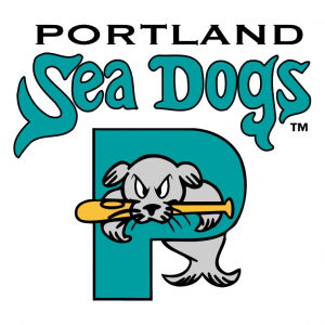 The Sea Dogs’ arrival on the scene ended a 45-year baseball void in Portland, Maine. Their logo, pictured here in its original Marlins teal (required by law of all 1990s expansion sports teams) was popular during the early years, but it became even more popular when the Sea Dogs switched affiliations (and team colors) to the nearby Boston Red Sox in 2003.
“When we became a Red Sox affiliate, we took a good thing and made it even better,” Cameron said. “Obviously, New England is the heart of Red Sox Nation. Everyone up here, for the most part, is a diehard Red Sox fan, and so the fact that you can now see the future of your favorite Major League Baseball team right here in your back yard has just really increased the popularity of the team.”
One of these diehard Red Sox fans was Guy Gilchrist, whose feelings were pretty clear when the team made the switch. “Oh, my gosh, I went crazy. Are you kidding me?” And as for Slugger’s new colors? “He does look good in red, white, and blue. He really does.”
As is the case with nearly every new logo in minor league baseball, however, fans didn’t buy in right away. “One person called the local radio station and complained, Who’s going to like this? Women and children are the only ones who are going to like this,” Cameron said. “And our owners were like, Yup. Jackpot. We want the women and children to like it and we’ll have success with that because we’ve already got the sports fans.” (One woman who liked the logo was Guy Gilchrist’s future wife: “When I met my wife,” he said, “she had one of the Sea Dogs caps in teal. She’s a Marlins fan.”)
Guy Gilchrist put the team’s early marketing strategy a little more bluntly:
I think many people, when they try to create a character or create a logo, they’re trying to sell products to fans of the organization. And that’s not the right way to do things. Fans of the organization will buy anything. If they’re fans, they’ll buy it. It could be the ugliest thing you’ve ever seen in your life. What you’re trying to do is create something that’s appealing to somebody who doesn’t even know what it is.
Obviously, this formula (which the rest of the baseball world seems to have caught on to in recent years) has been successful for the Sea Dogs. Minor League Baseball’s annual list of the top 25 teams in terms of merchandise sales has included the Sea Dogs every year since their inception, including this year. “Only one other team can say that for the same amount of time that we’ve been on it and that’s the Durham Bulls,” Cameron said. “Of course, they had a major Hollywood motion picture made about them, so it’s pretty good company to be in.”
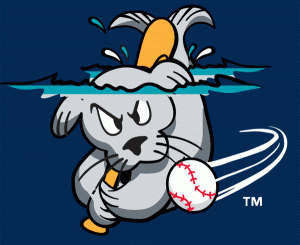 Slugger, who is featured in the primary logo as well as the secondary logo pictured here, got his name from a cracked Carl Yastremski bat that cup-of-coffee Major Leaguer Roger LaFrancois gave to Gilchrist in the early 1980s. Gilchrist was doing an interview with Baseball Weekly about the early success of the logo, when the interviewer asked what the mascot’s name was. Gilchrist looked around his studio and came up with an answer on the spot. “His name was either going to be Louisville or Slugger,” he said.
So the logo has been popular, the team draws more than 5,500 fans per home game (above average for an Eastern League team), and it can’t be lost on the notoriously superstitious Red Sox Nation that their big league team has won three World Series titles since Portland became an affiliate. But it’s not all been smooth sailing for the Sea Dogs. One persistent problem has been a misconception about Slugger.
“A lot of people think that a sea dog is a dog, and that is incorrect,” Cameron said. “A sea dog is just another name for the common harbor seal, which is found right off the coast of Maine…. If you look at our mascot, he doesn’t have paws, he actually has flippers. So he is indeed a seal and not a dog.”
Ultimately, if the price you pay for having a wildly successful logo and selling a bunch of merchandise every year is that you have to explain the difference between a dog and a seal every once in a while, that’s not such a bad deal.
Related stories:
 Birds of Play: The Story Behind the Oklahoma City RedHawks
  Everything is Better with Bacon: The Story Behind the Lehigh Valley IronPigs
  So Cool They Barely Need a Team: The Story Behind the Lake Elsinore Storm
  The story behind the Las Vegas 51s: Coolest logo this side of Gunga City
  The Most Edible Mascot in Baseball: The Story Behind the Montgomery Biscuits
  Rock ‘n’ Roll Cats: The Story Behind the New Britain Rock Cats
  Of Moose and (Celery) Men: The Story Behind the Wilmington Blue Rocks
  From Tobacconists to Lollygaggers: The Story Behind the Durham Bulls