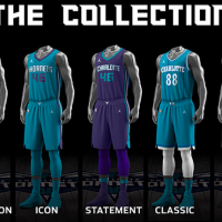
The logos have come out, the uniforms have come out, and now it’s time for the court. The Charlotte Hornets have unveiled their new court and although it’s not nearly as funky as the courts we used to see from the Hornets, it’s still a court that is very unique to the Hornets.
At first glance, it appears to be your typical, run-of-the-mill NBA court; The baselines/sidelines are in teal with the “Charlotte Hornets” script running along the baseline. The key area is in purple. There are secondary logos inside of the 3-point arc and at center court below the center line. There are also advertisements for Novant Health near both bench area, which continues the trend of NBA teams selling ad space on the sidelines of their court. Naturally, the team’s primary logo is at center court, which answers the question as to whether or not they were going to put that there or go with a secondary logo.
However, the most unique part here is the hardwood design. It’s been stained to make it look as if you’re running on honeycombs. Even though this is a “traditional”-looking court, the subtle honeycomb design is what sets this court apart from any in the NBA, which means it’s proof that you don’t need something tacky to look unique or ahead of the curve. So what you have here is a court that’s simple yet still one of the most forward-thinking court designs in the NBA.
So, what do you think? Is this a good court for the Hornets, or should they go back to the drawing board for next season?


