
Recently, I had a conversation with the Fearless Leader of this website (Chris Creamer, of course) and he made an interesting point about where our highest web traffic come from. Obviously the Land of the Free, the Home of the Brave, the U.S., and the great country of Canada and would be the top two. Well, then who would number three be? If you’re reading this right now then you’ve already figured it out: It’s the Philippines.
Now, what has brought our friends in the Philippines to this lovely website? If I had to venture a guess, it’d probably be their love of basketball. Reportedly, it’s the most popular sport there, which means it’d be pretty logical to believe that some of the basketball fans there would have a pretty big interest in the NBA, and we have plenty of NBA coverage here.
However, we’re not here today to discuss the NBA. That’s old hat. It’s Free Agency, and you can find LeBron James news anywhere else. Where else are you going to find the hottest news about Philippine basketball logos? Nowhere else but here!
That’s why this post will be dedicated to taking a look at all 10 PBA team logos. A quick note here: None of the teams are based in a geographic locale, and they’re all owned by corporations. For those of you who may be ruing the inevitable day of advertisements on NBA jerseys, think about it: It could be worse, the Boston Celtics could be the TD Banknorth Celtic Bankers. Now all of a sudden a small little ad on the jersey doesn’t seem so bad, now does it?
So, with those quick notes and a digression out of the way, here’s a review of all 10 of the PBA’s logos!
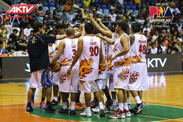
Air 21 Express

Well, this is an inauspicious start. A basketball with jet engines on the sides. Wow. The positive here is that the uniforms actually aren’t all that bad. The bad news is that this team won’t be around for the upcoming season, as the team has been sold and will be known as the NLEX Road Warriors. No word on whether or not we’ll see Mad Max implemented in that logo.
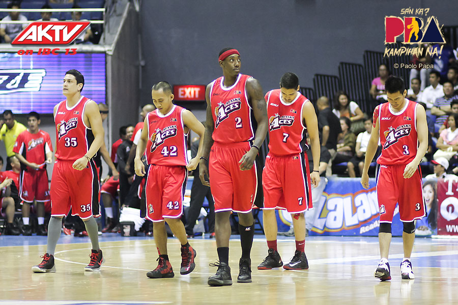
Alaska Aces
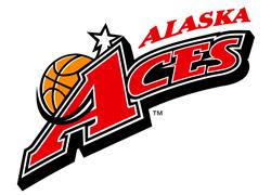
Once again, none of the PBA’s teams are geographically based, which means that no, the PBA has not cracked the code as to how to make a transoceanic sports league work. They’re sponsored by a company known as Alaska Milk, and have been since 1988, which is an eternity in this league. As such, they’ve actually been one of the most successful teams in the PBA, and as such, they have one of the better looking logos in the league. It’s nothing to write home about, but it looks good on the uniform, which is all you can ask.
Barako Bull Energy Cola

Taking a note from another Bull-related energy drink corporation who likes to dip their toe in the sporting world, Barako Bull Energy Cola has decided that the best way to go about branding your sports team is to just slap the brand’s logo on it and call it a day. What’s more interesting is that this team is actually the 2nd incarnation of the Barako Bull Energy. After the first one folded, the 2nd team came about after the Burger King Titans/Whoppers went under. Yes, there was a team named the Burger King Whoppers. Forget the NBA, I love this game.
Barangay Ginebra San Miguel

Next up we have the Barangay Ginebra San Miguel, formerly known as the Barangay Ginebra Kings. I wish they were still the Kings, because that logo is a whole lot better than this. With that being said, it’s another case of a logo not looking good on its own but looking pretty good on the jersey itself.
GlobalPort Batang Pier
Full disclosure: I’ve been sitting in front of this screen for the past few minutes trying to figure out what a Batang Pier is. Did GlobalPort really name their team after a pier? I mean, that’s clearly a boat above the “O” in the “Port” part of the logo, so I’m starting to believe that this team is really named after a pier. I suppose it’s just as ridiculous as a team being named after “Thunder” or “Nets” so I can’t really rant about it. The uniforms are cool, though, because they utilize rave green. We should see these colors more often in sports.
Meralco Bolts
Now, this is just my opinion, but I’m gonna go ahead and say it: This is far and away the best logo in the Philippine Basketball Associaton. It works as a script, and it works as a stand-alone logo, and it’s a clever way for the parent company to say “Hey guys, we’re an electric company that also moonlights as a basketball team!” Plus, there’s clear potential for a secondary logo, so this is just a solid logo all-around. I’m dead serious. With all of that being said, are the uniforms good as well? Unfortunately, you can’t have your cake and eat it, too, and these uniforms are proof of that.
Rain or Shine Elasto Painters
Now, before you start snickering to yourself as you look at this logo, I’m gonna argue that it makes sense. Anybody who has painted a house knows that it can get pretty hot painting that house during the middle of the day. As someone who has a bit of experience in painting houses in the summer heat, I can say that those flames are dead on. It feels like flames are on your back as you put the new gloss of paint on that house. The uniforms even point this out! Is it tacky? Of course, but it’s tacky for a purpose.
San Mig Super Coffee Mixers

For one season, this team was known as simply the Coffee Mixers. That season was 2012-13. For the 2013-14 season, they were known as the Super Coffee Mixers. Maybe they ate a mushroom and got better like Super Mario? I guess it worked, because they won a couple of titles that season. Plus, looking at just the “Mixers” part of the logo, it’s actually not half bad. Plus the uniforms are decent enough.
San Miguel Beermen

Now, we’ve reached the Old Lady of the PBA: The San Miguel Beermen. They’ve won the most titles in the PBA (and if you want to see how titles are given out in the Philippines, click here. It’s complicated.), and their nickname has been around since 1980. Once again, that’s basically an eternity in this league. So, even though the logo is a bit wonky with the meat of the logo on a slant and another appearance of a flaming basketball, maybe the uniforms would be simple as to reflect this being one of the blueblood clubs in the PBA? Nah.
Talk ‘N Text Tropang Texters

All I can think of is that this would be a perfect logo for a basketball team that would show up on a random basketball-centric episode of some live-action ’90s Nickelodeon show. Now, with a wacky logo like this, you’d think that the uniforms would be just as wacky, right? Actually, they may have the plainest uniforms in the PBA. Go figure. They’re the anti-Beermen.
***
So, there you have it: A relatively quick look at all 10 logos in the Philippine Basketball Association. Clearly, we shouldn’t expect a country that’s in a completely different continent and culture to have the same type of conventions as we do here in the North America when it comes to sports logos, but most of these are more than a little funky. You can’t say that they aren’t fun, though. Once again, there was a team named the Burger King Whoppers. That will never get old to me, and I feel like a better man for having found out that this team once existed.
Anyways, what do you guys, think? Which one is your favorite? Which one’s the worst? Most importantly, would you buy an Alaska Aces jersey? Let us know how you feel about all of it in the comments section, especially if you’re actually from the Philippines so that you can tell me just how wrong I am about all of this stuff.