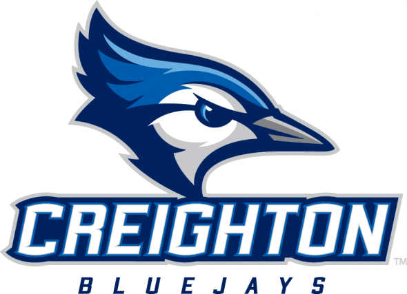
The Toronto Blue Jays have filed an opposition with the United States Patent and Trademark Office (USPTO) over the Creighton Bluejays logos from their most recent rebrand.
According to a letter [read it here] attached to their opposition Rogers Blue Jays Baseball Partnership feels that “[Creighton]’s Jay Design mark is comprised of a blue jay bird head design in profile with its crest raised in a manner similar to certain of [Toronto]’s Jays Design Marks.”
The complaint continues, “[Creighton’s] design is formed by thick, clean lines and outlines with no gradient or shading, resulting in a bold, two-dimensional mark that is highly similar to the designs contained in certain of [Toronto]’s Jays Design Marks.”

Within the letter the Blue Jays present a list of their fifteen different marks registered with the USPTO including those used by team-owned Minor League franchises in Dunedin, FL and Bluefield, WV.
The Toronto Blue Jays gripe seems to lie within a perceived public confusion as well as a dilution of their brand “by blurring of the distinctive quality”, it is alleged that the similarity in the marks when used alongside the name “Blue Jays” would creates a false sense of association between the two sports outfits.

Creighton University applied for a trademark on their updated marks on September 18, 2013, the Toronto Blue Jays have been using various logos featuring a side-profile of a blue jay since 1976.
The Toronto Blue Jays rebrand unveiled in the fall of 2011 won them the SportsLogos.Net New Logo of the Year Award for 2012; this challenged Creighton Bluejays mark won the same award in 2013.

—
UPDATE (Aug 21/14 10:30am ET):
The Associated Press ran with this story late last night and got some feedback, albeit minimal, from the university about the situation:
“Creighton general counsel Jim Jansen said Wednesday he’s in discussions with representatives of the Toronto club to resolve their concerns.”
It’s also fun to note, as several have pointed out to me on Twitter, that the Creighton Bluejays baseball uniforms once looked like this in the early 1990’s:
Who knows the arrangement (if any at all, because it didn’t last too long) that went on that allowed this to happen back then.
__
Special thanks to @IamRobSimms for the heads up on this story


