
Today, Zach Lowe over at Grantland decided to take a stab at ranking all 30 current court designs in the NBA, from the ugly (like the Suns) to the beautiful (like the Nets, Hornets, and Lakers). Personally, I’ve got no major qualms with the rankings. What was interesting was the fact that we ended up seeing six new court designs for this upcoming season. Six! In addition, there’s a brand new design on the way for one team that hasn’t been unveiled yet, but we’ll get to that later. For now, let’s get to the courts that we’ve already seen in the Grantland post.
Atlanta Hawks

The franchise itself is going through a bit of a mess, but at least the court is a reminder of better times; Back when the Pac-Man logo made its glorious return and the Hawks actually had some hope for the future. Those were such wonderful times, and I wish we could go back to those times. But enough about me being a sad Hawks fan, and more about the court. It’s a simple design: blue baselines and sidelines with the Atlanta Hawks wordmark going across the baseline, web links on the team bench sidelines, red keys, and the big Pac-Man logo at center court. It’s a simple and effective court, and much more lively than the previous design.
Portland Trail Blazers

Remember that poll from a while back in which the Blazers let fans vote on which design they liked the most? Well, this is the design that won. Now, it’s appear that there are a couple of changes made from the design that the fans actually voted on, but they’re minor. In the linked post, this is design number two. It’s clear that that design was just a rough draft, and here we have the finished design. This includes the team’s full name across the baselines, their web links across the team bench sidelines, and a new Rip City wordmark along the bottom center sideline.
Sacramento Kings

The Kings have a new court as well, and in a word, it’s purple. Purple sidelines, purple keys, purple secondary logos within the ark, and the return of the primary logo to center court. In addition, the team is using a new block font on the sidelines and baselines, with “SACRAMENTO” across both baselines and a “SACRAMENTO PROUD” motto across the bottom center sideline. That’s a nice touch for a city who has made sure that their NBA team is, for lack of a better term, Here to Stay. But once again, everything is purple.
San Antonio Spurs
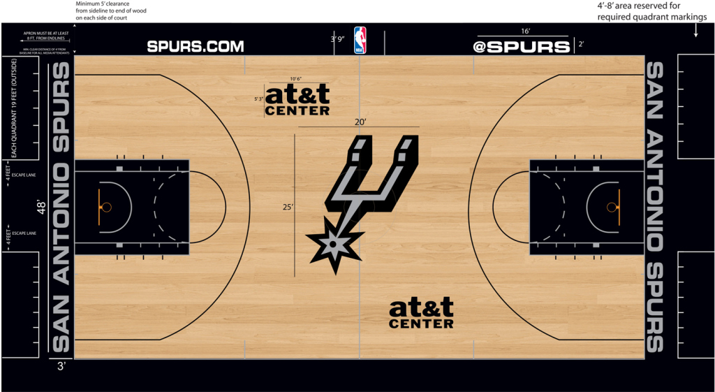
The defending NBA champs have made slight changes to their court. Instead of having “San Antonio SPURS Basketball” running across the baseline, the team name is there by itself, stretched along the baseline in a sans-serif font. Also, instead of having the wordmark logo at center court, the team’s secondary logo is now at center court. Small changes for a relatively simple court.
Toronto Raptors

After playing on one of the most unique courts in the NBA simply because of their trippy 3D logo on their baseline, the Raptors have gone back to a more traditional design. Black sidelines and baselines, red keys, a lighter shade of hardwood inside the arc compared to outside of it, and the alternate roundel Raptor footprint logo at center court. The team’s motto of “We The North” is running along the bottom center of the baseline, complimented with a nifty Maple Leaf because, obviously, this is Canada’s team. Hopefully the team’s Global Ambassador approves of the new design.
Washington Wizards
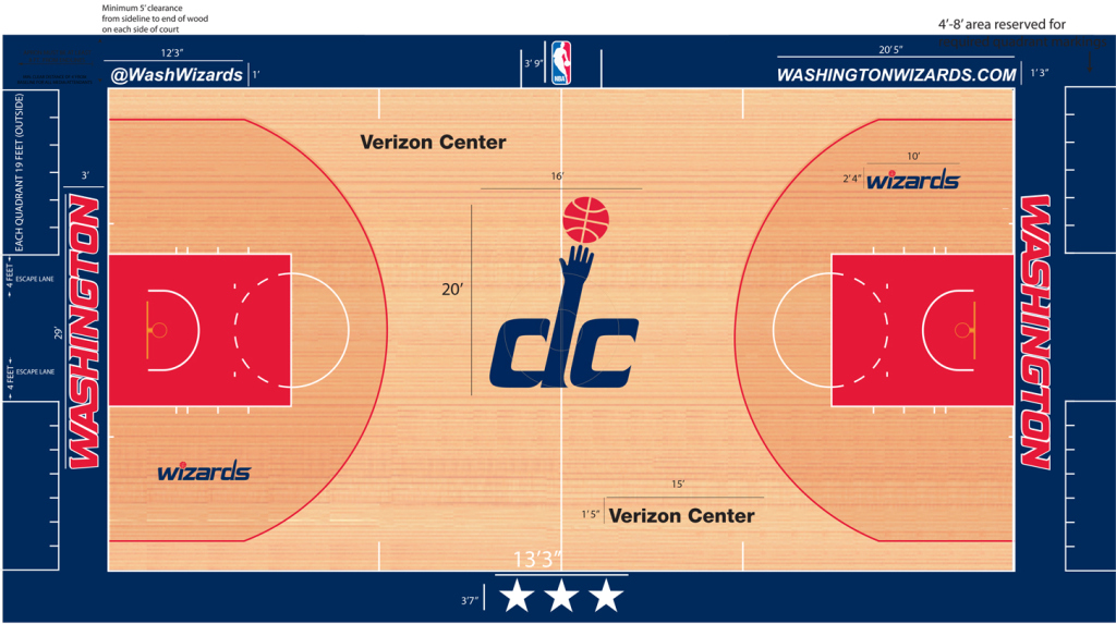 The Wizards’ court redesign is mostly a case of trading places. Red on the sidelines and baselines have been traded for blue (which means that the Washington wordmark that runs along the baselines is now red with white outlines instead of blue), blue in the keys have been traded for red, the primary Wizards wordmark that used to be at center court has been traded for the secondary DC logo (which harkens back to the old days of the Bullets) that used to be inside of the arc. The only thing that didn’t change was the 3-Stars symbol that is seen on their city’s flag.
***
Now, the big story here is that apparently the New Orleans Pelicans have a brand new court on the way, after using their previous design for only one season. According to Lowe, it’s a doozy.
The Pelicans have a brave proposed court redesign that might be the league’s boldest, but they have not received final approval to deploy it this season, per several league sources.
Well, it’s definitely going to be interesting to see how that one shakes out and if the league approves it. But for now, we’ve got six brand new court designs to gawk at. Which one is your favorite? Which one do you hate, if any? As always, we’d love to hear your thoughts on each design.
Related stories:
 Spurs, Raptors Among Seven New NBA Jersey Leaks
  2019 NBA Conference Finals Uniform Schedules Set: No Red for Raptors
  NBA Unveils New Earned Uniform for 16 Teams
  Jazz, Kings, and Pistons may have new primary logos for 2016-17 season
  Massive Leak Shows Images of 54 New NBA Uniforms for 2015-16
  NBA Ready to Take us all Back to the ’90s
  What’s new in the NBA for 2012 NBA: Heat, Mavs, Kings Unveil New Uniforms

