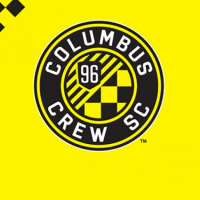
To say that this has been a long time coming for Columbus Crew SC would be an understatement. The club had the very first pick of the league’s first draft, they were the first club to build a soccer specific stadium, but despite being the leader in those two regards, they’ve had this logo since the league’s inaugural season in 1996. It was extremely outdated; a relic of the ’90s and nearly 2 separate eras of MLS’s history. But now, with “MLS 3.0” looming, the Crew finally decided to get with the times and unveil a new crest.
The new logo was unveiled tonight in front of a rowdy crowd of supporters, ad so far the reviews are positive. Although nearly anything would be an improvement over the old mark, the new logo is very easy on the eyes.
 Just like the league’s newly unveiled logo had an accompanying image explaining all of the symbolism of the logo down to the random slash in the middle of it, Columbus’ new logo has an accompanying image on its unveiling website detailing the meaning behind nearly every last part of the logo. The most important part to the fans would have to be the checkerboard pattern, which is normally the flag of choice that’s flown by the team’s fans.
In addition, the team has also officially changed its name to Columbus Crew SC, as evidenced by this “Brand Migration” image. Although its purpose is to show off the various new monikers that the team is attempting to take on, I think that its ultimate purpose is to show just how vast of an upgrade the new crest is to the old crest. Seriously, there’s a gulf in quality between the original and the new one.
Also, the team’s unveiled its new wordmark, and yes, they explained every last detail of the wordmark as well.
 Overall, it’s a very German looking crest. I say that because a good number of German soccer’s crests are roundels with a meaningful symbol in the middle (with Bayern Munich’s crest being the primary example here), and you could plop the Crew’s new logo in with the rest of the Bundesliga and it’d fit right in. Personally, I’d say that that’s a huge compliment to this logo, which was reportedly designed in-house. Well done to the Crew on a huge, huge upgrade that was badly and sorely needed.
I think I’ve made my feelings on the new crest pretty clear, but what do you guys think? Do you agree that it’s an upgrade? Do you think they should’ve gone in a different direction? Do you actually think that they shouldn’t have made any changes? If you choose to go with the 3rd option, then I’d love to hear your rationale on that. But seriously, let us know what you think!


