I have always liked the Louisville Bats logo and team name, but three things that I learned about it recently make me like it even more: 1. There’s a specific and awesome reason that the team color is purple (see below for that), 2. The logo was designed by the team’s in-house designer rather than an outside firm, and 3. The team’s Senior Vice President Greg Galiette twice referenced the Bat Signal in our conversation about the logo. (Not only that, but the team’s blog is call The Bats Signal.)
For four years, way back in the late 1990s and early 2000s, the triple-A baseball team in Louisville, Kentucky, succumbed to that well-known formula for coming up with minor league team names: Location + Nearby Natural Feature + Any Animal. This is how we end up with teams with names like the Tucson DesertMonkeys and Fort Collins MountainPoodles and Wildwood OceanZebras. (Note: Those are probably not real, but you never know.) But in 2002, the team broke away from that formula and the result was one of the cleverest nicknames out there.
 The Louisville Bats, an affiliate of the nearby Cincinnati Reds, were the Louisville (Location) River (Nearby Natural Feature) Bats (Any Animal) from 1998 to 2001. The franchise debuted in 1982 as a Cardinals affiliate called the Louisville RedBirds, then switch names to the RiverBats in 1998 when they switched parent clubs to the Milwaukee Brewers, a relationship that lasted just two years before switching to the Reds. Two years into their tenure with the Reds, simply dropping the word “River” from RiverBats reinforced Louisville’s obvious connection with baseball bats (they play at Louisville Slugger Field) and gave the team the opportunity to rebrand with a sleek logo based on a different kind of bat.
“We were a little apprehensive at first going with a bat mascot and bat logo,” Galiette said. “We were kind of afraid that he might scare some kids, but it’s worked really well.”
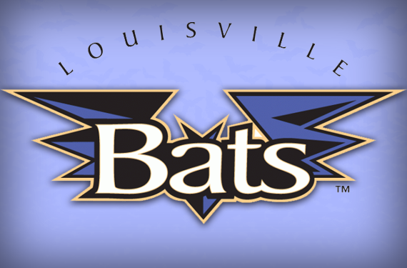
The Bats’ logo, which was designed by the team’s graphic designer Lonnie Walker, is meant to play to a fan base with deep baseball roots. It avoids the trend in minor league baseball towards cartoonish, kid-friendly logos and instead leans towards what Galiette describes as a “traditional, stronger, bolder look, almost like a Bat Signal.” (There’s one!)
 The team’s primary logo (at the top of this post), their home cap logo (left, above), and road cap logo (right, above) use clean, strong lines and a bold look to create a more sophisticated look than you see in some other minor league clubs. That said, the team does have a logo featuring their mascot Buddy Bat, which they use primarily for their kids’ club.
Having the logo designed in-house gave the team more control, and handed the job to someone who appreciated the city’s relationship with baseball. “A lot of times when you’re using an agency you get into this battle of egos with their designers,” Galiette said. “Whereas we used a gentleman who had basically developed our newspaper ads and a lot of our media looks for years even back to the old Louisville Redbirds days.”
And the team’s identity has thrived since the logo was adopted more than a decade ago. .
“It’s got a little bit of that Batman look,” Galiette said. (There’s two!) “It’s really stood the test of time over the years. I think it’s something we can take for many years into the future.”
Players who come up through the Cincinnati Reds’ system have a colorful experience—literally. They might play for the Dayton Dragons (green), the Daytona Cubs (blue), Pensacola Blue Wahoos (pink), and then Louisville. In fact, the only time a Reds player wears red in the minors would be if they played for the single-A rookie league Billings Mustangs. But the Bats didn’t choose purple just to complete an organizational color wheel, nor was it because bats come out at night, or even because anyone on the team is secretly a Baltimore Ravens fan. It’s a much better reason than that:
“In this college basketball, college sports-crazed state and area that we live in,” Galiette said, “if you take the red of the University of Louisville and the blue of University of Kentucky, mix the two together, you come up with purple.”
Players like the purple so much that the team actually made a change to their uniform. “Last year we switched our alternate jersey, which had always traditionally been pretty much been a black jersey,” Galiette said. “We went to a really bright, vivid purple, and the guys really enjoyed playing in those.”
I didn’t realize it until I started researching this article, but the Louisville Bats are a harmonic convergence of three things that I love: Baseball, basic color theory (red and blue make purple!), and puns (bats/bats). I think I’m in love.


