![]()
As one Minor League club absorbs the identity of its Major League affiliate, another has shed theirs altogether.
The Florida State League’s Daytona Cubs (A) and Chicago Cubs parted ways following the 2014 season with Daytona eventually partnering up with the Cincinnati Reds. A new name was naturally a necessity but they didn’t just take the easy way out and become the “Daytona Reds” or anything…
“All along, we knew that we were going to go with an independent name, a name that would have a true meaning within our community”, Daytona General Manager Josh Lawther explained.

It also solves the problem of having to come up with a whole new identity every time an affiliation switch happens.
Lawther and his team looked at Daytona, famous for it’s beach along the Atlantic Ocean, and what they could do to bring that into their brand.
“After several nights of brainstorming with the rest of the staff ‘Tortugas’ was brought up, and the more we thought about it, the more it made perfect sense”, Lawther continued.
So… Tortugas? What the heck is a tortuga?
Simple, it’s the spanish translation of “turtle”.
“Sea turtles are common here. You can find them up and down the beachline. Their nesting season runs parallel to the baseball season, and that adds to the continuity of it. And the tortuga aspect — that gives it some flair and makes it more unique than it already was. Florida is Spanish for the word ‘flower,’ so why not do something similar? We think it sounds perfect.”
Well, it’s certainly better than “Los Turtles”.
The new logos were designed by Dan Simon of Studio Simon who was also responsible for the fantastic Hillsboro Hops logo as well as other Minor League Baseball looks such as the Rochester Red Wings and Erie SeaWolves in recent years.

Looking at the total Tortugas brand package there’s one thing which stands out apart from most Minor League re-brands of late… consistency – the same design elements are used in each logo, uniform, and cap. There’s really no need to create a dozen additional alternate and secondary logos to compliment your brand (check out the new Oklahoma City Dodgers collection, wow) if it’s strong enough to survive on its own.
Overall, a great job by both the Tortugas staff and Studio Simon.
Related stories:
 Contest! Win a Daytona Tortugas New Era BP Cap
 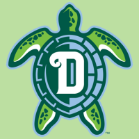 Daytona Tortugas add new logo
  USA! USA! Baseball Team Wears Miracle on Ice Jerseys
  St Lucie Mets Flirt with new name, settle on new logo
  Aberdeen Ironbirds Update Identity for 2013

