Just two months on top of the Eastern Conference and the Toronto Raptors are already painting themselves gold.
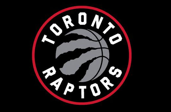
The Toronto Raptors unveiled a series of new logos today via their social media channels. Each of the new logos feature the same central design — a claw forming the left side of the seams on a basketball. The “basketclaw” design is housed inside a roundel with the team name around it in white.
“Last year during the playoffs, ‘We The North’ became a rallying cry for this team, and all of our fans. Our new logo represents that attitude and will be an important part of our identity starting next season.” – Raptors President and General Manager Masai Ujiri in a press release
The primary logo, which will not be implemented officially until the summer of 2015, is the one which is seen at the top of this post and to the left in the image below (black, silver, and red version). A black, silver, and gold version of this same logo is being listed as the official alternate club logo… because Drake.

A series of additional secondary/partial logos were also included in the unveil, all of which were just different colours of the “basketclaw”.
The logo was designed by Montreal-headquartered creative services agency Sid Lee (portfolio here) who had previously done work with Adidas, AFC Ajax, and with the Raptors on their popular “We The North” campaign heading into the 2014 NBA Playoffs.
This new look will end 21 years of their very 1990s primary logo featuring a red dinosaur dribbling a basketball. Due to NBA re-branding regulations, the primary logo remained the official club logo despite its rare usage in recent seasons. The logo underwent a colour change prior to the 2008-09 season, purple replaced with red and black.
Although the club said merchandise would not be made available until next fall (seriously? Why unveil it this early then?) they later Tweeted the photo seen above, showing the alternate gold and silver mark on t-shirts and ballcaps. So, who knows what the merch situation really is here.
I am a Toronto Raptors fan, when I heard the team was re-branding and bringing Drake on board to help with the process, frankly I expected something terrible. I have nothing against Drake, he’s a very proud ambassador of the city… but I pictured the team being completely designed based on his look – black and gold, random owls everywhere, basically a complete abandonment of team history.
This is not what we are getting here (eh, aside from the alternate logo). We have a logo which clearly references what the club has used in the past (the basketball/claw combo) and retains the primary colour scheme of red, black, and silver which has been in use for a decade now.
Based on the fact it isn’t horrible, I like it. Based on the fact that it isn’t “Hey, we’re Canadian so maple leaves gotta be in the logo!”, I’m pleasantly surprised.
Do I wish it wasn’t styled similarly to the Brooklyn Nets logo? Absolutely. But that’s really the only major negative feeling I have about this new brand.
Overall, I’m quite impressed. Well done.
*******
Below is our original article on this story. It was written and published *before* the Toronto Raptors had confirmed this would be their new logo for next season or released much of the information we now know.
*******
The Toronto Raptors have made it known that they will be re-branding for the 2015-16 season, and today it appears we may have gotten a glimpse of the new look.
At the end of a video posted to their official YouTube channel titled “This Is Our Shield” the logo, featuring a basketball with a dinosaur claw tearing at it, is shown waving on a flag as a narrator speaks:
“Every movement needs a badge to stand behind, a symbol to identify those who defend our territory, an emblem to represent our character and it’s effect on the landscape. ‘We the North’ is our battle cry, and this… this is our shield”
Below is the best screencap of the logo I could acquire from the video:
We’ll provide more details as we get them.
UPDATE:
The Toronto Raptors have released more images of this new logo courtesy their Facebook page…
They also accidentally posted a full-colour version of it first before quickly deleting it (screencap courtesy @GTAdross)… and this one, this one I really like:


