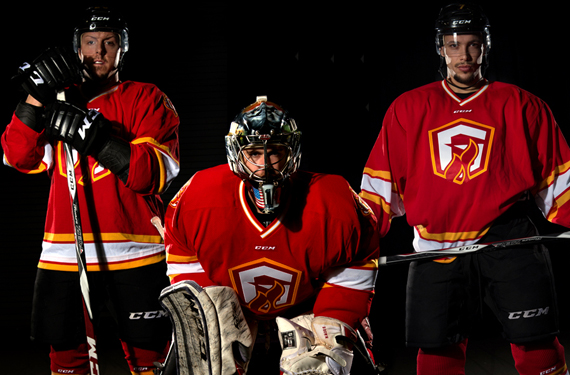
Hockey fans in Atlanta will notice something familiar about the new look unveiled today by the Gwinnett Gladiators, an ECHL affiliate of the Arizona Coyotes. The new uniforms, which will be worn at all home games for the remainder of the season, are an homage to the NHL’s Atlanta Flames, who played from 1972 to 1980.
 According to the team’s Director of Media Christi Johnson, who designed the logo and uniforms, the decision to honor the Flames was borne of respect for the city’s hockey history and nostalgia for Georgia’s first professional hockey team. She and team President/General Manager Steve Chapman hatched the plan to adopt the Flames’ identity more than five years ago.
The Gladiators have actually been around longer than the Flames played in Atlanta, and they’ve had considerably more success on the ice at their respective level, but hockey fans in the area remember their first team fondly.
“I can’t tell you how many of our fans over our twelve years have regaled me with memories of Flames games,” said Johnson, a native of Atlanta herself. “It was a huge thing back then. Any time you can associate a current experience with great memories from your past, that’s a win-win situation.”
Gladiators President Steve Chapman said in a statement, “Many of our fans see these red and yellow colors and think of the history associated behind it. Being here for 12 seasons, we hope that we’ve added a little bit to that history as well.”
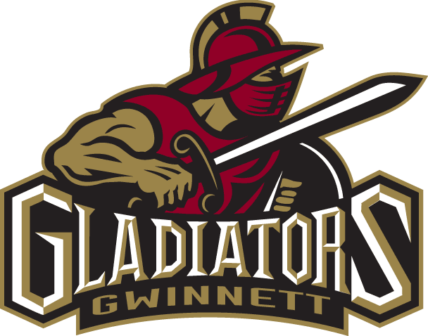
 The new look will complement rather than replace the Gladiators’ existing branding, seen here.
“The Gladiators are proud of the identity we’ve worked hard to cultivate in our backyard,” Johnson said. “Our logos and our official colors represent a commitment to this community that we have no plans of changing.”
The fact that the team now essentially has two identities should not affect branding. “I think people recognize that we are ‘the Gladiators,’ and that we are simply giving a nod to those who came before us,” Johnson said.
According to Johnson, the Gladiators’ NHL affiliate, the Coyotes, did not have a say in their decision to adopt the visual identity of a rival, currently the Calgary Flames.
“To be honest, we didn’t reach out to the Coyotes regarding the design,” Johnson said. “We are our own team, with our own identity, and while we are absolutely more than proud to be their ECHL affiliate, our business operations are two separate beasts.”
Johnson used one of the team’s alternate logos as the foundation of the new identity, which is at once unique to the Gladiators but unmistakably a tribute to the Flames. She describes the process:

“The ‘G-Sword’ logo on the shoulder, which, for the record, is my favorite part of the design, is already one of our go-to alternate logos,” she said. “I added the flames to tie it into the concept, and it worked perfectly.”

Johnson continued, “The main front crest of the new jersey I made by hand by utilizing the standalone ‘G’ from the sword logo, and incorporating a flame cutout.”

And the colors? That part was easy. “The color scheme is such a classic part of Atlanta’s hockey history that it was a no brainer,” Johnson said.
The Gladiators will take to the ice for the first time in the new uniforms Friday, when former Atlanta Flames players Tim Eccelstone, Eric Vail, and Willi Plett will drop the ceremonial first puck.
Note: Gladiators photos by Dale Zanine.
Related stories:
 Allen Americans unveil evolved logo set
  ECHL Gladiators Pay Tribute to Atlanta Hockey History With New Uniform
  Newfoundland Growlers Unveil Uniforms for Inaugural Season
  Utah Grizzlies Skeleton Uniform Headed to HHOF
  Hockey’s Scariest Scavengers: The Story Behind the Bakersfield Condors
  Atlanta’s Gwinnett Gladiators Present Team’s 10th Anniversary Logos. Plural. Trenton Devils suspend operations… Titans returning?