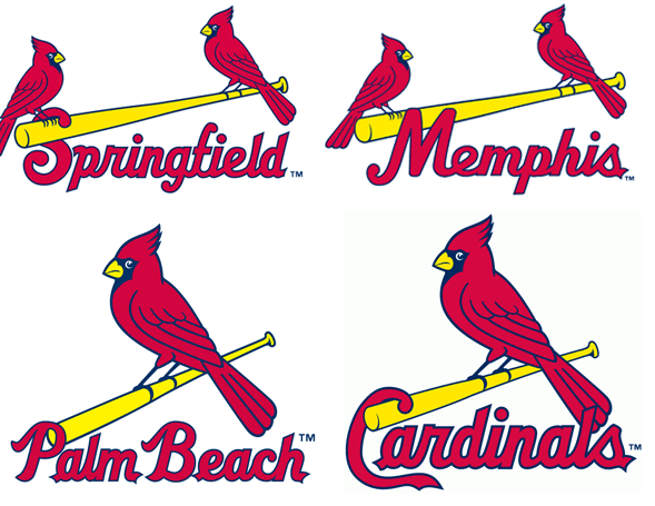
The Memphis Redbirds, AAA Pacific Coast League affiliate of the St. Louis Cardinals unveiled their new primary logo via a press release earlier today.
The new logo further streamlines the “birds-on-bat” theme running wild through the Cardinals Minor and Major League affiliations.

“We are extremely excited to debut our brand new logo to our fans and the City of Memphis,” said Redbirds General Manager Craig Unger in the release. “The new logo ties together the rich tradition of the Cardinals organization and Memphis’ role in developing the future of Cardinals baseball.”
Uniforms do not appear to have been released at this time but we have a pretty good description of what they’ll look like:
The Redbirds will proudly sport hometown “Memphis” jersey lettering under the “birds on the bat” logo across both the traditional home white and road gray uniform jerseys. Matching pants with red belts, red socks, and red shoes remain unchanged from previous seasons. The birds’ beaks are changing from red to yellow to match the colour of the bat.
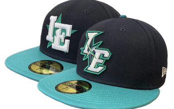
In addition to the jersey changes, the team will wear red caps with their home uniforms, blue caps on the road, and alternate red-and-blue batting practice caps. All three hats will sport an updated “M” logo centred on the front.
The logo replaces the one which the Redbirds had used since their first season back in 1998, and it’s certainly a more appropriate logo/brand for the name of the team:
Memphis joins the St Louis Cardinals, Palm Beach Cardinals, and Springfield Cardinals as teams in the organization to use the birds-on-bat look… just a heads up to their other affiliates the Peoria Chiefs and State College Spikes.


