
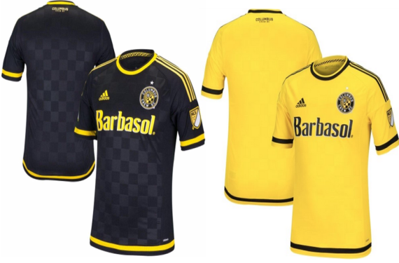
If you’re a fan of Major League Soccer and the uniform/logo side of things for our domestic league, then this past weekend was pretty good for you as we saw a bushel of new shirts come down the pike. In fact, we ended up getting a look at 8 clubs’ new shirts for 2015, including the entire home and away set for Columbus Crew SC (which you can see in the featured image). To put this in perspective, Crew SC recently sent out a tweet saying that they were going to unveil these shirts on March 3, so we’re getting an extremely early look at what we’ll see a good chunk of the league wearing for this upcoming season.
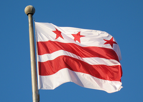
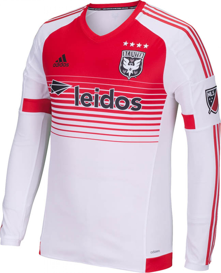
However, we’re going to start with a club who actually decided to beat the internet to the punch by officially unveiling their new shirt during this wave of craziness: DC United decided to reveal their new away jersey to their season ticket holders. The shirt is inspired by the District of Columbia’s famous flag design, and it also includes an alternate crest as well. which is meant to mark the franchise’s 20th MLS season.


Now that we’ve got the official stuff out of the way, now it’s time for the juicy part: The leaks! We’ll be going in alphabetical order by city here, which means we’ll be starting with Chicago Fire.
Chicago Fire

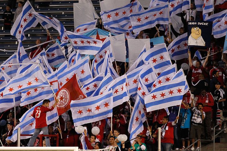
The Fire have traditionally paid tribute to their city’s iconic flag with their away jersey on multiple occasions, and it appears as though they’ve done so again with their 2015 away jersey.
Columbus Crew


Earlier this Winter, Crew SC unveiled their new logo (which is quite possibly one of the biggest logo upgrades in American sports), and now we’ve got a look at their new shirts for 2015. If you were worried about the jerseys not living up to the lofty standards of the crest itself, don’t be. It appears that the Crew will definitely be one of the better looking teams in MLS this season.
Houston Dynamo
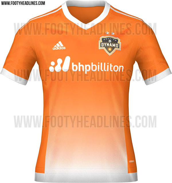
This would be a pretty great shirt if it weren’t for the weird gradient design from orange to white. It seems very out of place when compared to the rest of the shirt, but other than that, it’s not a terrible shirt. It would definitely be better without the gradient, for sure.
Sporting Kansas City
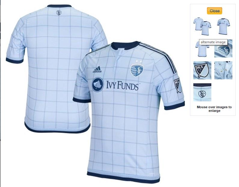
The club that brought baby blue, single-sleeved designs, and argyle to MLS continues their fashion-forward thinking with this new shirt that looks a tad bit like a picnic table design. That isn’t to say that I’m complaining about it; It’s another solid-looking shirt for SKC.
New England Revolution
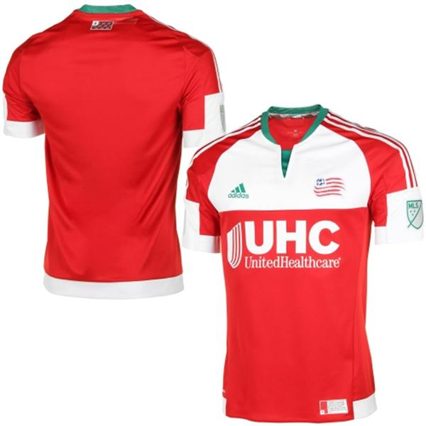
This is probably the most ambitious design of all the leaks. It’s another design that’s inspired by a local flag, which explains why the Revs dumped their normal color of blue for green. I love the idea of using the New England flag for inspiration, but I can’t say that I’m a fan of the execution. Then again, I’ve been stumping for an identity overhaul for the Revs for a while now, so until they fix that, they’ll still be in a bit of a rut in my opinion.
Portland Timbers
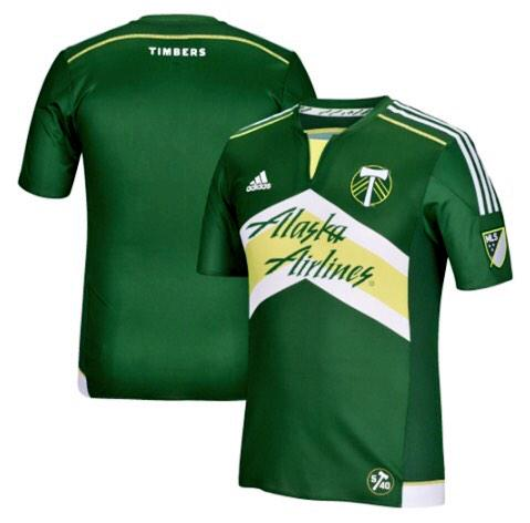
We’ve got another polarizing design here, and this time it comes from Cascadia. For starters, most of the shirt is green, which is a first for the MLS-era Timbers as their previous shirts had plenty of white integrated in the shirt. Also, the simplified alternate crest is on the primary shirt now, which could signal a potential change going forward. That’s just speculation on my part, though. However, I’m sure your eyes are focused on the chevron design that is dominating the front of the shirt. Most of the reaction has been negative, but looking at it here, I don’t think it’s all that bad. Again, this should be a polarizing design.
Toronto FC
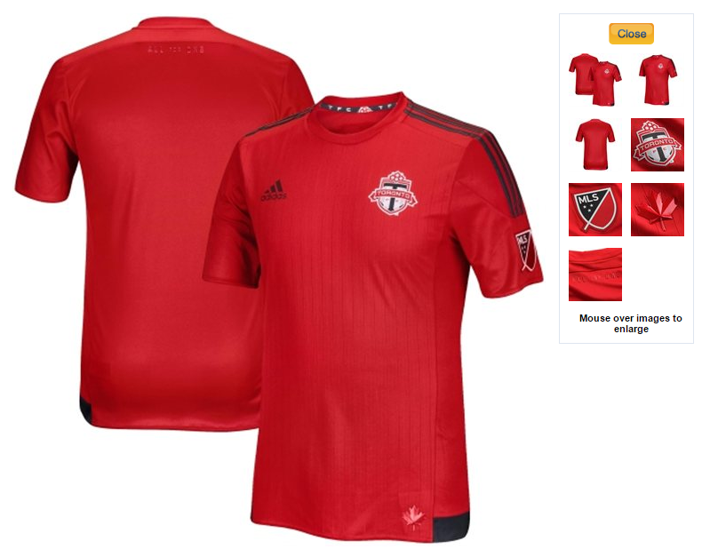
Lastly, we have the 2-time defending MLS offseason Champions Toronto FC, who have gone back to basics with their home shirt for 2015. Most of the shirt is either red or graphite, with only a small bit of white coming in the crest and the MLS logo on the sleeves. Other than that, if you love the shade of red and graphite that TFC uses, then you’ll probably enjoy this shirt.
***
So much for Jersey Week, right? Guess we’ve just had Jersey Weekend just now. With that being said, which one of these is your favorite? Would you consider buying any of these?
Related stories:
 MLS Renews Calls to End Plastic Waste With Return of Parley Kits
  2023 Football Kit Preview: Major League Soccer
  Adidas, Major League Soccer Extend Contract Until 2030
  Busy Wednesday Sees 13 MLS Clubs Launch New Jerseys for 2023 Season
  2022 Football Kit Preview: Major League Soccer
  MLS 2021: What’s New in Kits and Logos
  13 More Jerseys Revealed As MLS Jersey Week Ends