Woah, scary stuff kids! Friday the 13th is here, and won’t be back for a while, a whole… 28 days. Seriously, we have another one in March. But no biggie, we’ll still enjoy it.
The true origins of why Friday the 13th is “spooky” is unclear, but the popular theory is that it begins with Christianity where they say Friday was the day Jesus was crucified and Judas was the 13th guy at the Last Supper. So Friday’s get branded as a bad day and then 13’s got its negative associations… and, there you go, double unlucky.
But let’s be honest, modern day folk are all about Friday the 13th because of one guy and about a dozen different films… yes, we’re talkin’ Jason Voorhees ladies and gentlemen.
Jason is the star of the slasher “Friday the 13th” movie franchise and did away with his victims (quiet violently, might I add) all while wearing an old 1970s style hockey goalie mask. This homicidal fashion accessory may be Canada’s most iconic contribution to film history. Be proud, my fellow countrymen!
Considering Jason’s clear fondness for the goalie mask, we present to you what absolutely must be his favourite hockey logos of all-time (spoiler alert, Jason loves the ECHL):
The Mighty Ducks of Anaheim

Who says Jason can’t have a soft side? He was a happy go-lucky kid at one point who, like ducks, hung out in the water, occasionally even attempting to swim… but not so well it turns out (What? Too soon?).
The Mighty Ducks of Anaheim adopted this goalie-masked duck logo for their expansion season in the NHL 11 years after Jason first made the goalie mask famous in Friday the 13th Part 3 (yeah, no mask in the first two).
Inspiration? Absolutely. While the logo can surely attest some of its origins to a horror movie franchise, the name is based purely off of a Disney movie aimed towards children. This team was all over the movie map.
Anaheim dropped the logo in 2006, bringing it back just a few years later as a shoulder patch which they still wear to this day.
Las Vegas Wranglers

I mean… it’s Jason wearing Freddy Krueger’s hat, right? There’s no dispute about this. It’s the logo version of the film “Freddy vs Jason”. The logo has absolutely nothing to do with “Wranglers”, which is the name of the team. A wrangler, by the way, is a guy who keeps all the horses and other livestock in line on a farm. They don’t typically wear goalie masks nor do they wear fedoras.
Vegas adopted this logo after playing off the horse theme for the first 20 years of their existence. It was considered a serious downgrade by most and they ceased operations shortly thereafter… much like most of those who came face-to-face with Jason and/or Freddy during their fictional existences.
Wheeling Nailers

Jason gives this logo extra marks for adding weapons to his mask but then docks points for it’s use of “Vegas Gold”, mirroring the Wheeling Nailers parent club – the Pittsburgh Penguins.
Wheeling has been using the Voorhees mask with rail spikes since 1997 originally using the colours black and red, they somewhat foolishly swapped the red for this barely-gold in 2012.
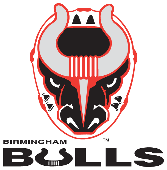
Birmingham Bulls

While Jason likes to do his business with his mask as naked as the day it was born, seeing this charge at you in the forest would be equally, if not more intimidating. But really seeing any strange man, painted mask or not, with a machete would be enough for me to GTFO ASAP, IMHO… LOL BRB.
The Bulls carried over the goalie mask theme with them during their relocation from Cincinnati in 1992 (that logo is later on in this article), they ended up moving to Atlantic City where they dropped the spooky mask for a cartoon bulldog playing hockey (he’s got an anchor for a tattoo though, so you know he’s a bad seed).
Idaho Steelheads

This is a goalie mask? Alright, sure, whatever you say Future Man. Now get in your hot tub and head back to 1999 before I machete you good.
The Idaho Steelheads are named after a fish, which is plainly obvious in this logo above which they used for nine years before deciding a logo which had anything to do with their team name was a good idea…. they switched to a logo showing mountains after that, which, yeah, try again guys. They did, here’s their current mark, it wins, by very muchly.
Cincinnati Cyclones

The first time I saw this logo was when I was kid reading through The Hockey News, where they quite loudly named it the “worst logo in all of hockey”. But it’s got everything you could ever want in a logo… a tornado, a goalie doing the “YMCA”, a domino being worn as a blocker, the classic colour scheme of black, red, grey, and yellow, and an infinite logo loop (look at his jersey, it’s the same guy!).
Cincinnati tried to play up their “worst logo” title like a badge of honour, but it didn’t last long, the club rebranded just three seasons later… still insisting on using a tornado despite clearly being named the Cyclones. Their current Cincinnati Cyclones logo, as you’d expect, is so much better than this it’s hard to believe they share the same name.
***
Fun fact: Jason’s famous goalie mask was originally branded with the marks of the Detroit Red Wings. The story of the origin of his mask courtesy that beacon of accuracy, Wikipedia:
“The film’s 3D effects supervisor, Martin Jay Sadoff, was a hockey fan, and had a bag of hockey gear with him on the set. He pulled out a Detroit Red Wings goaltender mask for the test… Doug White enlarged the mask and created a new mold to work with. After White finished the molds, Terry Ballard placed red triangles on the mask to give it a unique appearance. Holes were punched into the mask and the markings were altered, making it different from Sadoff’s mask”


