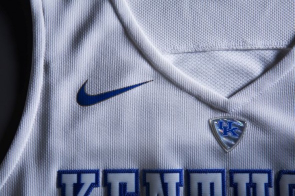
Remember last year when Nike rolled out a set of new uniforms in time for Tournament season for a select number of schools? Those uniforms were fun, fauxback looks that were colorful and interesting! This year, Nike’s done the same thing for a few schools with their Nike Elite Rivalry series, and as usual, the sequel isn’t as good as the original.
Here’s a snippet from Nike’s press release:
Each school’s home uniform will feature a white base with school-specific color lettering and a 26-degree speed graphic of an iconic symbol of each school across the side of the game short. The 26-degree angle of each school’s graphic was inspired by the chevron on the classic Nike Windrunner track jacket that debuted in 1978. Each graphic represents a distinctive basketball point of view, based on the roughly 1,000 directional changes, or “cuts” that a player might make in the course of a game.
While last year’s crop of uniforms were full of color and interesting ideas, most of these uniforms seem to have the same template’d idea with few differences across the board. Every team’s got a white wordmark with a colored outline, and a gray sublimated design on the shorts with the team’s logo in the shorts. The only differences between all the uniforms here appears to be the sublimated design, and the wordmark/numbers on each uniform. Other than that, it’s basically the same design for each team.


 Yeah, the design here is nowhere near as interesting or eye-grabbing as last year’s Elite series was. But I’m sure that this will catch someone’s eye (mainly the high school recruits that they design for), so it might be worth it for the schools. What do you guys think, though? If you were an alum/fan of one of these schools, would you buy it or would you be content with the mountain of memorabilia that you already have? Let us know what you think.


