
The Reading Fightin Phils, double-A affiliate of the Philadelphia Phillies, have stories to tell. Lots of stories. They play in a historic ballpark that has received tons of accolades. They have the longest-running affiliation with their parent club of any team in the minors. They play in a part of the country called Baseballtown because of roots in the sport that date back to 1858. And they have a regionally famous hot dog vendor who wears a costume that makes it look like he’s riding an ostrich.
“That’s a tough story to tell,” said the team’s general manager Scott Hunsicker. “It’s an especially tough story to tell if your name’s Reading Phillies and your logo is really just an R that’s always kind of looked like a P.”
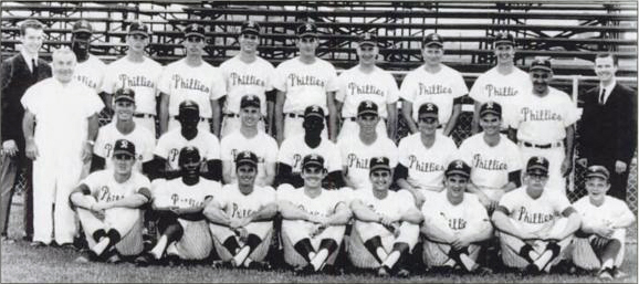
After 46 years as the Reading Phillies, the team decided that it was time for a change before the 2013 season. They were walking the fine line between wanting to honor and celebrate their parent club, which plays just 50 miles away, and doing something fun and unique to give them their own identity.
 “If you’re the Reading Phillies and your logo’s basically a Phillies P with a kickstand on it, you’re playing hard the Phillies card,” Hunsicker said. “While it’s cool to be the Reading Phillies, we were always just the little Phillies.” (To be fair, the Reading Phillies’ logo wasn’t always just a P with a kickstand. It featured a train for many years, because of the Reading Railroad, but as Hunsicker points out, “It’s not really the most fun, progressive angle to take from an iconic logo standpoint…. Not everyone thinks trains are cool anymore.”)
With the beginning of the 2013 season, the team went from one of the most conservative looks in minor league baseball to one of the wackiest. The Reading Fightin Phils, as they are now called, took to the field with a primary logo that featured an ostrich and a cap logo that featured a punching fist. Not only that, but they sometimes wore uniforms with a completely separate name and hot dog-themed identity. Lost amid the wackiness, though, was an attention to detail and an homage to history that baseball fans would love if they had noticed it.
“I think so many people got caught up on the hot dog with the mustard and the different color palette on the uniform and the ostrich with the hair on his leg,” Hunsicker said. “If there was one regret through that whole period of time, it was some of the stuff that got missed.”
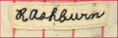
In putting their uniforms together, the team went back in their parent club’s history to 1950: “Literally having a game-worn uniform from the Whiz Kids team and putting that under a microscope and replicating the chain stitch and going through pattern after pattern after pattern of samples with Wilson,” Hunsicker said. “Our uniform is an exact replica of the Whiz Kids.”
 Then to reinforce that connection to history, the Fightin Phils called on the son of one of the most beloved figures in Philadelphia sports history. The first night they wore their new uniforms, the ceremonial first pitch was thrown out by Richie Ashburn, Jr., whose father played on that Whiz Kids team and served alongside the legendary Harry Kalas in the broadcast booth for decades. He wore a jersey that was an exact match of his father’s, “except it didn’t say Phillies, it said Fightin Phils,” Hunsicker said.
“I think some of that direct lineage to the Phillies kind of got whitewashed with the ostrich and the Baseball Town and all that stuff,” Hunsicker said, “which is a shame because for people that care about that sort of historical perspective, I’m not sure that they really got a chance to hear all that.”
What fans did hear about was the team’s outrageous new identity—two outrageous new identities, actually—that featured a combatant ostrich and an anthropomorphized hot dog.
 The first point of order in developing the new identity was the name. The nickname Fightin Phils, or Fightins for short, is often used by fans as a nickname for the big-league club, so it maintained that connection, but still gave the team some flexibility.
“The most important reason of our long-term success is the Phillies affiliation,” Hunsicker said. “Long story short, that’s how we arrived at Fightin Phils and how we sort of evolved to use Fightins.”
It’s worth noting for people who get twitchy about grammar and usage that there is no apostrophe in the abbreviated word “Fightin” in the team’s name. One of the reasons for this? “Apostrophes can be tough, even for English majors,” Hunsicker said.
Also of note is that Fightin begins with an F insted of PH, which would reinforce the alliteration visually. “Eliminating the PH and eliminating the apostrophe was eliminating two more variables,” Hunsicker explained. “We ended up with a one-color, simple wordmark with no apostrophe and no PH, which we think is more historically accurate with the way that Fightins fans over the years that did call the Phillies that are kind of used to.”

Next up is where things started getting weird. The team’s primary logo, designed by Brandiose, features an ostrich, which at first glance has nothing to do with rural Pennsylvania. (Hunsicker did offer, “Agriculture is the number one industry in Berks County, and while ostrich farming is not the number one industry in Berks County, farming is.”)
The real connection to ostriches in Reading is the Crazy Hot Dog Vendor, portrayed for more than a decade by Matt Jackson, the team’s Executive Director of Graphic Arts & Game Entertainment. The Crazy Hot Dog Vendor dresses like a guy riding an ostrich, slinging hot dogs into the crowd. It’s not the sort of connection you typically base a logo on, but the Crazy Hot Dog Vendor is a huge deal in Reading.
“He has achieved that status. It’s remarkable,” Hunsicker said. “We went through a bazillion different animals and ideas—they weren’t all animals—we came to realize that this Crazy Hot Dog Vendor and the fact that he rides an ostrich was worth it.”
That said, Hunsicker is aware that not everyone gets the connection. “For people in this region, he really has reached that status,” he said. “For people outside of this region, having any ostrich involved with us probably seems completely weird.”
Even though the logo is a bit out there, it reflects a time-tested tradition, “It’s kind of the ‘take an animal, make it kind of cool’ model,” Hunsicker said. “It’s existed forever.”
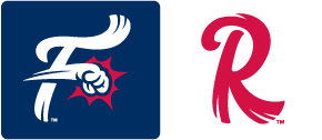 The team’s other logos include the letter F with a fist terminating a horizontal stroke and a feathered letter R for Reading. While kids are drawn to the ostrich logos, the other logos appeal to different generations. “We have the feathered R. That’s for the old-timers that saw Roger Maris and Rocky Colavito,” Hunsicker said. “Then the F-fist hat would be kind of our lead hat. The F-fist is very indicative of today, current.”
![]()
As if all of this were not enough, the Fightins have a completely different identity, called Baseballtown as an homage to the region’s Baseballtown Charities. “Baseballtown has been around for a long time, and it speaks to more than just the Reading Fightins,” Hunsicker said. “We’ve got thousands of kids that have played baseball now directly as a result of Baseballtown Charities.”
The identity features Bunbino the hot dog and a mustard-themed script, and allows the team to market paraphernalia to fans who may not want to wear Phillies gear.

“We really felt like, well you know what, if the Cubs have a bunch of Wrigley Field stuff and the Red Sox have a bunch of Fenway Park stuff, if you’re coming here, we should have a lot of Baseballtown stuff,” Hunsicker said. “The easiest way to achieve that is to wear some of it on the field. Because once you wear it on the field it really becomes part of who you are.”
“At the same time, though, we didn’t feel like we wanted to force the same color palette and everything on Baseballtown,” Hunsicker said. “We’ve always liked that it was a different color palette. It was obviously heavy lifting to figure out a way to possibly accomplish it.”
One of the benefits to the team’s new identity (or identities) is that they can now participate in the Minor League Baseball Little League uniform program. After years of seeing teams of local children showing up to Reading Phillies games wearing gear from other teams around the country, Reading wanted to see their own brand represented.
“Why do the Toledo Mudhens and the Durham Bulls and the Lake Elsinore Storm get to have that?” Hunsicker asked. “Not because of the merchandise sales, but just because I think that the people that have come to the games here since 1967 deserve that. Why would a kid in Toledo not be able to learn about us? They didn’t even know that we existed.”
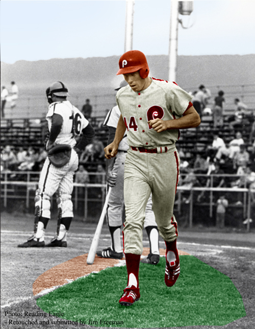 With so many stories to tell, it’s no wonder the Reading Fightin Phils’ visual identity is so diverse. They have a rich history, which includes, among much else, the first professional game and the first professional home run (pictured at right) of Hall of Famer Mike Schmidt, who would hit 548 dingers for the big-league club. There is more incentive than usual for them to maintain close visual ties with their parent club because of the duration of their relationship with that team as well as their geographic proximity.
But they also exist in a world of increasingly edgy minor league logos, and a boring identity just won’t fly. (Technically, ostriches don’t fly either, but that’s neither here nor there.) It’s safe to say that they’re the only team in sports that started the process of designing its uniform by analyzing 65-year-old fabric swatches, then based its new identity on a wacky costume worn by one of its hot dog vendors.
They’re attempting to walk the rather wide line between tradition and wackiness, and while what most people notice is the fighting ostrich and the grimacing hot dog, it’s all built on a foundation of a history that goes back decades.
Related stories:
 More Cowbell: The Story Behind the Visalia Rawhide
  Pilot Episode: The Story Behind the Lakeland Flying Tigers
  The Evolution of Dinosaurs in Utah: The Story Behind the Ogden Raptors
  Sweet Mosquitoes: The Story Behind the Sugar Land Skeeters
  What a Ride: The Story Behind the Brooklyn Cyclones
  Here there be the story behind the Dayton Dragons
  Hopped Up: The Beery Story Behind the Hillsboro Hops
  The Story Behind the Carolina Mudcats: It’s the Fish, Stupid
