Milwaukee, Wisconsin, Bucks.
That’s what these folks had in mind when they developed the latest identity of the NBA’s Milwaukee Bucks, unveiled at a fan and media event held tonight at the BMO Harris Bradley Center here in Downtown Milwaukee.
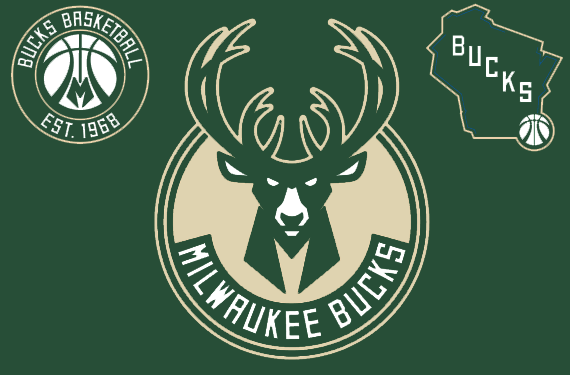
In each of the new Bucks marks we see either a buck, an “M” (for Milwaukee), or the State of Wisconsin. Not just in the logos, the colours are also a nod to all three. Milwaukee’s “Cream City Cream”, Wisconsin’s “Great Lakes Blue”, and of course the Bucks’ “Good Land Green”, a colour the club has used since their first tip-off nearly fifty years ago.
This is a brand meant to embody the spirit of the Bucks’ home and to create a global identity for the city of Milwaukee and State of Wisconsin to be proud of.
The new logos were designed by Brooklyn-based design agency Doubleday & Cartwright, their first major pro team re-brand (however they have worked in the past with Nike on brands for Lebron James and Chris Paul, among others). The Bucks approached the firm in July of 2014 leaving only six weeks to develop the look in time to meet the NBA’s deadline for 2015-16 team branding changes. Success!

Front and centre is the new primary mark, featuring a bold image of a green deer facing the viewer straight on and “focusing on the road ahead”.
The general idea of a buck’s head facing the viewer is a very similar central visual element as what had been used in their most recent primary brand, and the purple version (remember that one?) before that:
Below the deer head, forming the mane or neck is a stylized green “M”. More antlers, previously 8 and now 12, have been added to show the maturation of the Bucks franchise and, hey, fun with negative space (my favourite), there’s a basketball formed in the white area between the antlers just above the head.
The M’deer logo is contained within a cream circle, the team name arched below in white on green in an custom Varsity Block-esque font designed by Doubleday & Cartwright. This unique font is meant to resemble raw, industrial metal signage found throughout the state.
ALTERNATE LOGOS
The first alternate logo is a stylized basketball inside a green and cream roundel. The lines of the basketball used in this logo are intended to mimic the shape and style of the antlers above the head of the buck in the new primary logo shown earlier in this post. The “M” from the neck of the buck in that graphic has also been pulled out and is placed at the bottom of the basketball.
The Bucks are referring to this logo to a “Badge of Honour”, to showcase the history of basketball in the city of Milwaukee.
The tertiary logo is a neat geography lesson about the State of Wisconsin:
On the surface you may ask, “So what? It’s just a map of the state! It’s a good thing they don’t play in Wyoming”
Well, yes, but take note of those light royal blue lines placed on some of the edges. These represent the location of the two great lakes (Superior and Michigan) as well as the two rivers (the Mississippi and the St Croix) which form the majority of Wisconsin’s borders:
And the antler-ball, placed right on Milwaukee’s location within the state. The basketball goes where basketball is played.
This is the only logo in the set to feature the new “Great Lakes Blue”, also making it the only logo to feature the three main colours of green, cream, and blue. It is not clear how much more of this blue we will see in the Bucks identity vis-a-vis the new team uniforms.
Did somebody say uniforms? Yeah, sorry about that, you’ll have to wait, they aren’t unveiling them quite yet — that’s being saved for the summer.
As for the new colour scheme, green and cream is the overwhelming primary duo the Bucks will be going with, blue will be treated more of an accent colour. Black *is* actually listed as an official team colour on the 2015-16 stylesheets however it’s nowhere to be seen in anything we saw today… so, keep that in mind.

Cream is a nod to Milwaukee’s nickname, the “Cream City”. The Bucks become the only NBA team to use this colour and will be one of just five teams in the “Big Four” (the others being the Arizona Diamondbacks, San Francisco Giants, Minnesota Wild, and Arizona Coyotes). The foundation of the city of Milwaukee is built using “cream bricks” and now the foundation of each of these new Bucks logos are built upon a similar cream foundation.
Merchandise featuring the new primary logo was made available for sale immediately in the arena hosting the event, the team will be making the switch to the new look official at the conclusion of their 2014-15 playoff run.


