
I thought this one was going to be easy. The Buffalo Bisons are the triple-A affiliate of the Toronto Blue Jays. They play in a town called Buffalo, which is the common name of the animal technically called a bison. Case closed. My shortest Story Behind the Nickname ever, right?
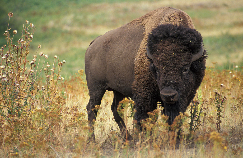
 But if the team is called Bisons because they play in Buffalo, where did Buffalo get its name? In this instance, the only fact that historians seem to agree on is that the town of Buffalo was named for Buffalo Creek. The name of Buffalo Creek might have come from the big ol’ bovid itself, whose original range (at right) included western New York before overhunting and introduced disease reduced its populations and range to tiny specks of the North American West.
But historians are not convinced that it’s that simple. Rather than just being named for the animal, the creek’s name could have come from a Native American person named Buffalo, a mispronounced Native American word (though no one is sure which one), or mumbling French traders, who might have been calling the place “beau fleuve” (pretty river) or “boeuf a l’eau” (beef of the water). So if the team is named for the city, it’s possible they should have featured a Native American, a river, or a French dictionary in their logo.
To get to the bottom of where the baseball team’s name came from, I called to talk straight with the source.
“I’ll tell you this,” said Brad Bisbing, the team’s director of public relations. “You’re not going to be able to find anybody to comment about why we are called the Bisons because, unfortunately, they’re all passed on.”
While this might be startling at first, the reason why anyone involved with naming the first iteration of the Buffalo Bisons is dead is that it happened almost 140 years ago.

“We have been the Bisons since 1877,” Bisbing said. “Every year of our professional baseball existence has been as the Buffalo Bisons.”
Having a brand that’s been established for 14 decades can help a team build some impressive numbers. “We were established almost a hundred years before the Buffalo Sabres first took the ice,” Bisbing said. “We have 20 players who wore a Bisons uniform that are in Cooperstown. Stuff like that is really cool.”
While the team’s longevity has made it one of the most solidly established brands in the minors, the team name itself seems to make people want to correct each other—for lots of reasons.
First up is the pronunciation. Whereas most people pronounce the word bison with a hard S, as demonstrated by the Merriam-Webster Dictionary, the Buffalo Bisons use a soft S. “It’s almost like there’s a Z in there. Maybe that’ll help,” Bisbing said. “When we have voiceovers and commercials and PA announcers and local sports media, we use that as a teaching tool, because it is the Bizzzons. That’s the correct way to pronounce it.”
Next up is an issue of grammar and usage. “The question that I deal with multiple times every season is, ‘You know, that’s not the right way to pluralize bison,’” Bisbing said. “And the correct answer is yes, we know that’s the not the correct spelling. The plural of bison is, of course, bison. We know that it’s not bisons. What we tell them is that we’ve been the Bisons every year since 1877 so that’s what we’re going to be.”

Finally, there’s the question of just what this animal is called. The American bison is commonly referred to as a buffalo, but this derives from the fact that early settlers thought the animal looked like African and Asian buffalo (pictured above), which are, scientifically speaking, completely different animals. So people who like to be pedantic about this sort of thing will tell you that bison and buffalo should not be used interchangeably.
I asked Brad Bisbing about this, because he must deal with it all the time. I mean, if the team is named for a city that is named for a creek that’s (maybe) named for an animal, you’d at least want it to be the right animal, right?
“I’ll be honest,” Bisbing said. “This is my 12th season as director of public relations for the Bisons and no one has ever brought that question up.”

Lots of teams called the Bisons have played in Buffalo since 1877, but the current triple-A iteration of the Bisons debuted in 1985, when their logo featured a red, white, and blue drawing of Buster, the team’s mascot. They played two seasons as a White Sox affiliate (1985-86), then one season with the Indians (1987) before taking up with the Pirates from 1988 to 1994, then switching back to the Indians in 1995.
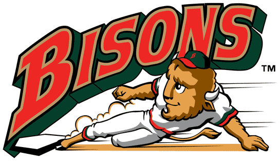
In 1998, the team changed colors and went with a logo that features Hunter Pence with horns sliding into home plate. (Okay, not really, but it looks like Hunter Pence, doesn’t it?)
 That look lasted until 2009, when the team switched its parent club once more. “When we aligned with the New York Mets, we wanted to celebrate the changing of a new affiliation with a new logo and a new brand, so that logo obviously mirrors a lot of what the New York Mets logo was,” Bisbing said. “During the four years that we were affiliated with the Mets, it was a more realistic-looking animal.”
That realistic buffalo (er, bison) was a departure from the classic swinging Buster logos, and fans reacted enthusiastically whenever the team busted out its retro gear. So when the Bisons switched to their current parent club before the 2013 season, they went back to their roots with a logo designed by a local firm called ADPRO Sports.
 “We wanted to obviously celebrate a great partnership that we have with the Toronto Blue Jays, but we also wanted to reestablish an independent Bisons brand with the logo,” Bisbing said.
But it’s more than just an independent brand—it’s a look that conjures nostalgia and captures the hearts of longtime fans.
“One of the main things that we wanted to do was celebrate a logo from the past, from when we first opened up Pilot Field, now Coca Cola Field, in 1988. We wore red, white, and blue colors and we had a Buster swinging the bat,” Bisbing said. “That’s why we went back to that with this recent logo, because we wanted to get back to what fans remember the Bisons looking like and the colors Bisons fans are used to.”
Given the history of the team, it’s appropriate that their current look reflects the past (though it’s certainly a more recent past in the context of the history of baseball in Buffalo). Wherever the name of their city came from and whatever the animal is called and however it’s supposed to be pluralized or even pronounced, the Bisons are right up there with the Toledo Mud Hens and Durham Bulls as icons of minor league baseball.
Related stories:
 More Cowbell: The Story Behind the Visalia Rawhide
  USA! USA! Baseball Team Wears Miracle on Ice Jerseys
  Pilot Episode: The Story Behind the Lakeland Flying Tigers
  The Evolution of Dinosaurs in Utah: The Story Behind the Ogden Raptors
  Sweet Mosquitoes: The Story Behind the Sugar Land Skeeters
  Here there be the story behind the Dayton Dragons
  The Story Behind the Carolina Mudcats: It’s the Fish, Stupid
  Rancho Cucamonga Quakes are the Picture of Stability

