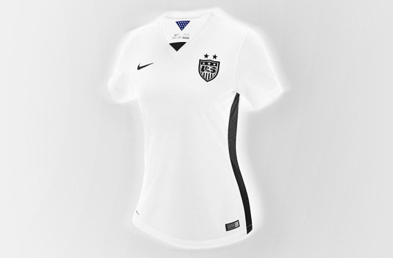
A while back, the always-reliable footyheadlines.com released a leaked design of what appeared to be the 2015 US Soccer home shirt. Now, full disclosure: The team here at sportslogos.net didn’t want to really talk about it because 1) The design seemed way too out there to be true and 2) Seriously, black and white?! Well, color us shocked because today, US Soccer revealed the home kit that the USWNT will be wearing for this year’s World Cup (and if the past is any indication, this is probably also the new home shirt for the USMNT as well) — and the leak was correct. It’s seriously a black-and-white shirt.
Also, as you can see there, they didn’t just stop at black-and-white. They also threw volt into the mix, which is included in a gradient effect on the socks. Also, thanks to the also-reliable todosobrecamisetas.com, we got a closer look at the crest. There was speculation that the black in this kit may have been an extremely dark blue, but it looks black to me; Especially so when you compare it to the blue that’s on the inside of the shirt.
All-in-all, this is definitely a “progressive” look for US Soccer, especially when you take their away kit into consideration. It’s almost as if they heard all of the criticisms levied at the 2014 kits for being too simple and decided to go deep into left field for the new kits. Or, maybe they just saw what Mexico was doing this year and tried to emulate that. Either way, it’s a unique look, to say the least. It’s very weird to see a national team go away from their flag’s colors for the home shirt, but we’re going to have to get used to it; At least for this year.
But what do you think? Should US Soccer and Nike have stuck with the ol’ red-white-and-blue color scheme? Or are you feeling the new volt attitude for US Soccer?


