

The city of Everett, Washington, about 25 miles north of Seattle, gets roughly 49 inches of rain per year—a good 30 percent more than the national average. That’s almost an entire Danny Devito of rain each year. And when it’s not raining there, it’s just about to rain. When you’re in Everett, you know that misty, Pacific Coast drizzle is on its way at any moment.
So in 1995, when it came time to come up with an identity for the local short-season single-A Northwest League team, a newly minted Mariners affiliate, there was one animal that leapt to mind.
 “The frog I think was appropriate and chosen because, you know, we’re here in the Northwest and we’ve got a lot of rain and moisture,” said Pat Dillon, the team’s radio broadcaster for 17 seasons. “Frogs are amphibians and spend time in water and on land.”
So the AquaSox baseball team is represented by a frog, but it’s not just any frog.
According to Dillon, “The frog is a cross between a Pacific tree frog and a Central American red-eyed tree frog—and Brooks Robinson,” And if that sounds just a touch oddly specific, Dillon has his sources. “I’m looking at the official release that we put out back in early 1995.”


The frog has another defining characteristic: It looks like it’s on a constant, bug-eyed, LSD high, perhaps induced by licking its own hallucinogenic skin. It’s this look that likely inspired one of the team’s annual traditions.
“Once a year—we’ve been doing this since 1996—we have a promotion called Frogstock, where it’s a salute to the 1960s,” Dillon said. “I don’t know if you ever played any Grateful Dead music,” he trailed off, the implication lingering for a moment, then continued, “The players wear tie-dyed uniform tops.”
If you come from a relatively dry part of North America, like my home state of Colorado, you might wonder just what an aqua sock is. While an internet search of the term turns up a footwear item that companies will sell you to wear when you’re walking in water, the Everett AquaSox are merely walking in the footsteps of their predecessors, carrying on the baseball tradition of adopting an archaic pluralization of socks (sox) and ascribing a team color to it.


One of the AquaSox’s alternate logos pays specific tribute to that tradition. “The Chicago White Sox, one of their logos is just a white sock, and then the Red Sox’s primary logo is a pair of red socks positioned a certain way,” Dillon said. “We wanted not to duplicate that, but to have something play off the color of our socks.”
And this being minor league baseball, “To put our own spin on it, we put the frog toes in there,” Dillon said.
All of that being said, there’s this: “We don’t actually wear aqua socks,” Dillon said. “Aqua is one of the colors in our scheme.” (Of course, with a logo that features multiple gradient blends and many of the 10 million distinct colors visible to the human eye, it’s hard to find a color not in their scheme.)
When the team introduced its new identity in 1995, it was coming off a decade as the Everett Giants, named for its parent club in San Francisco, and a new relationship with the Mariners was beginning.
“I don’t know if there was any passing thought of calling us the Everett Mariners, but it was a perfect opportunity,” Dillon said, “At that time, 20 years ago in minor league baseball merchandise, crazy logos and colors were just coming into vogue.”
But this logo was a bit crazier than some people were prepared for. “It was kind of out there,” Dillon said. “People, it takes a while for them to warm up to it. A frog? What is this? After a relatively short period of time, really after the first season, people took to it really well. Right after it was introduced, our hat through New Era was one of the top-selling hats in minor league baseball.”
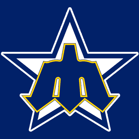

In 2010, the team’s relationship with its parent club gave rise to one of the more clever elements in minor league baseball logos. An update to the team’s identity took the Mariners’ trident M from the 1970s and 1980s and upended it—or at least turned it on its side. Rotated one turn to the left, the M for Mariners works perfectly as an E for Everett, and while the Mariners have moved on to a tepid compass logo, the AquaSox have revived one of Major League Baseball’s more popular retro logos.


 The 2010 update to the logo (on the right above) included another wink and a nod to the parent club. It incorporated a font similar to the one the Mariners used on their jerseys in the early 1980s.
While much of the AquaSox’s identity is out of the ordinary, their origin story shares one important element with basically every other minor league team’s—the fraudulent name-the-team contest.
“There was a name-the-team contest, and I can’t really speak to the validity of these things, because a lot of times teams will have a name-the-team contest and they’ll know exactly what they want to call the team,” Dillon said. “You know, they’ll say that they chose one of the thousands of entries.”
The most important thing about the Everett AquaSox’s identity is that it accomplishes what it set out to accomplish. “I think people look at it and they just think fun,” Dillon said. “Here’s an organization that doesn’t take itself too seriously. It’s creative and I think it’s disarming for folks.”
The AquaSox’s logo pays tribute to the fact that they play in a town where it’s soggy and gray much of the time, but at the same, they’ve introduced a burst of much-needed color. It’s unashamedly wacky, and doesn’t try to be anything other than fun. And sometimes, if you’re tired of getting rained on all the time, that’s just what you need.
Related stories:
 More Cowbell: The Story Behind the Visalia Rawhide
  Northwestern Exposure: The Northwest League’s New Logo
  Pilot Episode: The Story Behind the Lakeland Flying Tigers
  The Evolution of Dinosaurs in Utah: The Story Behind the Ogden Raptors
  Here there be the story behind the Dayton Dragons
  Hopped Up: The Beery Story Behind the Hillsboro Hops
  Bigfoot is Real: The Story Behind the Eugene Emeralds
  The Story Behind the Carolina Mudcats: It’s the Fish, Stupid