

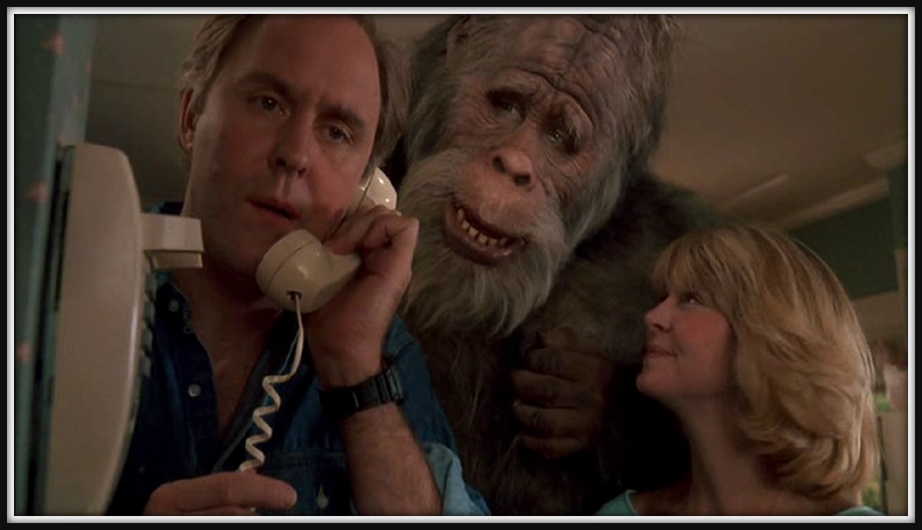
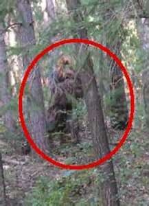
Of all the documented sightings of Bigfoot, known in the scientific community as Sasquatch, roughly a third of them have occurred in the mountain forests of the Pacific Northwest. There’s an obvious reason for this: That is where Bigfoot lives.

Since 1955, the Eugene Emeralds, currently a short-season single-A affiliate of the Chicago Cubs, played in the heart of Sasquatch country without even realizing it. Their logos were pleasant, almost soothing, like one you might use for a bed and breakfast promoting the serenity of the Pacific Northwest.
“This whole area is called the Emerald Valley,” said Allan Benavides, the team’s general manager. “It’s known as that because of how beautiful and how green it is—gorgeous trees and rolling hills and big mountains, just green for miles.”
If you’re feeling really calm right now, like you want to strap on a backpack and delve into a misty forest to discover your inner self, that’s not the effect the team was looking for. So they changed their logo.

“We had seen all these fun logos come out throughout the country, all these great teams coming up with these really fun logos that they could manipulate, have some fun with them. Ours was technically just a cursive E,” Benavides said. “It was a very nice logo in a traditional font, but we wanted something that was a little more modern—something that we thought was a little more minor league.”
The rebranding process started with an attempt to overcome the most deadly reaction a person can have to a minor league baseball logo. “The one thing I hated about our old brand was apathy, the ‘I don’t really care about it. It’s there, you know?’” Benavides said. “That’s the worst emotion to have about a brand, isn’t it? You don’t care? Doesn’t that have to be the worst reaction to your logo or your brand?”
The first challenge the team faced in its rebrand? “It’s just a color. We’re basically named after a color,” Benavides said. “How do you brand around a color?” Not only that, but their nickname is often shortened to “Ems,” so they were basically an episode of Sesame Street, sponsored by the color green and the letter M.
They started thinking about why they had the name they had—because of the Emerald Valley. And what lives in the Emerald Valley? Lots of stuff—deer, beavers, gnomes—but none of it was really inspirational when it came to a team name.
“All of a sudden it hit us,” Benavides said. “We’re like, it’s Sasquatch! Sasquatch lives here, obviously, right? He’s in the hills. He’s in the mountains. He’s in the trees.”
The team worked with Brandiose to develop a new look, to take their identity in a new direction while maintaining the name with six decades of tradition under its belt. For the unveiling in November 2012, the team packed about 300 fans into a local brewery to watch a video featuring their mascot Sluggo venturing into the woods to retrieve a home run ball.
“He goes in there and this big hand comes out and rips the ball away from him, and it shows kind of like these claws ripping through the old logo and the new one pops up,” Benavides said. “I remember being like ‘Oh God, here it comes.’ And it was huge cheers. Huge.”
And then the team breathed sigh of a relief. “Obviously we were so nervous at the unveiling because had gone to such an extreme,” Benavides said.


 .
.
The new logo set features Oregon resident Sasquatch carrying, chewing on, or swinging a bright green tree, as well as a green E footprint. (That fluorescent green has proven to be problematic for a minor league team with a limited printing budget, because getting it right on printed materials often requires additional steps beyond a traditional four-color printing process. “We love it, which is why we still have it,” Benavides said, “but for a small team like us, it’s like, ‘God dangit, we have to spend how much more to print this?’”)

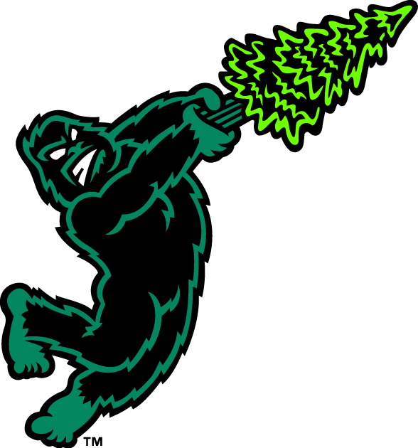
Of course, with this logo being designed by Brandiose, one of the alternate logos features a character swinging a thing. While this is something of a signature look for Brandiose logos, the Emeralds had their reasons. “We did it because we were a Padres affiliate,” Benavides said. “We were trying to mimic the swinging friar.”
With such a drastic change in direction, not everyone has loved it. But that’s okay with the team. “I’m sure there are people who hate our logo, which is fine,” Benavides said. “I want you to either to either hate it or love it. Because if you hate it, if you think we’re the biggest idiots for doing this, you’re going to tell somebody. You’re going to tell a lot of people. And they might say, ‘You know what, it’s not that bad. I kind of like it.’ And it’s going to create a conversation.”
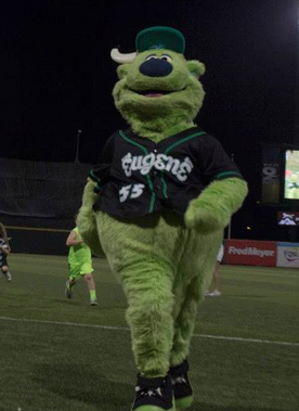 One concern over the new identity was that the team would get rid of its beloved mascot, Sluggo. (They would not.) Another concern was that the logo inadvertently promoted another Oregon institution. “People tell us all the time, ‘You know you guys have Nike swooshes throughout the whole thing,” Benavides said. “We’re like, ‘No, those aren’t Nike swooshes.’ We get that a lot.”
Yet another issue involved the delicate sensibilities of the children the team was appealing to. “When we unveiled it, some of the criticism that we got early on was like, ‘Oh my God that’s scary. Kids aren’t going to want to wear that,'” Benavides said. “I’m like, ‘Really? You see what’s on TV nowadays? Get out of here!’”
In fact, one of the effects of the new logo set is that the team has been picked up by Minor League Baseball’s Little League uniform program. “It’s fun to get people from all over the country, ‘Hey my kids play on the Tallahassee Emeralds,’” Benavides said. “You get a call or an email, ‘Hey my kid played for the Emeralds in Little League.’ We never had that before, ever.”

When the class A short season begins in June, the Emeralds will reflect their new Cubs affiliation with more traditional uniforms than what they’ve worn previously. The redesigned pinstripe uniforms (not pictured because the team had to send the first attempt back) will be Emeralds black rather than Cubs blue and will feature the Cubs logo on the sleeve.
While the team’s uniforms are taking on a more traditional look, the story of the Emeralds’ identity is decidedly the opposite. Their switch from a milquetoast (though pleasant) reflection of the local scenery to a logo that embraces the spirit of minor league baseball has worked for the team. In short, it’s more fun, it’s bright green, and it reminds the world just where Bigfoot lives.
Related stories:
 Northwestern Exposure: The Northwest League’s New Logo
  Pilot Episode: The Story Behind the Lakeland Flying Tigers
  The Evolution of Dinosaurs in Utah: The Story Behind the Ogden Raptors
  Emeralds keep Eugene weird on Portlandia Night
  Sweet Mosquitoes: The Story Behind the Sugar Land Skeeters
  Hopped Up: The Beery Story Behind the Hillsboro Hops
  Soggy Froggy, Man: The Story Behind the Everett AquaSox
  Eugene Emeralds Find Bigfoot in New Team Logos