The rectangle fad just didn’t take off like they hoped it would.
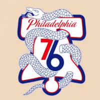
Today the Philadelphia 76ers introduced their new series of team logos, an (ever-so-slightly) updated version of the mark they have been using for the majority of the history of their team since moving from Syracuse, NY in 1963.
The rectangle is gone, the roundel is in; a blue roundel now surrounds the classic logo with “PHILADELPHIA” arched over top in white, six white stars arched below. The basketball behind the “76ers” wordmark has also been modernized.
The Benjamin Franklin secondary logo, which was included as part of their official team stylesheet beginning in 2014-15 despite the club denying it was a team logo is apparently now being used by the club. Perhaps due to taking home SportsLogos.Net’s Best Secondary Logo of the Year Award in 2014? Perhaps.
Philadelphia hasn’t had the most interesting approach to evolving their logo over time, my handy step-by-step guide below:
A handy step-by-step on the evolution of the Philadelphia 76ers logo since 1963 #NBA #Sixers pic.twitter.com/DkFFeOACJt
— Chris Creamer (@sportslogosnet) May 12, 2015
New uniforms are coming June 18th in a ceremony being held at the team arena that evening. They will be a mix of designs over the 1960s, 1970s, and 1980s. Sorry, Shawn Bradley fans.


