Sitting by the fireplace with the stockings hung high above, grandmother rocking in her chair while knitting a sweater for your young niece, reflections and warm feelings of another old-fashioned Norman Rockwell family Christmas. Oh, and NBA basketball, lots and lots of NBA basketball.
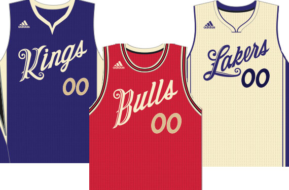
The National Basketball Association and Adidas will be evoking those feelings of those days of Christmas past with their new set of fauxback-style Christmas Day uniforms, first posted earlier today by Paul Lukas at Uni-Watch.
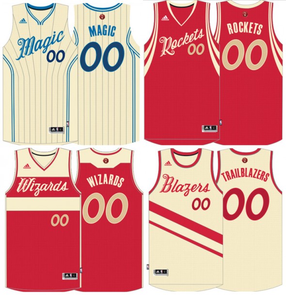
Each team in the league gets a special uniform either in their standard road jersey colour or “greige”, we could call it cream for familiarity’s sake but it’s actually (as Lukas explained) “a fabric that’s neither dyed nor bleached”; “plain” or “natural” may be just as accurate — although neither sounds nearly as “interesting”.

Jersey wordmarks and numbers are templated, that’s all, I am calling this a partial victory! Unlike Christmas uniforms of yesteryear every team gets unique design elements of their standard home/road uniform implemented, from the pinstripes of the Orlando Magic to the striping of the Washington Wizards. Well done!
The wordmarks are, as Lukas explains, “meant to evoke the feel of the fancy script on a Christmas card.” Sure, I can see that.
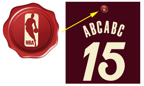
On the back of the jerseys is an idea I love and would have supported had I been in the brainstorming session, but not sure I’m a fan of the outcome. The NBA logo is on, what looks to be a red splat — it’s meant to look like the sealed wax on the back of envelopes, the NBA logo the stamp in that wax. Like I said, really fun idea, but will have to wait to see an actual jersey before knowing if I like it.
We got a look at the uniforms of two of the teams which are getting new looks next season (Sixers, Bucks, Raptors missing) – the Los Angeles Clippers jersey shows the leaked “LAC” logo we’ve all seen a million times further confirming it’s the real deal, as well as giving us an idea of the striping we’ll see down the sides of the new jersey and shorts:
But this is where it gets real interesting… check out the Atlanta Hawks uniform:
That sublimation pattern, the “HAWKS” going up the shorts, the new logo on the waistband of the shorts, the lime green making a comeback?? From that forgotten 1970s set?!? Wow, a lot to take in here, but we’re really getting a good look at what the Atlanta Hawks are going to be doing next season! Also, black and no blue. Wow!
If the Christmas jerseys *have* to be a thing, then I’m liking this new direction. The dumb sleeves are still gone, the last names (yes last names, none of this first name nonsense) are back above the numbers, and each team gets their own unique look in some fashion.
Of course only a handful of teams will actually wear these uniforms, we’ll have to wait until the 2015-16 schedule is released to find those out.
Check out Paul’s post at Uni-Watch to see all the team uniform designs available

